10 Flutter Widgets Probably Haven’t Heard Of (But Should Be Using!)
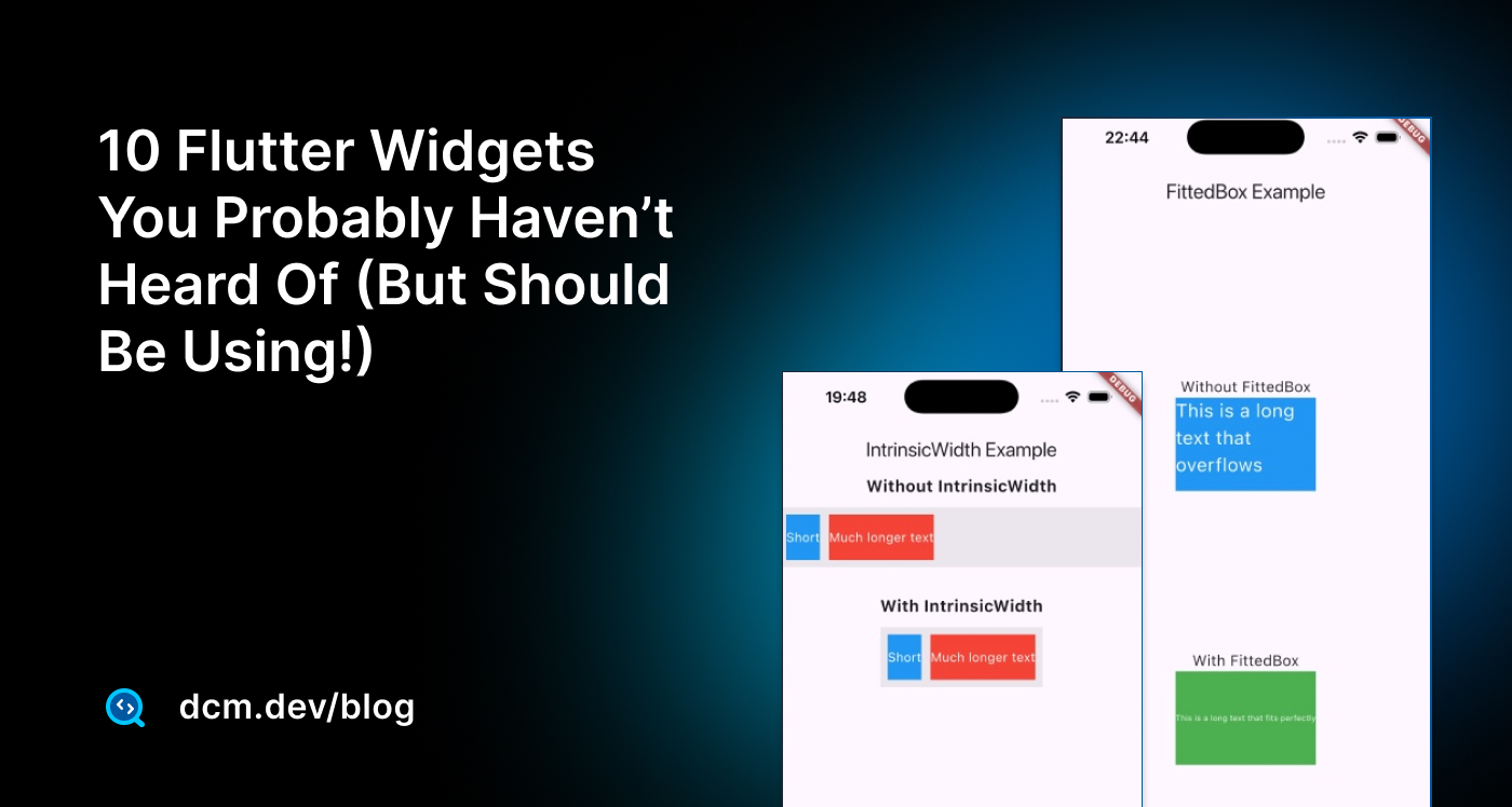
It’s been over 6 years since I started developing with Flutter and Dart, and yet I still come across features or widgets that I didn’t know existed. It’s fascinating how a framework you work with daily can still surprise you with its depth and versatility.
In this article, I want to share some of those hidden gems I’ve discovered lesser-known widgets and functionalities that can simplify your development process and add a unique touch to your apps. Moreover, we will go deeper into the implementation and explore how they are implemented to learn more about the patterns.
Let’s uncover some of these widgets together!
Banner Widget
Imagine you’re building a feature where certain items in your app need a bold visual indicator, for example, a "SALE," "NEW," or "FEATURED" tag that calls for attention. You could go the custom route, but Flutter offers a much simpler and easier-to-use widget: the Banner widget.
This looks familiar, doesn’t it?
You are right! CheckedModeBanner uses this widget to display a banner saying "DEBUG" when running in debug mode, and MaterialApp builds one by default.
class CheckedModeBanner extends StatelessWidget {
const CheckedModeBanner({super.key, required this.child});
final Widget child;
Widget build(BuildContext context) {
Widget result = child;
assert(() {
result = Banner( // <--- That's the Banner widget!
message: 'DEBUG',
textDirection: TextDirection.ltr,
location: BannerLocation.topEnd,
child: result,
);
return true;
}());
return result;
}
void debugFillProperties(DiagnosticPropertiesBuilder properties) {
// LOGIC
}
}
Under the hood, the Banner widget relies on CustomPaint for rendering. The CustomPainter within the widget draws a diagonal stripe using a Path.
Let’s take a closer look:
class _BannerState extends State<Banner> {
BannerPainter? _painter;
// ...
Widget build(BuildContext context) {
// ...
_painter?.dispose();
_painter = BannerPainter(
message: widget.message,
textDirection: widget.textDirection ?? Directionality.of(context),
location: widget.location,
layoutDirection: widget.layoutDirection ?? Directionality.of(context),
color: widget.color,
textStyle: widget.textStyle,
shadow: widget.shadow,
);
return CustomPaint(foregroundPainter: _painter, child: widget.child);
}
// ...
}
The CustomPaint widget here renders the banner and delegates the drawing logic to the BannerPainter class. This painter uses Flutter's low-level canvas APIs to handle both the diagonal stripe and the accompanying text. The painter class goes further with its paint method, which orchestrates everything from rotations to text layout:
class BannerPainter extends CustomPainter {
// ...
void paint(Canvas canvas, Size size) {
// ...
canvas
..translate(_translationX(size.width), _translationY(size.height))
..rotate(_rotation)
..drawRect(_kRect, _paintShadow)
..drawRect(_kRect, _paintBanner);
const double width = _kOffset * 2.0;
_textPainter!.layout(minWidth: width, maxWidth: width);
_textPainter!.paint(
canvas,
_kRect.topLeft + Offset(
0.0, (_kRect.height - _textPainter!.height) / 2.0,
),
);
}
// ...
}
The Banner widget’s API is simple as the below:
message: Whether it’s "BETA", "SALE", or "NEW", this property defines the purpose of the banner.location: With values liketopStart,topEnd,bottomStart, andbottomEnd, the banner’s position is fully customizable.
enum BannerLocation {
  topStart,
  topEnd,
  bottomStart,
  bottomEnd,
}
color: This property sets the background color, ensuring the banner stands out without clashing with the underlying widget.textStyle: A companion to the message, it allows you to fine-tune the appearance of the text, from font size to color to weight.child: Perhaps the most crucial property, the child, represents the widget being wrapped by the banner. It could be anything—a card, a container, or even another complex widget.
Let’s now take a look at a full example:
Banner(
  message: 'BETA',
  location: BannerLocation.bottomStart,
  color: Colors.green,
  textStyle: TextStyle(
    fontSize: 12,
    color: Colors.white,
  ),
  child: Card(
    elevation: 4,
    child: Padding(
      padding: const EdgeInsets.all(16.0),
      child: Text('New Feature: Try Now!'),
    ),
  ),
);
This widget was generally simple, but it has a lot to offer when you look at the source code, especially in terms of learning how to use Custom Painter.
Alright now let’s take a look at another widget, that you may have not heard.
MetaData Widget
The MetaData widget in Flutter is one of those widgets that often go unnoticed.
At first glance, it may not seem like much—it doesn’t render anything visible on the screen, nor does it directly modify the behavior of its child. However, MetaData attaches custom metadata to a widget subtree. This means that as Flutter developers, we can define additional semantic or structural information.
Consider the following example:
MetaData(
  metaData: 'Custom tag for this widget',
  child: Container(
    height: 100,
    width: 100,
    color: Colors.blue,
  ),
);
Here, the MetaData property allows you to tag the widget subtree with any arbitrary information. This information doesn’t affect rendering or interaction but can be retrieved and processed by external systems. Imagine using this metadata during automated testing to identify widgets by custom metadata or attaching descriptions for custom analytics.
Let’s get a bit deeper and answer which scenarios this can be helpful in.
MetaData becomes apparent in the accessibility scenarios. While Flutter provides rich built-in accessibility support through widgets like Semantics, there are times when you need to add custom annotations. Using MetaData, you can tag widgets with additional information that external tools can interpret.
MetaData(
  metaData: {'role': 'button', 'label': 'Custom Button'},
  behavior: HitTestBehavior.translucent,
  child: GestureDetector(
    onTap: () => print('Button tapped'),
    child: Container(
      height: 50,
      width: 150,
      color: Colors.green,
      child: Center(child: Text('Click Me')),
    ),
  ),
);
In this example, the MetaData field holds a map containing custom roles and labels for the widget.
The MetaData widget also plays a role in debugging and developer tools. For instance, if you’re working on a large and complex UI hierarchy, you can use metadata to tag specific sections of the tree. This tagging can help you trace widget interactions or state changes during runtime.
Another effective feature of MetaData lies in the behavior property. This property defines how the widget participates in hit testing. By default, the MetaData widget doesn’t interfere with hit tests, but you can configure it using one of the values from HitTestBehavior:
opaque: The widget captures all pointer events, even if the child doesn’t.translucent: Pointer events pass through to widgets below the child.deferToChild: Only the child handles pointer events.
For example, consider a scenario where you want to add metadata to an invisible widget that still participates in hit testing:
MetaData(
  metaData: 'Invisible button',
  behavior: HitTestBehavior.opaque,
  child: Container(
    height: 100,
    width: 100,
    color: Colors.transparent,
  ),
);
Here, the container is invisible but still captures pointer events, thanks to the HitTestBehavior.opaque configuration. This can be useful in cases where you need a tappable region that doesn’t have a visual representation.
Now, let’s look deeper at the source code. The MetaData widget itself is a straightforward wrapper:
class MetaData extends SingleChildRenderObjectWidget {
const MetaData({
super.key,
required this.metaData,
this.behavior = HitTestBehavior.deferToChild,
super.child,
});
final Object? metaData;
final HitTestBehavior behavior;
RenderMetaData createRenderObject(BuildContext context) {
return RenderMetaData(
metaData: metaData,
behavior: behavior,
);
}
void updateRenderObject(
BuildContext context, RenderMetaData renderObject) {
renderObject
..metaData = metaData
..behavior = behavior;
}
}
The widget itself doesn’t do much—it’s primarily a line to pass metadata to the RenderMetaData object. The real work happens at the rendering layer:
class RenderMetaData extends RenderProxyBox {
RenderMetaData({this.metaData, HitTestBehavior? behavior})
: _behavior = behavior ?? HitTestBehavior.deferToChild;
Object? metaData;
HitTestBehavior _behavior;
bool hitTest(BoxHitTestResult result, {required Offset position}) {
switch (_behavior) {
case HitTestBehavior.opaque:
return super.hitTest(result, position: position) || true;
case HitTestBehavior.translucent:
final hitTarget = super.hitTest(result, position: position);
return hitTarget || true;
case HitTestBehavior.deferToChild:
return super.hitTest(result, position: position);
}
}
}
The RenderMetaData class overrides the hitTest method to handle pointer events based on the specified behavior.
Alright, let’s talk about another widget now that you may have heard and seen it. I have also talked about it in the past, but there might be a chance that you still are not using it properly.
RepaintBoundary Widget
The RepaintBoundary widget's purpose is to limit the area of the screen that needs to be redrawn when visual updates occur by reducing unnecessary repaints, which drastically improves an app's performance, especially in scenarios with complex or frequently changing UI elements.
The RepaintBoundary widget works by creating a new compositing layer in Flutter’s rendering pipeline. Layers are an essential part of Flutter’s rendering model, allowing portions of the scene to be drawn independently. I talked about rendering pipe in Flutter quite extensively in my book FlutterEngineering.io.
When a RepaintBoundary is added to a widget, that widget and its subtree are isolated into their own compositing layer. This ensures that only that layer needs to be redrawn when a visual update happens within the subtree, not the entire screen.
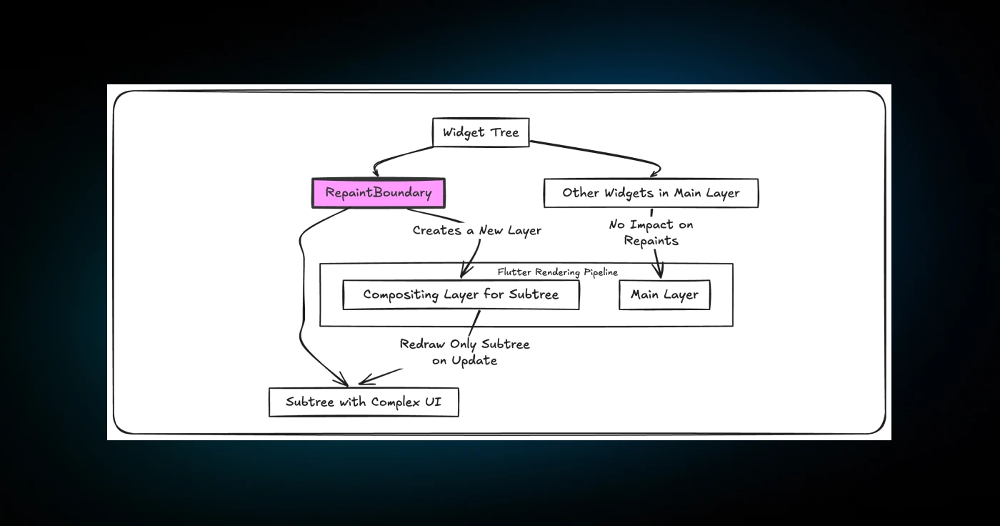
Here’s an example of how RepaintBoundary can be used:
RepaintBoundary(
  child: Container(
    width: 100,
    height: 100,
    color: Colors.blue,
    child: Text('Optimized Painting'),
  ),
);
Let’s dig deeper into why RepaintBoundary is necessary and how it works under the hood!
Without it, Flutter’s rendering engine propagates visual updates upward through the widget tree, marking all ancestor widgets as dirty. This cascading effect can result in large portions of the screen being unnecessarily redrawn, even if the change is confined to a small area.
The RepaintBoundary is implemented at the rendering layer as a RenderRepaintBoundary object. This class overrides the paint method to control how the widget is drawn and when it needs to be repainted:
class RenderRepaintBoundary extends RenderProxyBox {
void paint(PaintingContext context, Offset offset) {
if (!isRepaintBoundary) {
super.paint(context, offset);
return;
}
final bool needsRepaint = _repaint;
if (needsRepaint) {
// Repainting logic
layer = context.pushLayer(
OffsetLayer(offset: offset),
super.paint,
offset,
oldLayer: layer,
);
} else {
context.paintChild(child!, offset);
}
}
}
The isRepaintBoundary flag determines whether this render object creates a compositing layer. If true, the render object isolates its subtree, preventing unnecessary repaints of its ancestors. The _repaint flag tracks whether the subtree needs to be redrawn, further optimizing performance by avoiding redundant work.
Flutter provides a debugging tool to visualize the impact of RepaintBoundary. By enabling the "Show Performance Overlay" option in the Flutter DevTools or adding debugRepaintRainbowEnabled = true; in your app, you can see the repaint boundaries as colored outlines on the screen. You can also add showPerformanceOverlay: true to MaterialApp to see the overall performance.
void main() {
  debugRepaintRainbowEnabled = true;
  runApp(
    MaterialApp(
      showPerformanceOverlay: true,
      home: RepaintBoundaryExample(),
    ),
  );
}
Areas within these boundaries are repainted independently, providing a clear view of how RepaintBoundary reduces the scope of visual updates.
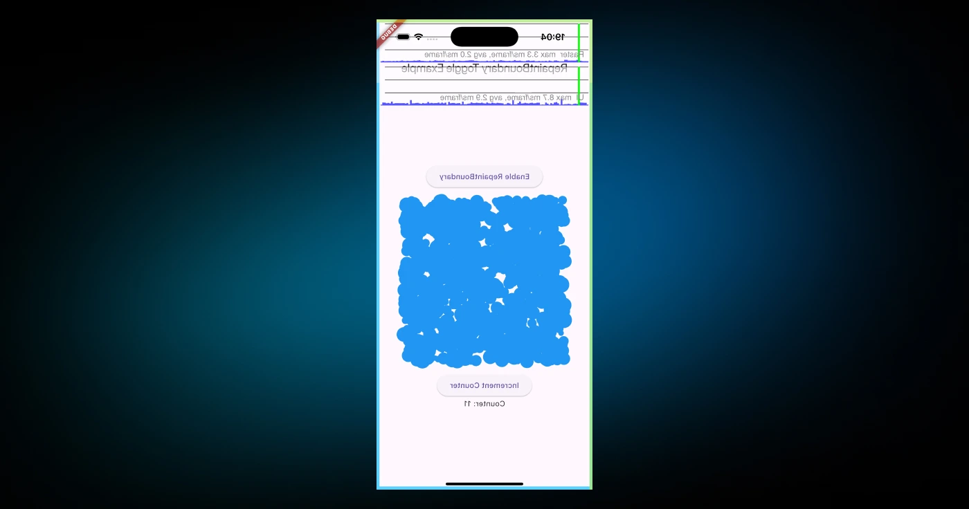
For example, if you have a scrolling list with images, wrapping each image in a RepaintBoundary ensures that scrolling doesn’t trigger unnecessary repaints of the images. This can greatly enhance performance in apps with complex layouts or animations.
Another practical use case is using RepaintBoundary with animations:
RepaintBoundary(
  child: AnimatedBuilder(
    animation: _controller,
    builder: (context, child) {
      return Transform.rotate(
        angle: _controller.value * 2 * pi,
        child: child,
      );
    },
    child: Image.asset('assets/image.png'),
  ),
);
By wrapping the animated widget in a RepaintBoundary, you ensure that only the animation is redrawn during each frame, leaving the rest of the screen unaffected.
Now, let me give you a full example of custom painting.
import 'package:flutter/material.dart';
import 'dart:math';
import 'package:flutter/rendering.dart';
class HeavyPainter extends CustomPainter {
void paint(Canvas canvas, Size size) {
final paint = Paint()
..color = Colors.blue
..style = PaintingStyle.fill;
// Draw a complex pattern with many circles
final random = Random();
for (int i = 0; i < 1000; i++) {
final x = random.nextDouble() * size.width;
final y = random.nextDouble() * size.height;
final radius = random.nextDouble() * 10 + 5;
canvas.drawCircle(Offset(x, y), radius, paint);
}
}
bool shouldRepaint(covariant CustomPainter oldDelegate) => false;
}
class RepaintBoundaryExample extends StatefulWidget {
_RepaintBoundaryExampleState createState() => _RepaintBoundaryExampleState();
}
class _RepaintBoundaryExampleState extends State<RepaintBoundaryExample> {
bool _useRepaintBoundary = true;
Widget build(BuildContext context) {
return Scaffold(
appBar: AppBar(title: Text('RepaintBoundary Toggle Example')),
body: Center(
child: Column(
mainAxisAlignment: MainAxisAlignment.center,
children: [
// Toggle RepaintBoundary mode
ElevatedButton(
onPressed: () {
setState(() {
_useRepaintBoundary = !_useRepaintBoundary;
});
},
child: Text(
_useRepaintBoundary
? 'Disable RepaintBoundary'
: 'Enable RepaintBoundary',
),
),
const SizedBox(height: 20),
// Centered container for the painting logic
Container(
width: 300,
height: 300,
child: _useRepaintBoundary
? RepaintBoundary(
child: CustomPaint(
painter: HeavyPainter(),
),
)
: CustomPaint(
painter: HeavyPainter(),
),
),
const SizedBox(height: 20),
// An unrelated widget that causes frequent rebuilds
AnimatedCounter(),
],
),
),
);
}
}
class AnimatedCounter extends StatefulWidget {
_AnimatedCounterState createState() => _AnimatedCounterState();
}
class _AnimatedCounterState extends State<AnimatedCounter> {
int _count = 0;
Widget build(BuildContext context) {
return Column(
children: [
ElevatedButton(
onPressed: () {
setState(() {
_count++;
});
},
child: Text('Increment Counter'),
),
Text('Counter: $_count'),
],
);
}
}
void main() {
debugRepaintRainbowEnabled = true;
runApp(
MaterialApp(
showPerformanceOverlay: true,
home: RepaintBoundaryExample(),
),
);
}
And that’s how it will work.
Enjoying this article?
Subscribe to get our latest articles and product updates by email.
IntrinsicHeight Widget
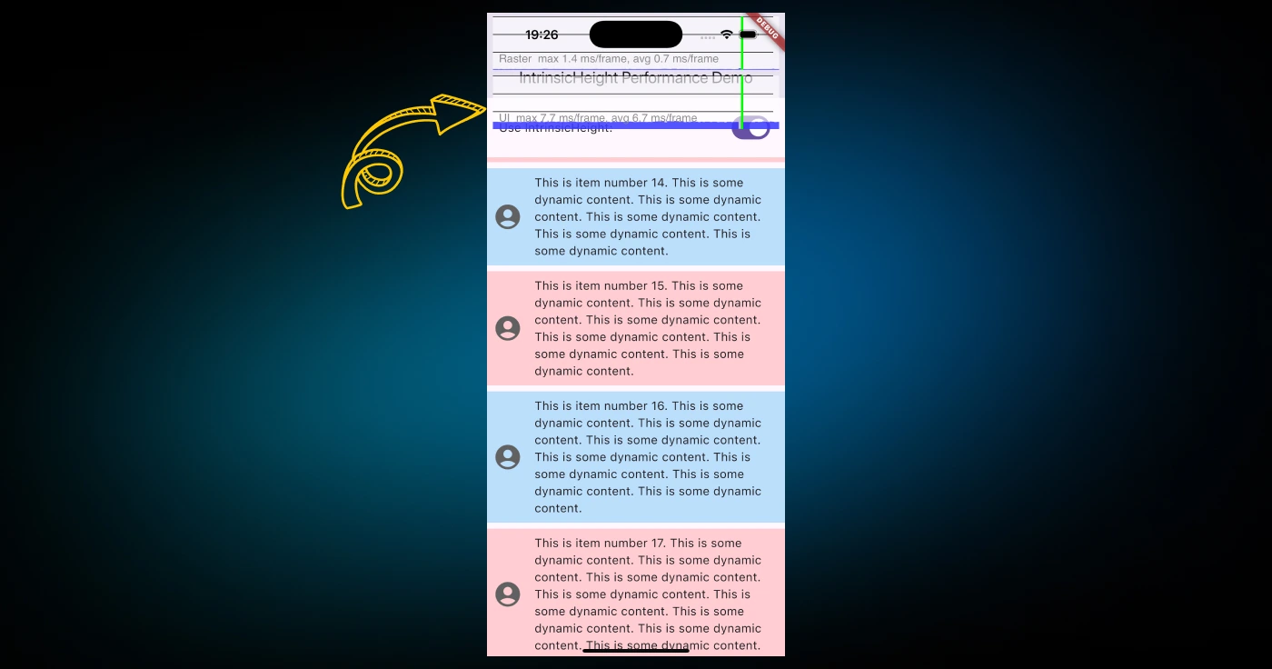
The IntrinsicHeight widget’s purpose lies in resolving situations where varying heights might create visual imbalance or inconsistencies in your user interface.
The IntrinsicHeight widget may seem like a niche widget, but its value becomes obvious when working with dynamic layouts where maintaining proportionality is essential. Let me give you an example: imagine a row of widgets that contain text, icons, or other content of varying lengths. Without intervention, each child's widget’s height would be determined independently, potentially leading to misalignment.
Consider the code below:
IntrinsicHeight(
  child: Row(
    crossAxisAlignment: CrossAxisAlignment.stretch,
    children: [
      Container(
        width: 100,
        color: Colors.blue,
        child: Text('Short text'),
      ),
      Container(
        width: 100,
        color: Colors.red,
        child: Text('This is a much longer piece of text'),
      ),
    ],
  ),
);
In this example, the IntrinsicHeight widget ensures that both containers in the row stretch to the same height, matching the tallest child. This effect is achieved by computing the intrinsic height of each child widget and aligning them accordingly. Without IntrinsicHeight, the heights would be determined independently, leading to a visually unbalanced layout.
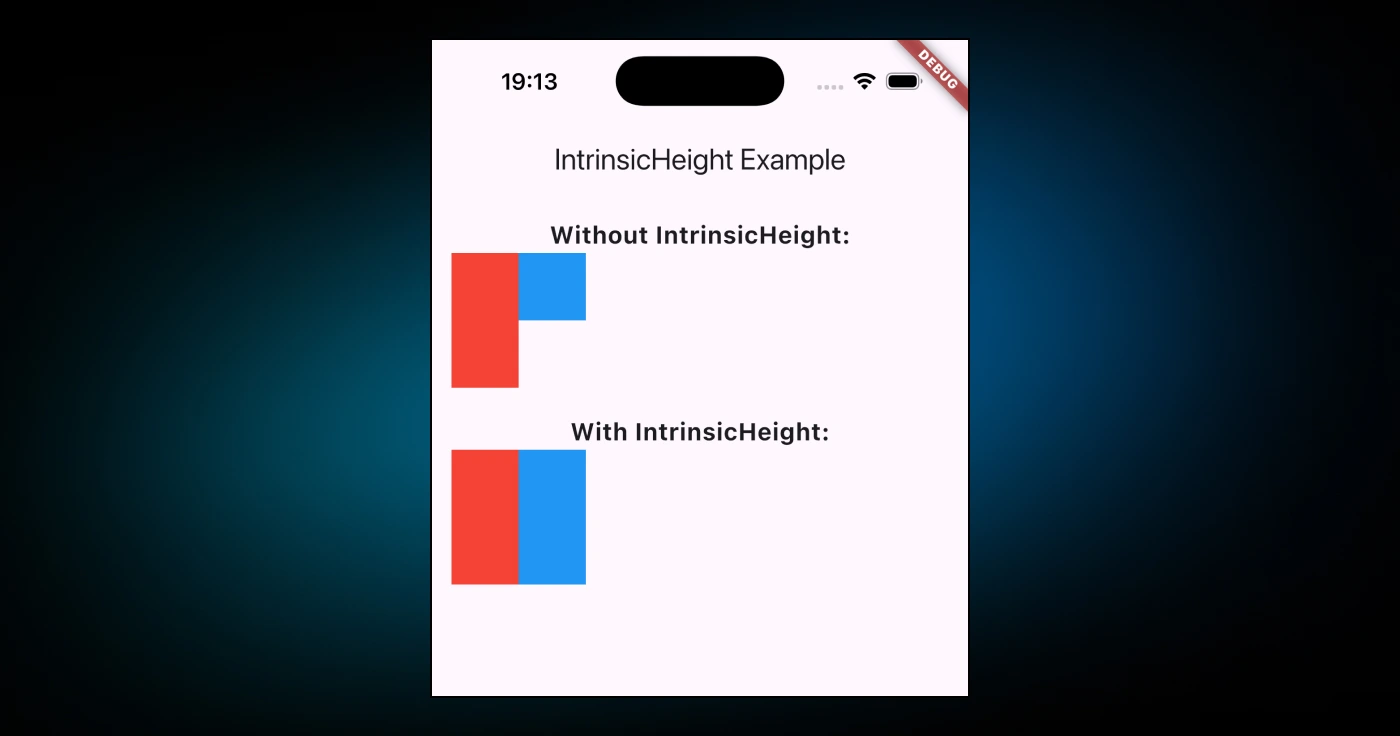
Let’s delve deeper into how IntrinsicHeight works under the hood.
It achieves its functionality by deferring the height calculation to its children. Each child widget reports its preferred intrinsic height and the tallest child dictates the height of the entire group.
The implementation involves the RenderIntrinsicHeight class, which measures and lays out the widget subtree.
class RenderIntrinsicHeight extends RenderBox {
void performLayout() {
double maxHeight = 0.0;
for (final RenderBox child in _children) {
child.layout(constraints, parentUsesSize: true);
maxHeight = math.max(
maxHeight, child.getMaxIntrinsicHeight(double.infinity),
);
}
size = constraints.constrain(Size(constraints.maxWidth, maxHeight));
for (final RenderBox child in _children) {
child.layout(BoxConstraints.tightFor(height: maxHeight));
}
}
}
This logic highlights two key steps:
- Each child widget is asked for its intrinsic height using the
getMaxIntrinsicHeightmethod. - The tallest height is applied uniformly to all children.
While the IntrinsicHeight widget is a handy widget, it’s important to avoid abusing it. Computing intrinsic dimensions can be expensive in terms of performance, especially when dealing with deeply nested or complex widget trees. Flutter’s rendering pipeline is optimized for constraints-based layouts, and relying on intrinsic dimensions can disrupt this optimization.
For example, wrapping an entire layout in IntrinsicHeight might lead to performance bottlenecks:
IntrinsicHeight(
  child: Column(
    children: List.generate(
      100,
      (index) => Container(
        height: index % 2 == 0 ? 50 : 100,
        color: index % 2 == 0 ? Colors.blue : Colors.red,
      ),
    ),
  ),
);
In this scenario, the IntrinsicHeight widget would need to calculate the intrinsic height of each container in the column, leading to a significant performance overhead. It’s best to restrict its usage to smaller, specific parts of the layout where the visual benefits outweigh the performance cost.
IntrinsicWidth Widget
The IntrinsicWidth widget in Flutter sizes its child to the child’s maximum intrinsic width. It is particularly useful in scenarios where unlimited width is available, and a child widget would otherwise expand infinitely. Instead of stretching, the child is constrained to its intrinsic width, creating a more suitable layout.
Additionally, wrapping a Column in an IntrinsicWidth ensures all its children are as wide as the widest child, enabling consistent alignment.
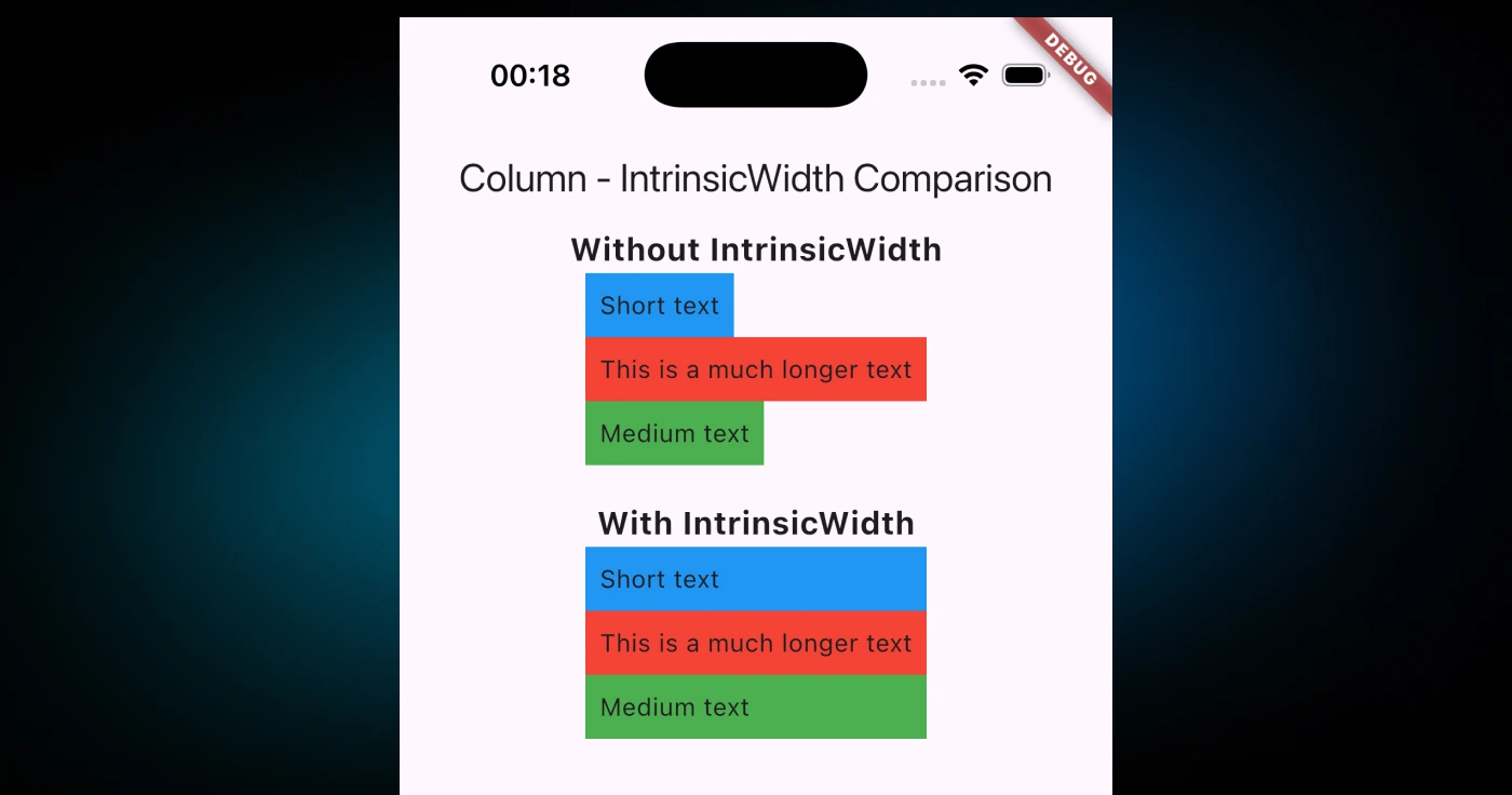
If I want to mention the key features and behavior of this widget, I can categorize them into two:
- The constraints passed by
IntrinsicWidthto its child adhere to the parent’s constraints. If the constraints are too small to satisfy the child’s maximum intrinsic width, the child will receive less width. Conversely, if the minimum width exceeds the child’s maximum intrinsic width, the child will be forced to expand. - Optional parameters like
stepWidthandstepHeightsnap the child's width and height to multiples of these values, enabling fine-tuned control over layout alignment.
IntrinsicWidth(
  child: Row(
    children: [
      Container(
        height: 50,
        color: Colors.blue,
        child: Text('Short'),
      ),
      Container(
        height: 50,
        color: Colors.red,
        child: Text('Much longer text'),
      ),
    ],
  ),
);
Here, the IntrinsicWidth widget ensures that the Row assigns widths to its children based on their intrinsic dimensions.
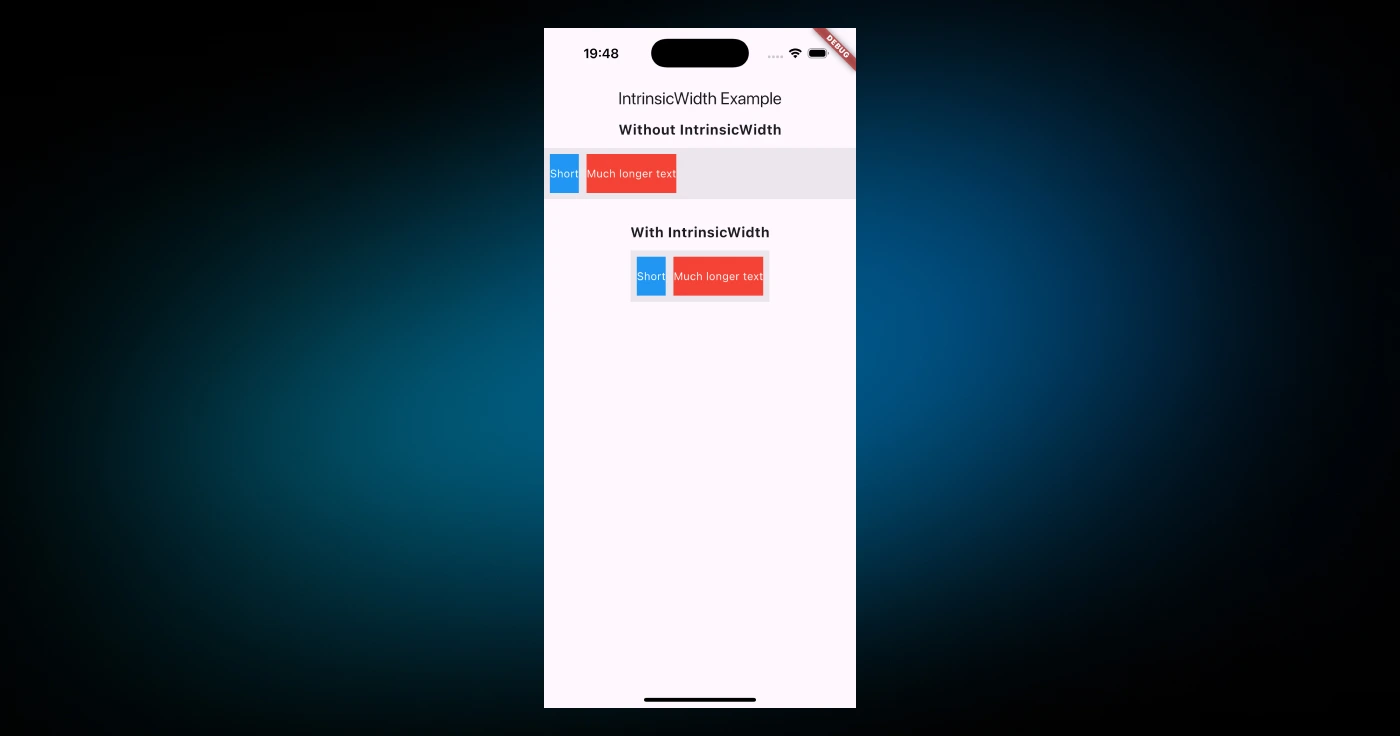
The IntrinsicWidth calculates the intrinsic dimensions of its child or children and applies the largest width as a uniform constraint.
This logic is implemented in the RenderIntrinsicWidth class. Below is a simplified version of its layout logic:
class RenderIntrinsicWidth extends RenderBox {
void performLayout() {
double maxIntrinsicWidth = 0.0;
for (final RenderBox child in _children) {
final double childIntrinsicWidth = child.getMaxIntrinsicWidth(double.infinity);
maxIntrinsicWidth = math.max(maxIntrinsicWidth, childIntrinsicWidth);
}
size = constraints.constrain(Size(maxIntrinsicWidth, constraints.maxHeight));
for (final RenderBox child in _children) {
child.layout(BoxConstraints.tightFor(width: maxIntrinsicWidth));
}
}
}
Using IntrinsicWidth comes with a performance cost because it requires a speculative layout pass before the final layout. This can make layouts computationally expensive, especially in deeply nested trees or scenarios with a large number of children.
For instance, wrapping a ListView in an IntrinsicWidth is not recommended:
IntrinsicWidth(
  child: ListView.builder(
    itemCount: 100,
    itemBuilder: (context, index) {
      return Container(
        height: 50,
        color: index % 2 == 0 ? Colors.blue : Colors.red,
        child: Text('Item $index'),
      );
    },
  ),
);
This would calculate intrinsic widths for every item in the list, introducing unnecessary overhead. Instead, use IntrinsicWidth only in specific parts of the UI where precise width alignment is critical.
KeyedSubtree Widget
The KeyedSubtree widget is particularly useful when you want to attach a key to an existing widget that doesn’t directly support keys or doesn’t expose its key as a constructor argument.
Here's how you might use it:
Widget build(BuildContext context) {
  final myWidget = Text('Hello, Flutter');

  return KeyedSubtree(
    key: ValueKey('uniqueKey'),
    child: myWidget,
  );
}
I can think of why this might be useful for three use cases:
- Flutter uses keys to determine which widgets in a list should be updated, reused or recreated when the widget tree is rebuilt. If two widgets in a list have the same type and properties, a key helps distinguish them.
- When dealing with dynamically created widgets (e.g., in lists or grids),
KeyedSubtreecan be a lifesaver for attaching unique keys to prevent rendering issues. - Instead of rewriting or extending a widget class to include a key, you can simply wrap it in
KeyedSubtree.
Flutter also provides the KeyedSubtree.ensureUniqueKeysForList method, which automatically assigns unique keys to items in a list:
final widgets = [
  Text('Item 1'),
  Text('Item 2'),
  Text('Item 3'),
];

// Ensuring unique keys for each widget in the list
final keyedWidgets = KeyedSubtree.ensureUniqueKeysForList(widgets);

return Column(
  children: keyedWidgets,
);
The KeyedSubtree class implementation is pretty straightforward. Let’s take a quick look:
class KeyedSubtree extends StatelessWidget {
const KeyedSubtree({super.key, required this.child});
KeyedSubtree.wrap(this.child, int childIndex)
: super(key: ValueKey<Object>(child.key ?? childIndex));
final Widget child;
static List<Widget> ensureUniqueKeysForList(List<Widget> items, {int baseIndex = 0}) {
if (items.isEmpty) {
return items;
}
final List<Widget> itemsWithUniqueKeys = <Widget>[
for (final (int i, Widget item) in items.indexed) KeyedSubtree.wrap(item, baseIndex + i),
];
assert(!debugItemsHaveDuplicateKeys(itemsWithUniqueKeys));
return itemsWithUniqueKeys;
}
Widget build(BuildContext context) => child;
}
When you explore the Flutter source code, you'll notice the KeyedSubtree class is used in various scenarios to maintain widget identity during transitions and animations. One notable example is its use in the Hero widget.
// ...
return SizedBox(
  width: _placeholderSize?.width,
  height: _placeholderSize?.height,
  child: Offstage(
    offstage: showPlaceholder,
    child: TickerMode(
      enabled: !showPlaceholder,
      child: KeyedSubtree(key: _key, child: widget.child),
    ),
  ),
);
// ...
During a hero transition, a placeholder widget temporarily replaces the child widget. The KeyedSubtree ensures that the child retains its identity and state when the transition completes, preventing Flutter from recreating or misidentifying the widget.
You see, this is an example that you might have in your Flutter application.
Enjoying this article?
Subscribe to get our latest articles and product updates by email.
AutomaticKeepAlive Widget
The AutomaticKeepAlive widget and its associated classes are critical for managing widgets in lazy lists like ListView and PageView that need to persist state when scrolled out of view.
The AutomaticKeepAlive widget listens to KeepAliveNotification messages from its descendants. If a descendant requests to stay alive by dispatching this notification, the AutomaticKeepAlive widget ensures that the corresponding subtree is marked for retention. This behavior is particularly useful in scenarios involving scrollable lists or grids where widgets are dynamically built and often destroyed for memory optimization.
The AutomaticKeepAlive class is a stateful widget that wraps its child and ensures the child’s KeepAlive state is updated appropriately. Look at the full implementation here.
The main logic resides in the private state class _AutomaticKeepAliveState, which implements the mechanism to listen for KeepAliveNotification messages and handle their lifecycle.
One key part of the implementation is how the widget updates the child dynamically:
void _updateChild() {
  _child = NotificationListener<KeepAliveNotification>(
    onNotification: _addClient,
    child: widget.child,
  );
}
Here, the NotificationListener listens for KeepAliveNotification messages sent by its subtree. Whenever such a notification is triggered, the _addClient method is called to register the Listenable handle associated with the notification.
The _addClient method is central to the AutomaticKeepAlive lifecycle:
bool _addClient(KeepAliveNotification notification) {
  final Listenable handle = notification.handle;
  _handles ??= <Listenable, VoidCallback>{};
  assert(!_handles!.containsKey(handle));
  _handles![handle] = _createCallback(handle);
  handle.addListener(_handles![handle]!);

  if (!_keepingAlive) {
    _keepingAlive = true;
    final ParentDataElement<KeepAliveParentDataMixin>? childElement = _getChildElement();
    if (childElement != null) {
      _updateParentDataOfChild(childElement);
    } else {
      SchedulerBinding.instance.addPostFrameCallback((Duration timeStamp) {
        if (!mounted) {
          return;
        }
        final ParentDataElement<KeepAliveParentDataMixin>? childElement = _getChildElement();
        assert(childElement != null);
        _updateParentDataOfChild(childElement!);
      });
    }
  }
  return false;
}
This method performs several critical tasks:
- A
Listenablehandle is associated with the notification and added to a map of active handles. - If the child widget is not yet fully built, it schedules a callback via
SchedulerBindingto ensure that the keep-alive parent data is updated post-frame. - The
_keepingAliveflag is set to true to indicate that the widget subtree should be kept.
The KeepAliveNotification class is a cornerstone of the AutomaticKeepAlive mechanism. Each notification is equipped with a Listenable handle that triggers events when the widget no longer requires being kept alive:
class KeepAliveNotification extends Notification {
  const KeepAliveNotification(this.handle);

  final Listenable handle;
}
The handle must be disposed of whenever the widget is removed from the tree to ensure that no stale notifications are emitted. This is why dispose methods in widgets using AutomaticKeepAliveClientMixin play a critical role.
Yet, perhaps the most important part of this class is the AutomaticKeepAliveClientMixin, which provides a convenient way to interact with the AutomaticKeepAlive system. By overriding the wantKeepAlive property and calling updateKeepAlive whenever its value changes, you can integrate seamlessly with the keep-alive mechanism:
mixin AutomaticKeepAliveClientMixin<T extends StatefulWidget> on State<T> {
  bool get wantKeepAlive;

  void updateKeepAlive() {
    if (wantKeepAlive) {
      _ensureKeepAlive();
    } else {
      _releaseKeepAlive();
    }
  }
}
In fact, here is where you can leverage DCM rules. DCM comes with several rules that can help to identity when listener or streams or instances that have dispose methods are not properly handled. For example, always-remove-listener, dispose-fields and dispose-class-fields are among many of the rules.
dart_code_metrics:
  rules:
    - dispose-fields:
        ignore-blocs: false
        ignore-get-x: false
    - dispose-class-fields:
        methods:
          - someCustomDispose
    - always-remove-listener
DCM is a code quality tool that helps your team move faster by reducing the time spent on code reviews, finding tricky bugs, identifying complex code, and unifying code style.
Here’s an example of using the mixin where you can leverage it in your Flutter application:
class StatefulItem extends StatefulWidget {
_StatefulItemState createState() => _StatefulItemState();
}
class _StatefulItemState extends State<StatefulItem>
with AutomaticKeepAliveClientMixin {
bool keepAlive = false;
bool get wantKeepAlive => keepAlive;
Widget build(BuildContext context) {
return CheckboxListTile(
value: keepAlive,
onChanged: (bool? value) {
setState(() {
keepAlive = value ?? false;
updateKeepAlive();
});
},
title: Text('Keep alive?'),
);
}
}
In this example, the state of the CheckboxListTile determines whether the widget should remain alive when scrolled out of view.
There are a few tips for using AutomaticKeepAlive effectively that I can think of:
-
Always trigger the
KeepAliveNotificationhandle when a widget is deactivated. If you fail to do so, it can result in memory leaks, as the widget subtree might continue to be retained unnecessarily. -
Using
AutomaticKeepAliveindiscriminately for all widgets in a large list can increase memory usage. Reserve it for widgets where preserving state is important, such as form fields, focused elements, or dynamic inputs. -
Use the
AutomaticKeepAliveClientMixinin conjunction withStatefulWidgetsubclasses which helps for convenience and reliability. It abstracts much of the manual notification handling and ensures proper integration with the keep-alive mechanism. -
Moreover,
debugFillPropertiesto verify which widgets are being kept alive. This method is invaluable when troubleshooting keep-alive issues or memory leaks. Here is an example:
class KeepAliveItem extends StatefulWidget {
final int index;
const KeepAliveItem({Key? key, required this.index}) : super(key: key);
State<KeepAliveItem> createState() => _KeepAliveItemState();
}
class _KeepAliveItemState extends State<KeepAliveItem>
with AutomaticKeepAliveClientMixin {
bool _isKeptAlive = false;
bool get wantKeepAlive => _isKeptAlive;
void toggleKeepAlive() {
setState(() {
_isKeptAlive = !_isKeptAlive;
});
}
void debugFillProperties(DiagnosticPropertiesBuilder properties) {
super.debugFillProperties(properties);
properties.add(IntProperty('index', widget.index));
properties.add(FlagProperty(
'isKeptAlive',
value: _isKeptAlive,
ifTrue: 'kept alive',
ifFalse: 'not kept alive',
showName: true,
));
}
Widget build(BuildContext context) {
super.build(context); // Required when using AutomaticKeepAliveClientMixin
return Card(
child: ListTile(
title: Text('Item ${widget.index}'),
subtitle: Text(_isKeptAlive ? 'Kept Alive' : 'Not Kept Alive'),
trailing: IconButton(
icon: Icon(
_isKeptAlive ? Icons.check_box : Icons.check_box_outline_blank,
),
onPressed: toggleKeepAlive,
),
),
);
}
}
- Last but not least, understanding lifecycle triggers, the mix of
disposeof,deactivate, andupdateKeepAlivemethods ensures that the widget interacts correctly with its lifecycle. Pay careful attention to these methods when implementing custom logic.
Let me end this widget with a more practical example, which I bet you have all used in your Flutter application.
import 'package:flutter/material.dart';
void main() => runApp(const PageViewExampleApp());
class PageViewExampleApp extends StatelessWidget {
const PageViewExampleApp({super.key});
Widget build(BuildContext context) {
return const MaterialApp(home: PageViewExample());
}
}
class PageViewExample extends StatefulWidget {
const PageViewExample({super.key});
State<PageViewExample> createState() => _PageViewExampleState();
}
class _PageViewExampleState extends State<PageViewExample> {
List<String> items = ['1', '2', '3', '4', '5'];
void _reverse() {
setState(() {
items = items.reversed.toList();
});
}
Widget build(BuildContext context) {
return Scaffold(
appBar: AppBar(title: const Text('PageView Example')),
body: PageView.custom(
childrenDelegate: SliverChildBuilderDelegate(
(BuildContext context, int index) {
return KeepAliveItem(
data: items[index],
key: ValueKey<String>(items[index]),
);
},
childCount: items.length,
findChildIndexCallback: (Key key) {
final String value = (key as ValueKey<String>).value;
return items.indexOf(value);
},
),
),
bottomNavigationBar: BottomAppBar(
child: TextButton(
onPressed: _reverse,
child: const Text('Reverse Items'),
),
),
);
}
}
class KeepAliveItem extends StatefulWidget {
const KeepAliveItem({super.key, required this.data});
final String data;
State<KeepAliveItem> createState() => _KeepAliveItemState();
}
class _KeepAliveItemState extends State<KeepAliveItem>
with AutomaticKeepAliveClientMixin {
bool get wantKeepAlive => true;
Widget build(BuildContext context) {
super.build(context);
return Center(
child: Text(
widget.data,
style: const TextStyle(fontSize: 24),
),
);
}
}
This example demonstrates keeping widgets alive in a PageView using AutomaticKeepAliveClientMixin.
AnimatedModalBarrier Widget
The AnimatedModalBarrier widget provides a visually engaging and functional way to block user interactions with widgets behind it. This widget acts as a modal barrier, typically used to obscure and prevent interaction with lower-priority widgets (e.g., underlying routes). It extends the functionality of the ModalBarrier by supporting animated color transitions, which enhance the user experience by providing smooth visual feedback during transitions between routes or modal overlays.
The AnimatedModalBarrier is primarily used in scenarios where you want to:
- Prevent user interaction with widgets behind it.
- Visually indicate the presence of a modal layer, such as a dialog or bottom sheet.
- Provide dynamic, animated transitions in the barrier’s appearance (e.g., changing colors during route transitions).
Let’s take a look at an example:
AnimatedModalBarrier(
  color: ColorTween(begin: Colors.transparent, end: Colors.black54)
      .animate(animationController),
  dismissible: true,
  onDismiss: () {
    Navigator.of(context).pop();
  },
);
The AnimatedModalBarrier smoothly transitions from transparent to a semi-opaque black color as the modal appears.
The AnimatedModalBarrier extends AnimatedWidget, leveraging its listenable property to react to color animation changes. Here’s the critical implementation snippet:
class AnimatedModalBarrier extends AnimatedWidget {
const AnimatedModalBarrier({
super.key,
required Animation<Color?> color,
this.dismissible = true,
this.semanticsLabel,
this.barrierSemanticsDismissible,
this.onDismiss,
this.clipDetailsNotifier,
this.semanticsOnTapHint,
}) : super(listenable: color);
Animation<Color?> get color => listenable as Animation<Color?>;
Widget build(BuildContext context) {
return ModalBarrier(
color: color.value,
dismissible: dismissible,
semanticsLabel: semanticsLabel,
barrierSemanticsDismissible: barrierSemanticsDismissible,
onDismiss: onDismiss,
clipDetailsNotifier: clipDetailsNotifier,
semanticsOnTapHint: semanticsOnTapHint,
);
}
}
The build method creates a ModalBarrier widget, dynamically updating its color property based on the current animation value. This dynamic behavior is what differentiates AnimatedModalBarrier from ModalBarrier.
If I want to go a little deeper, I need to also mention the key properties:
color: Accepts an animatedColor?value, which defines the barrier’s visual appearance. This is the core feature that allows seamless transitions during route changes or modal presentations.dismissible: Determines whether tapping the barrier dismisses the current route. Iftrue, tapping the barrier pops the route from theNavigatorstack or triggers the optionalonDismisscallback.onDismiss: A callback invoked when the barrier is dismissed. If this is null, the default behavior pops the current route.semanticsLabel: A label used for accessibility, providing context about the barrier’s function (e.g., "Tap to close dialog").clipDetailsNotifier: AValueNotifier<EdgeInsets>is used to adjust the barrier’sSemanticsNode.rect, defining the interactive area.
The AnimatedModalBarrier ensures accessibility compliance by integrating with Flutter’s Semantics system. It includes properties like semanticsLabel, barrierSemanticsDismissible, and semanticsOnTapHint to provide descriptive, accessible interactions for users with assistive technologies:
Semantics(
  onTap: handleDismiss,
  label: semanticsDismissible ? semanticsLabel : null,
  child: MouseRegion(
    cursor: SystemMouseCursors.basic,
    child: ColoredBox(color: color.value),
  ),
);
This integration ensures that visually impaired users understand the barrier’s purpose and how to interact with it.
The AnimatedModalBarrier includes a private gesture detector to handle taps on the barrier:
class _ModalBarrierGestureDetector extends StatelessWidget {
const _ModalBarrierGestureDetector({required this.child, required this.onDismiss});
final Widget child;
final VoidCallback onDismiss;
Widget build(BuildContext context) {
final gestures = <Type, GestureRecognizerFactory>{
_AnyTapGestureRecognizer: _AnyTapGestureRecognizerFactory(onAnyTapUp: onDismiss),
};
return RawGestureDetector(
gestures: gestures,
behavior: HitTestBehavior.opaque,
child: child,
);
}
}
This gesture detector listens for tap events and either trigger the onDismiss callback or plays an alert sound if the dismissible is false.
The clipDetailsNotifier property allows you to customize the interactive area of the barrier by clipping the semantics rect:
_SemanticsClipper(
  clipDetailsNotifier: clipDetailsNotifier!,
  child: barrier,
);
This widget is used in other widgets as well, and one of the most well-known ones is bottom_sheet.
// ...
Widget buildModalBarrier() {
if (barrierColor.a != 0 && !offstage) {
assert(barrierColor != barrierColor.withValues(alpha: 0.0));
final Animation<Color?> color = animation!.drive(
ColorTween(
begin: barrierColor.withValues(alpha: 0.0),
end: barrierColor,
).chain(
CurveTween(curve: barrierCurve),
),
);
return AnimatedModalBarrier(
color: color,
dismissible:
barrierDismissible,
semanticsLabel: barrierLabel,
barrierSemanticsDismissible: semanticsDismissible,
clipDetailsNotifier: _clipDetailsNotifier,
semanticsOnTapHint: barrierOnTapHint,
);
} else {
return ModalBarrier(
dismissible:
barrierDismissible,
semanticsLabel: barrierLabel,
barrierSemanticsDismissible: semanticsDismissible,
clipDetailsNotifier: _clipDetailsNotifier,
semanticsOnTapHint: barrierOnTapHint,
);
}
}
When you call showModalBottomSheet, the buildModalBarrier method ensures that an AnimatedModalBarrier is displayed as the overlay behind the modal content. The overlay fades in and out smoothly during the modal’s appearance and dismissal.
FittedBox Widget
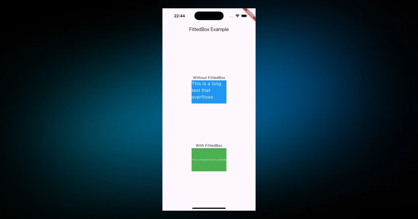
The FittedBox widget ensures that the child widget fits within the available space while maintaining the desired aspect ratio or scaling behavior.
The FittedBox widget addresses the problem of rendering content that may not naturally fit within the constraints of its parent widget. For example, when dealing with images, text, or custom widgets in a layout with limited space, you can use FittedBox to scale or align the content appropriately.
Here’s a basic example:
FittedBox(
  fit: BoxFit.contain,
  child: Text(
    'Hello, Flutter!',
    style: TextStyle(fontSize: 50),
  ),
);
The FittedBox widget provides several properties to control its behavior:
fit: Determines how the child should be resized to fit within the parent. It accepts values from theBoxFitenum:fill: Stretches the child to fill the parent, potentially distorting its aspect ratio.contain: Scales the child to fit within the parent while preserving its aspect ratio.cover: Scales the child to cover the parent completely while preserving its aspect ratio. Parts of the child may be clipped.fitWidth: Scales the child to match the parent’s width while maintaining the aspect ratio.fitHeight: Scales the child to match the parent’s height while maintaining the aspect ratio.none: Does not scale the child.scaleDown: Scales the child down to fit within the parent if it’s larger; otherwise, it does nothing.
alignment: Specifies how the child is aligned with the parent. It accepts values from theAlignmentclass, such as:Alignment.centerAlignment.topLeftAlignment.bottomRight
The FittedBox widget wraps its child in a Transform to apply scaling and alignment. During the layout phase, the scaling factors needed to make the child fit within the parent are calculated based on the provided fit and alignment properties.
Internally, FittedBox is implemented as follows:
class FittedBox extends SingleChildRenderObjectWidget {
const FittedBox({
super.key,
this.fit = BoxFit.contain,
this.alignment = Alignment.center,
super.child,
});
final BoxFit fit;
final AlignmentGeometry alignment;
RenderFittedBox createRenderObject(BuildContext context) {
return RenderFittedBox(
fit: fit,
alignment: alignment,
);
}
void updateRenderObject(
BuildContext context, RenderFittedBox renderObject) {
renderObject
..fit = fit
..alignment = alignment;
}
}
When you are using this widget, it’s good to keep in mind a few tips, let me elaborate:
- Choose the right
fitvalue based on how you want the content to scale, for example, usecontainfor keeping the proportions andcoverwhen the content needs to completely fill the space. - The
alignmentproperty helps you position the child if it doesn’t fully cover the parent container. - While
FittedBoxis useful, using it too much can make your layout more complex or even affect performance, so only use it when scaling is truly necessary. - For better control, pair
FittedBoxwith constrained widgets likeContainerorConstrainedBoxto clearly define the available space. - Last but not least, always test how
FittedBoxbehaves with different child widgets, like images, text, or custom widgets, to make sure it works as intended.
Alright, that’s it. Let’s now talk about another interesting widget for accessibility.
SemanticsDebugger Widget
The SemanticsDebugger widget helps to visualize and debug the semantics tree. The SemanticsDebugger overlays a visual representation of the semantics tree on top of your app’s UI. This overlay displays rectangles and labels that correspond to the semantic nodes of your widgets, allowing you to see which elements are accessible and what information they provide. It highlights key accessibility properties such as labels, actions, and roles.
Here’s a basic usage example:
SemanticsDebugger(
  child: MyApp(),
);
There are several key features with this widget; let me elaborate:
- Each semantic node is shown with a colored box around it, marking the area it covers on the screen.
- Inside these boxes, you’ll see text that explains the node’s labels, roles, and actions.
- The debugger also shows how touch events, like taps and swipes, connect to these nodes.
- Different colors are used to make it easy to spot which nodes overlap or are nested inside each other. This makes it much clearer to understand how everything works together.
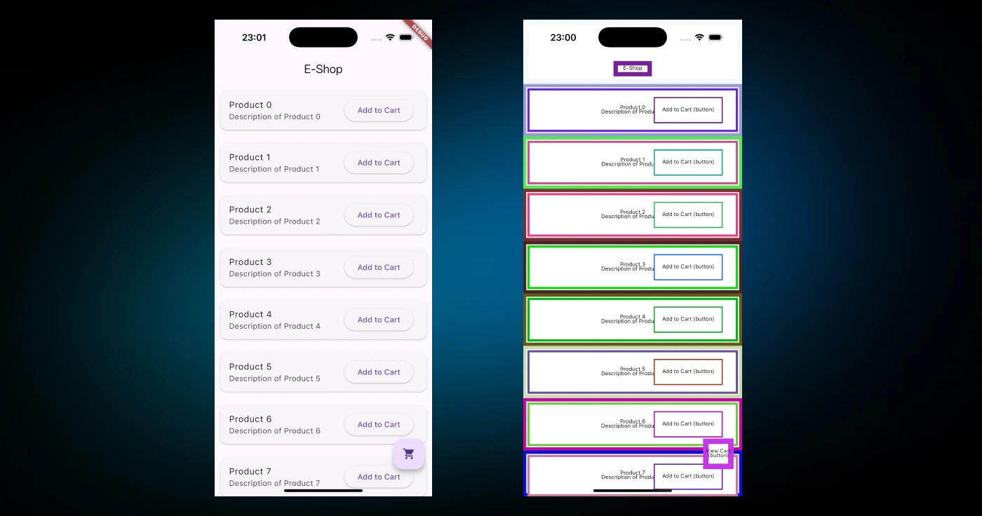
The SemanticsDebugger widget builds on Flutter’s RenderObject system, creating a layer that overlays the visual representation of the semantics tree. Internally, it uses a custom render object to draw the semantic information on top of the app’s UI.
Here's the core implementation:
class SemanticsDebugger extends StatelessWidget {
const SemanticsDebugger({super.key, required this.child});
final Widget child;
Widget build(BuildContext context) {
return _SemanticsDebugger(
child: child,
);
}
}
class _SemanticsDebugger extends SingleChildRenderObjectWidget {
const _SemanticsDebugger({required Widget child}) : super(child: child);
RenderObject createRenderObject(BuildContext context) {
return RenderSemanticsDebugger();
}
}
The actual debugging logic is implemented in the RenderSemanticsDebugger class, which traverses the semantics tree and renders the bounding boxes, labels, and other annotations.
There are several cases in which I think you can leverage this widget; let’s talk about them.
Use SemanticsDebugger to verify that all interactive elements (buttons, links, etc.) are accessible and have meaningful semantic labels:
SemanticsDebugger(
  child: Scaffold(
    appBar: AppBar(title: Text('Accessibility Debugging')),
    body: Column(
      children: [
        ElevatedButton(onPressed: () {}, child: Text('Tap me')),
        Text('Static text content'),
      ],
    ),
  ),
);
This setup ensures that the ElevatedButton and Text widgets have appropriate semantic information.

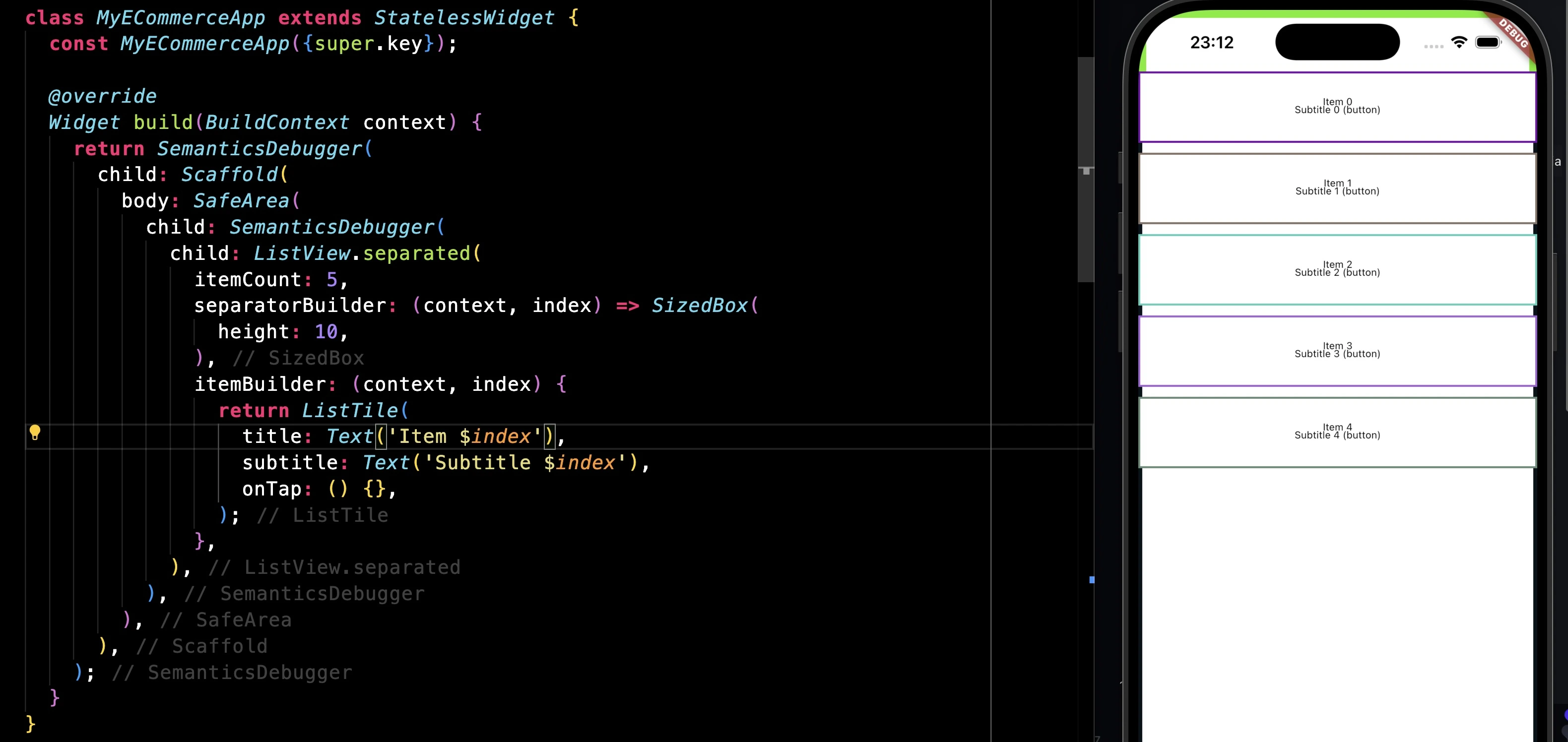
In complex layouts, it’s easy to overlook accessibility for certain elements. SemanticsDebugger helps identify unintentional gaps in the semantics tree, such as missing labels or incorrectly defined roles.
SemanticsDebugger(
  child: ListView.builder(
    itemCount: 10,
    itemBuilder: (context, index) {
      return ListTile(
        title: Text('Item $index'),
        subtitle: Text('Subtitle $index'),
        onTap: () {},
      );
    },
  ),
);
In this example, the debugger shows whether each ListTile is correctly represented in the semantics tree and whether its tap action is registered.
For fine-grained control over semantics, you can use the Semantics widget directly. This is particularly useful for custom widgets or scenarios where default semantics are insufficient:
Semantics(
  label: 'Custom button',
  onTap: () => print('Custom button tapped'),
  child: Container(
    color: Colors.blue,
    width: 100,
    height: 50,
    child: Center(child: Text('Press')),
  ),
);
In this case, using SemanticsDebugger can verify that the custom label and tap action are properly registered.
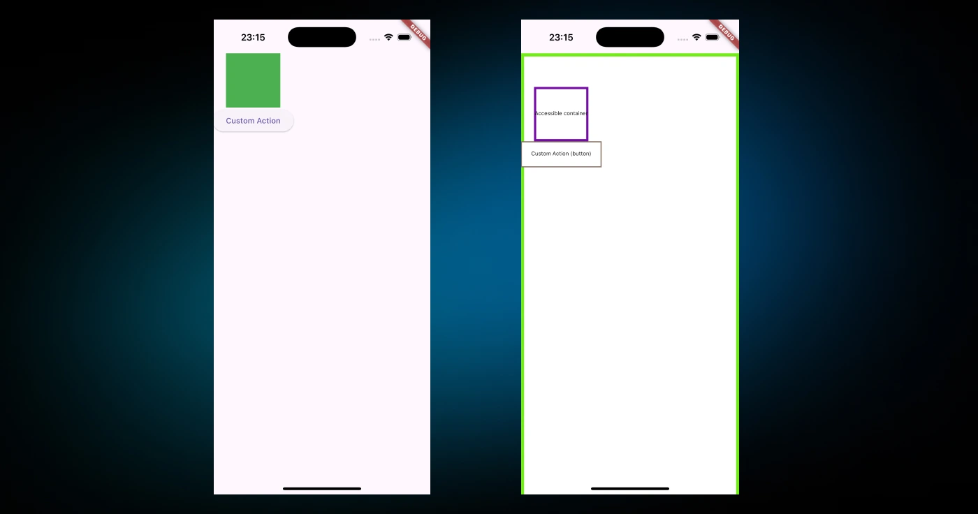
SemanticsDebugger(
  child: Column(
    children: [
      Semantics(
        label: 'Accessible container',
        child: Container(
          color: Colors.green,
          width: 100,
          height: 100,
        ),
      ),
      Semantics(
        label: 'Button with custom action',
        onTap: () => print('Button tapped'),
        child: ElevatedButton(
          onPressed: () {},
          child: Text('Custom Action'),
        ),
      ),
    ],
  ),
);
Let me also mention a few tips that I can think of about this widget:
- The
SemanticsDebuggeris a great tool to make sure all tappable widgets, like buttons and list items, are properly included in the semantics tree and have clear, meaningful labels. It helps you spot issues like overlapping or redundant nodes that might confuse assistive technologies. - For the best results, combine the
SemanticsDebuggerwith accessibility tools like Android TalkBack or iOS VoiceOver to test your app thoroughly. - If you’re using custom widgets, make sure you define semantic properties like
label,onTap, androle, and double-check that they work as expected.
Spacing for Column and Row Widget
The Column and Row widgets are probably among the most used widgets in Flutter. One of the things that you may have done using these widgets to make some spacing between elements was using widgets such as SizedBox or Spacer. I bet many of you can relate to what I mean.
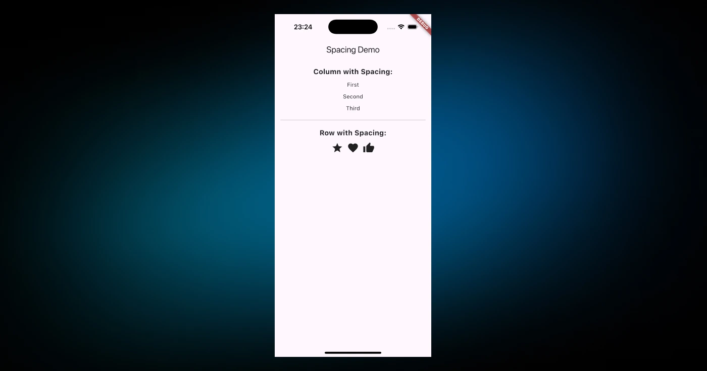
A recent addition to both widgets is the spacing property, which simplifies the process of adding consistent space between child widgets without requiring explicit SizedBox or Spacer widgets.
Here’s how you can use the spacing property in a Column:
Column(
  spacing: 10.0,
  children: [
    Text('First'),
    Text('Second'),
    Text('Third'),
  ],
)
The same logic applies to a Row:
Row(
  spacing: 15.0,
  children: [
    Icon(Icons.star),
    Icon(Icons.favorite),
    Icon(Icons.thumb_up),
  ],
)
The spacing property is implemented directly within the Column and Row widgets.
When the children list is processed, the spacing is applied by injecting additional gaps between each child widget. This behavior can be observed in the rendering logic:
Widget build(BuildContext context) {
final List<Widget> spacedChildren = [];
for (int i = 0; i < children.length; i++) {
if (i > 0) {
spacedChildren.add(SizedBox(
width: isHorizontal ? spacing : 0,
height: isHorizontal ? 0 : spacing,
));
}
spacedChildren.add(children[i]);
}
return Flex(
direction: isHorizontal ? Axis.horizontal : Axis.vertical,
mainAxisAlignment: mainAxisAlignment,
mainAxisSize: mainAxisSize,
crossAxisAlignment: crossAxisAlignment,
textDirection: textDirection,
verticalDirection: verticalDirection,
textBaseline: textBaseline,
children: spacedChildren,
);
}
Here, the children list is iterated, and SizedBox widgets are conditionally added between adjacent children based on the spacing value.
The spacing property works seamlessly with other alignment and layout properties like mainAxisAlignment, crossAxisAlignment, and mainAxisSize. For example:
Column(
  spacing: 8.0,
  mainAxisAlignment: MainAxisAlignment.center,
  crossAxisAlignment: CrossAxisAlignment.start,
  children: [
    Text('Aligned Text 1'),
    Text('Aligned Text 2'),
    Text('Aligned Text 3'),
  ],
)
Before we end, just to ensure you are using spacing in right place, DCM 1.26.0 has introduced a new rule prefer-spacing which suggests using the spacing argument of a Row, Column or Flex instead of using SizedBox widgets for adding gaps between children widgets.
dart_code_metrics:
  rules:
    - prefer-spacing
Alright, that was 10 Flutter widgets. Now, let’s just wrap up this article.
Conclusion
In this article, we’ve explored several lesser-known yet effective Flutter widgets, such as AnimatedModalBarrier, FittedBox, SemanticsDebugger, and more. These widgets not only enhance your app's functionality but also simplify your development process. It’s also nice to see what’s under the hood of these widgets and learn from them to apply to our Flutter applications.
This is just the beginning. Flutter and Dart are packed with hidden gems waiting to be uncovered. Stay tuned for the next article, which I will reveal in the next 10 unknown or less-used functionalities in Dart and Flutter. Remember to subscribe to our newsletter, YouTube, or social media to get the latest updates.
Enjoying this article?
Subscribe to get our latest articles and product updates by email.
