Practical Accessibility in Flutter (and Code You’ll Actually Use)
I still remember the day a colleague turned on VoiceOver to try our Flutter app, then we found large parts of the UI were silent or confusing. No crashes or errors, just buttons with no labels, images announced only as "image," and custom widgets invisible to accessibility tools.
It's easy to forget about these during development, and they can silently exclude a group of our users and before you realize it, you might get a user complaint or a poor accessibility audit. Accessibility is crucial for inclusive apps, and thankfully Flutter’s latest updates are making it easier and faster to do the right thing.
In this post, I’ll share what I learned about building accessible Flutter apps with real examples, best practices, and leveraging Flutter 3.32’s new features to fix common pitfalls. We’ll explore mistakes like missing alt text on images or ignoring large font settings and how to fix them.
Why Accessibility Matters in Flutter
Making apps accessible isn’t just about reaching more users, it’s about ensuring everyone, regardless of ability, can use your app effectively.
According to WHO report in 2023, over 16% of the world’s population or in other words, 1 in 6 of us, lives with some form of disability, and even more benefit from accessible design in situational contexts, for example, consider a parent using your app one-handed, or someone in bright sunlight needing high contrast, I am sure you might have similar experiences.
A key insight is that accessibility improvements often improve overall user experience. For example, adding keyboard shortcuts and logical focus order doesn’t only help users with motor impairments, it also benefits power users on desktops. Supporting dynamic text sizing not only helps visually impaired users; it also aids anyone who prefers larger text, for example, based on appt.org studies, around 25% of phone users increase their font size!
In short, accessibility is just good UX.
And let’s not forget, inclusive design can be a competitive advantage and may even be required by law in some domains.
Before I start, I need to mention that a lot of great content are available on Flutter Accessibility documentation website, let's keep it as one of our main references.
New Accessibility Features in Flutter 3.32
First let me start with one of the latest major updates to accessibility that Flutter team has released recently in May 2025.
Flutter’s accessibility features keeps improving, and the Flutter 3.32 release brought several exciting enhancements, including:
-
Optimized Semantics Tree Compilation: Flutter 3.32 overhauled how the semantics tree is compiled, making it around 80% faster to build. In practice, when you enable accessibility (TalkBack, VoiceOver, etc.), your app’s frame rendering overhead is much lower. Flutter Web apps saw about a 30% reduction in frame time when semantics are enabled, which means smoother performance even with screen readers turned on.
-
Semantic Roles API: You can now assign fine-grained semantic roles to widgets using the new
SemanticsRoleAPI. By simply wrapping a widget subtree with aSemanticswidget and giving it a role, you provide extra context to screen readers.For example, a custom drawn score can be labeled with a text or status role, so the screen reader knows how to describe it.
// ✅ Assigning a semantic role
Semantics(
  label: 'Player score',
  value: '1200',
  role: SemanticsRole.status,
  child: CustomPaint(
    painter: ScorePainter(score: 1200),
  ),
)
Here is a full list of enum available for
SemanticRoleas of writing this article in Flutter 3.32:enum SemanticsRole {
none,
tab,
tabBar,
tabPanel,
dialog,
alertDialog,
table,
cell,
row,
columnHeader,
searchBox,
dragHandle,
spinButton,
comboBox,
menuBar,
menu,
menuItem,
menuItemCheckbox,
menuItemRadio,
list,
listItem,
form,
tooltip,
loadingSpinner,
progressBar,
hotKey,
radioGroup,
status,
alert,
}Note that currently, this is available on web (mapping to ARIA roles) with other platforms to follow.
-
Better Screen Reader Feedback: Flutter 3.32 includes a few fixes to make common widgets more descriptive to screen readers. Text fields, focus handling, menus, sliders, and dropdowns all got improvements so that screen readers provide more context when users interact with these elements. For instance, a
Slidernow announces its value more clearly, and a focused menu item might be read with its state. These changes might seem small, but they add up to a much more usable experience for users relying on TalkBack or VoiceOver. -
Smoother Focus Navigation on Web: If you’re building for web or desktop, you’ll appreciate the refined focus behavior. When semantics are enabled, Flutter web now avoids those abrupt jumps or weird focus traps that sometimes occurred when tabbing through widgets. Focus traversal is more intuitive and follows the visual order of widgets more reliably which is an important improvement for keyboard-only users.
-
Link Accessibility and TalkBack: Another fix, Android TalkBack now properly recognizes and announces links. If you use
Semantics(link: true, label: "…")or theLinkwidget (fromurl_launcher) with a URL, TalkBack will identify it as a link and may include hints like "double tap to activate". No more awkward workarounds for accessible hyperlinks. -
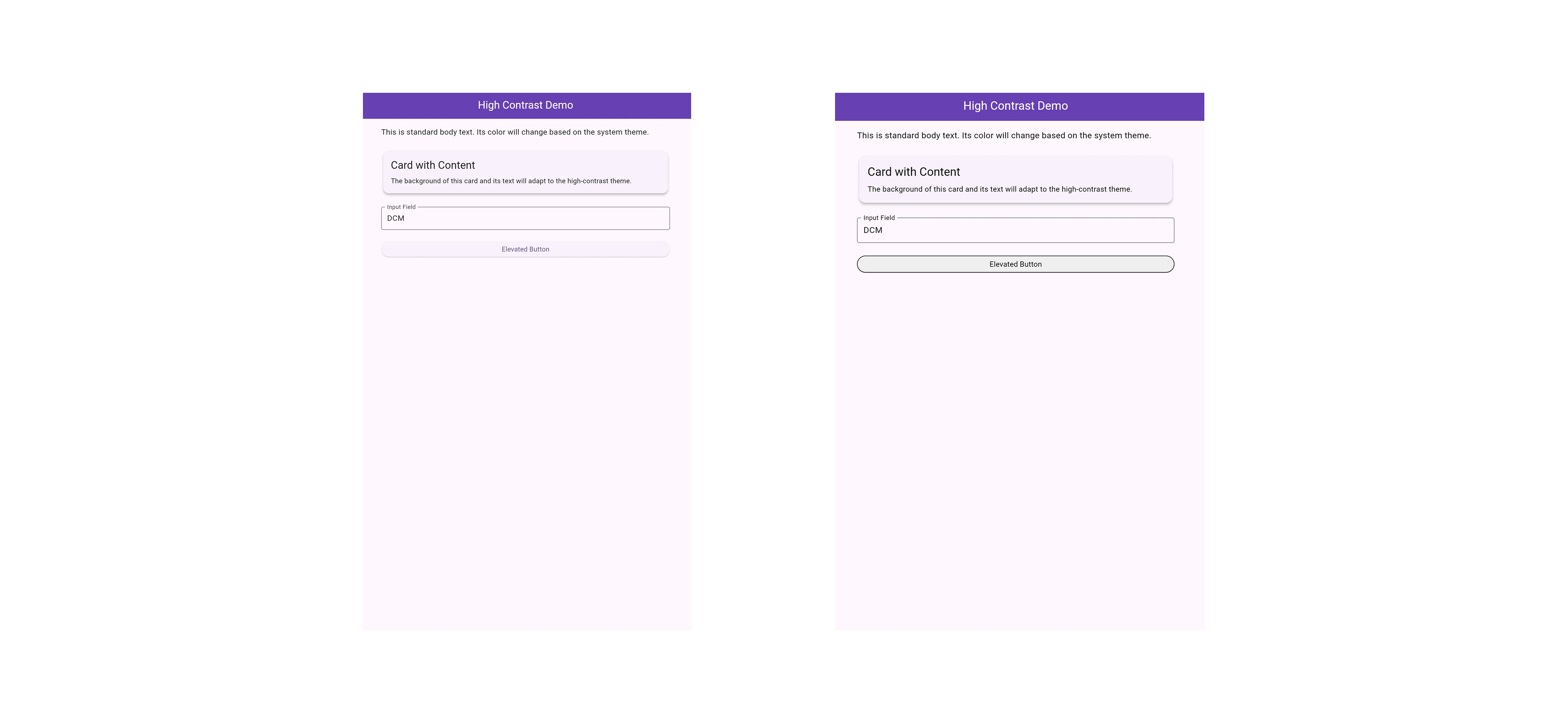
High Contrast Support: Flutter now supports Windows high-contrast mode (forced colors) on web. By setting
ThemeData.useSystemColors = true, your Flutter web app will automatically apply the user’s high-contrast color scheme. This is huge for low-vision users who rely on high-contrast themes. Instead of your app appearing washed out or unusable in those modes,ThemeData(
useMaterial3: true,
colorScheme: ColorScheme.fromSeed(seedColor: Colors.deepPurple),
useSystemColors: true, // Enable system color overrides
// ... other theme properties
)This is currently for Flutter Web; on Windows desktop Flutter, native high-contrast is handled by the OS, but keep an eye on future updates.
- Voice Control Improvements on iOS: For users who navigate iPhones by voice (Voice Control), Flutter 3.32 made it so that non-actionable widgets won’t get random "clickable" labels. This means a cleaner experience, only interactive elements are labeled with the numbered tags for voice commands. Prior to this, even static text might get a label which was confusing.
While the Flutter framework is providing lots of great improvements and features, framework improvements alone aren’t enough, we developers still need to apply best practices.
That's where I want to start looking into those with practical examples and tips (and yes, some embarrassing mistakes to avoid).
Accessibility Best Practices in Flutter
Let's start by looking at common pitfalls and how to fix them. As you go through them, remember that accessibility isn’t an all-or-nothing switch, it’s about doing a lot of little things right.
1. Provide Descriptive Labels for Interactive Elements
Every interactive UI element should have an accessible label or description. This is how screen readers convey meaning. In Flutter, many widgets have built-in ways to set labels:
-
Buttons and Icons: Use the widget’s properties to add text. For example,
ElevatedButtonandTextButtonuse their childTextas the label automatically. For icon-only buttons like anIconButtonorFloatingActionButton, always provide atooltip. The tooltip doubles as the semantic label, VoiceOver/TalkBack will read it out and on long-press, it appears visually as well. -
Images: Use the
semanticLabelproperty onImagewidgets (orDecorationImageetc.). This is effectively the alt text for the image. If the image conveys important info, describe it. If it’s purely decorative, you can setsemanticLabel: ""(empty string) to mark it as decorative so screen readers skip it. -
Custom widgets or containers with
GestureDetector: If you make something tappable that isn’t inherently accessible like aContaineror custom drawing, wrap it in aSemanticswidget or useSemantics(label: ..., onTap: ...)to give it a role and name.
A common mistake here is, forgetting to label an image or icon. Let’s look at an example:
Image.asset('assets/profile.png'), // ❌ No description provided
In this example, a visually impaired user would have no idea what this image is, it could be a profile photo? A logo? Just decorative?.
Image.asset(
  'assets/profile.png',
  semanticLabel: 'User profile picture', // ✅ Image with semantic label
),
Now a screen reader will say "User profile picture" when it encounters that image. It took one extra line, but it makes a world of difference.
In fact, DCM can remind you about this. DCM’s avoid-missing-image-alt rule will warn if an Image has no semanticLabel. This helps catch unlabeled images during development, so you don’t ship them.
DCM is a code quality tool that helps your team move faster by reducing the time spent on code reviews, finding tricky bugs, identifying complex code, and unifying code style.
The same goes for icon buttons; if you use an IconButton without text, do this:
IconButton(
  icon: Icon(Icons.delete),
  onPressed: () => deleteItem(),
  tooltip: 'Delete item',  // ✅ Gives the button an accessible label
),
With the tooltip, TalkBack will announce "Delete item, button." If you forget the tooltip, TalkBack might only say "Button, double tap to activate," which isn’t helpful.
Let me also introduce you to another rule, DCM’s prefer-action-button-tooltip which warns when tooltips on FloatingActionButtons lack text.
class MyWidget extends StatelessWidget {
const MyWidget({super.key});
Widget build(BuildContext context) => Scaffold(
floatingActionButton: FloatingActionButton(
tooltip: 'some tooltip', // ✅ Tooltip is provided
onPressed: () {},
),
);
}
For custom tappable widgets, wrap them in Semantics:
GestureDetector(
  onTap: _toggleFavorite,
  child: Semantics(
    label: isFavorite ? 'Remove from favorites' : 'Add to favorites',
    // Mark as a tab button if you want to keep as Tab
    role: SemanticsRole.tab,
    // Or use this for general button
    button: true,
    child: Icon(
      isFavorite ? Icons.star : Icons.star_border,
      color: Colors.yellow,
    ),
  ),
)
Here we’ve made a star icon which toggles a favorite state, accessible by providing a label that updates based on state, and we assign a button role. Now a screen reader will treat the whole thing as a button and read the appropriate label. Without the Semantics widget, the screen reader might just say "Star icon" with no indication that it’s interactive or what it does.
One tip, try to keep labels concise and specific. Screen reader users often navigate quickly, so "Button to add this item to your list of favorites" is too verbose. "Add to favorites" is clearer. Also, avoid including words like "button" in the label, use the role or let the widget imply it. The screen reader will typically append "button" anyway for a button role.
2. Support Dynamic Text Scaling (Don’t Hardcode Font Sizes)
Many users rely on enlarged text for readability as noted earlier, about a quarter of users may bump up font sizes. Flutter automatically respects the OS’s text scale factor which is accessible via MediaQuery.textScalerOf. But your app’s layout and widgets need to cooperate.
import 'package:flutter/material.dart';
class ResponsiveCard extends StatelessWidget {
const ResponsiveCard({
super.key,
required this.title,
required this.icon,
});
final String title;
final IconData icon;
Widget build(BuildContext context) {
// returns a TextScaler, **not** a double.
final textScaler = MediaQuery.textScalerOf(context);
return Card(
child: Padding(
// Use `scale()` for any size that should grow/shrink with text.
padding: EdgeInsets.all(textScaler.scale(12.0)),
child: Column(
children: [
Text(title, style: Theme.of(context).textTheme.headlineSmall),
SizedBox(height: textScaler.scale(8.0)),
// Scale the icon to keep visual balance with the text. 40 is font size
Icon(icon, size: textScaler.scale(40.0)),
],
),
),
);
}
}
For this situation I have spotted a few common pitfalls:
- Using fixed widget sizes that don’t accommodate larger text, causing text to get clipped or overflow.
- Setting
TextStylewith an absolute font size andoverflow: TextOverflow.clipwithout considering scaling. - Using
RichTextdirectly instead ofText: Flutter’sRichTextwidget does not scale text automatically with the system settings, whereas theTextwidget does. If you want to display rich formatted text which has multiple styles in one string, prefer usingText.rich(...)which ensures scaling works, rather than building aRichTextfrom scratch.
For example:
// ❌ Prefer Text.rich instead of RichText for better text scaling.
RichText(
  text: TextSpan(
    text: 'Hello ',
    children: [
      TextSpan(text: 'world', style: TextStyle(fontWeight: FontWeight.bold)),
      TextSpan(text: '!'),
    ],
    style: TextStyle(fontSize: 16),
  ),
);
This renders fine, but if the user has a larger text setting, RichText might not scale it correctly because it doesn’t automatically apply the device’s textScaleFactor. The developer would have to manually multiply the font sizes or provide textScaleFactor to the TextSpan, which is easy to overlook.
// ✅ Using `Text.rich`
Text.rich(
  TextSpan(
    text: 'Hello ',
    children: [
      TextSpan(text: 'world', style: TextStyle(fontWeight: FontWeight.bold)),
      TextSpan(text: '!'),
    ],
    style: TextStyle(fontSize: 16),
  ),
);
Text.rich is just a convenience constructor for Text that internally uses a RichText but will automatically scale with accessibility settings. The UI looks the same, but now if the user’s font size is huge, our "Hello world!" will respect it.
This is exactly what the DCM prefer-text-rich rule enforces. It warns when you use RichText instead of Text.rich.
DCM is a code quality tool that helps your team move faster by reducing the time spent on code reviews, finding tricky bugs, identifying complex code, and unifying code style.
Beyond that, design with flexibility; use layout widgets that can grow, like Flexible/Expanded in rows, or wrap text in a Flexible to avoid overflow.
// ✅ Using Flexible allows the text to wrap.
Card(
  color: Colors.green.shade100,
  child: Padding(
    padding: const EdgeInsets.all(8.0),
    child: Row(
      children: [
        Icon(Icons.check_circle, color: Colors.green.shade900),
        const SizedBox(width: 16),
        // The Flexible widget tells the Text to wrap if needed.
        Flexible(
          child: Text(
            'OK: Your account settings are up to date. No action needed.',
            style: TextStyle(color: Colors.green.shade900, fontSize: 16),
          ),
        ),
      ],
    ),
  ),
)
Test your app with the font size cranked up to 200%. Are all texts still readable? Do buttons or cards expand to fit, or does text get cut off?
Before I wrap up this section, let me remind you for two quick checks:
- Content Clarity: Is all content still understandable at max font size? Sometimes labels might wrap or truncate, it's our responsibility to ensure critical info isn’t lost.
- No clipped text: Look for "..." where text overflows. If you see it, address it, maybe allow wrapping, or adjust your layout.
Also be cautious with FittedBox or Transform scales on text; those might override the natural scaling. Generally, lean on Flutter’s responsive layout, for instance, use LayoutBuilder to adjust UI for different font scales if needed.
3. Ensure Sufficient Color Contrast (and Don’t Convey Info by Color Alone)
Visual design plays a big role in accessibility, let me break them down into several bullet points:
- Contrast:
Make sure text stands out against the background. WCAG guidelines recommend at least a 4.5:1 contrast ratio for normal text. In practice, light gray text on a white background, or say red text on a blue background, can be hard to read. If your design uses subtle colors (I mean muted, delicate shades that are not immediately noticeable or intense), consider bumping up the contrast or providing a "high contrast" toggle.
Flutter’s theming can help here. You might have a high-contrast theme ready, or as mentioned Flutter web can auto-apply system colors for high contrast mode now. Test your app with a contrast checker or even enable grayscale to see if everything remains recognizable.
- Don’t rely on color alone:
If something is "red means error, green means success," a color-blind user might not tell the difference. Use icons or text labels as additional elements. For example, alongside a red error underline, also show an error message or an ❗ icon.
Flutter’s Material components often handle this well, for instance, TextFormField shows error text, but if you’re doing custom stuff, be mindful. You can simulate color blindness in your device settings to see if your UI still makes sense. Just a reminder how you can do that:
- On iOS: Settings → Accessibility → Display & Text Size → Color Filters;
- On Android: Developer options → Simulate color space
Consider a bad practice: using a Container with a background color to indicate selection state, without any label. A color-blind user might not know it’s selected. Better: add an icon like a checkmark or bold the text in addition to the color change. And ensure the contrast of that indicator is strong.
Let's see it in code. Imagine a list of selectable items.
// ❌ A color-blind user might not see the difference between selected and not selected.
class SelectableItem extends StatelessWidget {
const SelectableItem({
required this.title,
required this.isSelected,
required this.onTap,
});
final String title;
final bool isSelected;
final VoidCallback onTap;
Widget build(BuildContext context) {
return GestureDetector(
onTap: onTap,
child: Container(
padding: const EdgeInsets.all(16),
color: isSelected ? Colors.blue.withOpacity(0.2) : Colors.transparent,
child: Text(title),
),
);
}
}
By doing a small change as follow you can make it more inclusive:
// ✅ The checkmark icon and bold text provide clear indicators beyond color.
class AccessibleSelectableItem extends StatelessWidget {
const AccessibleSelectableItem({
required this.title,
required this.isSelected,
required this.onTap,
});
final String title;
final bool isSelected;
final VoidCallback onTap;
Widget build(BuildContext context) {
return InkWell(
onTap: onTap,
child: Container(
padding: const EdgeInsets.all(16),
color: isSelected ? Colors.blue.withOpacity(0.2) : Colors.transparent,
child: Row(
children: [
Expanded(
child: Text(
title,
style: TextStyle(
fontWeight: isSelected ? FontWeight.bold : FontWeight.normal,
),
),
),
if (isSelected)
Icon(Icons.check_circle, color: Theme.of(context).primaryColor),
],
),
),
);
}
}
Also, test in dark mode and light mode, sometimes an accessible color in light theme becomes inaccessible in dark theme, if I want to give an example, using pure blue (#0000FF) on black is low contrast.
Flutter provides the Semantics widget with a label and also a flag for "selected" state or value. For example, if you have a custom toggle, you can set Semantics(label: 'Notifications', value: 'On'). But often simply using the built-in Switch or Checkbox widget will handle announcing "Checked"/"Unchecked" for you, as well as provide the visual distinction beyond color like the checkmark in a checkbox.
4. Touch Target Size
This is a common accessibility failure. Interactive elements should have a minimum touch target size to be usable for people with motor impairments. The WCAG recommends a minimum of 44x44 CSS pixels. While Flutter uses logical pixels (dp) instead of physical pixels, the principle of a minimum touch target size is crucial for usability. The Material Design guidelines recommend a minimum target size of 48x48 logical pixels.
Consider this example:
// ❌ A small icon that's hard to tap
IconButton(
  icon: Icon(Icons.info_outline),
  onPressed: () {},
)
However, IconButton has a constraints property and that wrapping smaller widgets in a Container with padding can increase the tappable area without changing the visual size.
IconButton(
  icon: Icon(Icons.info_outline),
  onPressed: () {},
  padding: EdgeInsets.all(12.0),
  // ✅ Enforcing a minimum size
  constraints: BoxConstraints(minWidth: 48.0, minHeight: 48.0),
)
This principle is even more important for custom interactive elements. If you have a small Icon or Text wrapped in a GestureDetector, the tappable area is only as big as the widget itself.
// ❌ Small, hard-to-tap custom button
GestureDetector(
  onTap: () { /* handle tap */ },
  child: Icon(Icons.info_outline, size: 24.0), // Tappable area is only 24x24
)
By wrapping the Icon in a Container with padding, you increase the hit area of the GestureDetector without changing the visual size of the icon.
GestureDetector(
  onTap: () { /* handle tap */ },
  child: Semantics(
    label: 'More information',
    button: true,
    child: Container(
      // The padding creates a 48x48 tappable area around the 24x24 icon
      padding: const EdgeInsets.all(12.0),
      child: Icon(Icons.info_outline, size: 24.0),
    ),
  ),
)
This might sound a small change but will have a bigger impact for a large group of people.
5. Manage Focus and Navigation Order
For users who navigate via keyboard (on web/desktop) or using switch devices, focus order is key.
Flutter’s default focus traversal follows the widget tree order, which usually corresponds to the UI top-to-bottom, left-to-right. If you stick to standard layouts, you’re often fine. But there are cases where you need to manage it:
- Custom Focus Widgets:
If you implement a custom control that isn’t inherently focusable, use Focus or FocusNode. For instance, a game made in Flutter might have a custom game canvas, you’d want to make sure keyboard events can reach it. The Focus widget can wrap something to make it focusable and handle key events.
- Logical Order vs UI Order:
Sometimes your UI might be visually arranged in a grid or something that doesn’t naturally map to a linear focus order. You can use FocusTraversalOrder with a NumericFocusOrder or OrderedTraversalPolicy to specify a custom order. Another approach is the Semantics(sortKey: ...) property which can reorder how semantics are read.
Here is an example that you can leverage:
Row(
  children: [
    FocusTraversalOrder(
      order: NumericFocusOrder(2),
      child: ElevatedButton(onPressed: () {}, child: Text('Second')),
    ),
    FocusTraversalOrder(
      order: NumericFocusOrder(1),
      child: ElevatedButton(onPressed: () {}, child: Text('First')),
    ),
  ],
)
Even if the visual order is left-right, you can set keyboard navigation order explicitly, especially helpful for custom UIs.
- Modal Dialogs:
When a dialog or bottom sheet opens, it should trap focus inside it until closed. Flutter’s showDialog and showModalBottomSheet handle this for you. But if you make a custom overlay, ensure to use ExcludeSemantics or manage focus such that background content is inert.
For mobile screen readers, focus order is usually the semantic traversal order which again is by widget tree. Use logical widget ordering in code that matches the visual/logical order on screen. If you conditionally hide/show things, consider if that confuses focus, for example, removing a focused widget from tree will dump focus somewhere unexpected.
Let me give you a testing tip for this matter:
On Android, use TalkBack’s "linear navigation" (swipe right/left to move to next/previous item) or on iOS, use VoiceOver swipe gestures. Make sure the order of elements being read makes sense.
On web, try pressing Tab repeatedly through your app, you might need to enable MaterialApp(home: ..., theme: ThemeData(useMaterial3: true)) for better focus visuals, as Material 3 style shows a highlight on focused widgets. All interactive elements should be reachable by Tab, and the sequence should be predictable.
If something shouldn’t be focusable, like a decorative element, you can mark it as such by wrapping in ExcludeSemantics or setting focusable: false in Semantics, but usually Flutter won’t focus a Text or so unless it’s an input.
One more thing.
When a screen’s content changes in response to an action, consider where focus should go. For example, after submitting a form and showing a success message, you might want to programmatically focus that message or a header, so that screen readers announce the update. Flutter has an FocusScope.of(context).requestFocus(node) for manual focus, or you can use Semantics(liveRegion: true) (will learn about it later in this blog) on a status text so updates are announced automatically.
6. Use the Semantics Widget for Custom Drawings or Complex UI
Flutter gives us the Semantics widget to basically inject accessibility info into the widget tree. If you have a custom rendered widget like a chart, game canvas, or a CustomPaint, it might not inherently expose any semantics. By wrapping it in Semantics, you can provide labels, hints, roles, and actions.
For instance, suppose you have a rating widget that shows stars but is just drawn, not individual Icon widgets:
// ❌ Invisible to screen readers.
CustomPaint(
  painter: StarRatingPainter(rating: 3),
  size: const Size(100, 20),
)
This by itself is invisible to screen readers (it’s just a drawing). Wrap it:
// ✅ Accessible with a label and role.
Semantics(
  // The label describes the state.
  label: 'Rating: 3 out of 5 stars',
  // The role gives it meaning as advisory information image of a rating.
  role: SemanticsRole.status,
  // Or use general image flag
  image: true,
  child: CustomPaint(
    painter: StarRatingPainter(rating: 3),
    size: const Size(100, 20),
  ),
),
Now VoiceOver will read "Rating: 3 out of 5 stars." You can get fancier and update the label if the rating changes, etc.
The Semantics widget has many properties:
label(what is it),value(dynamic content like "75%"),hint(extra guidance like "Double tap to edit"),enabled,checked,textField,onTap,onDismiss, and so on.
You can even use Semantics(child: ..., explicitChildNodes: true) to break a complex widget into multiple semantic nodes if needed.
Semantics(
  explicitChildNodes: true,
  child: Row(
    children: [
      Semantics(liveRegion: true, child: Text(_dynamicText)),
      Semantics(label: 'Stars', image: true, child: Icon(Icons.star)),
    ],
  ),
)
This lets assistive tech read “5 stars” as separate semantic elements, not one long phrase. Useful for composite widgets!
However, you can also use it to structure the information you present to screen readers.
Fine-Tuning with MergeSemantics and ExcludeSemantics
Sometimes, Flutter’s default semantic grouping isn’t ideal. Two common scenarios are splitting related information or announcing decorative clutter.
MergeSemantics Use this widget to group a collection of widgets that should be read as a single, coherent unit. A classic example is a checkbox next to a text label. By default, a user might have to swipe twice: once for the label ("Notifications"), and again for the checkbox ("Checkbox, checked"). MergeSemantics combines them.
// ✅ Merging a label and a switch for a better experience
MergeSemantics(
  child: Row(
    children: <Widget>[
      const Text('Receive push notifications'),
      Switch(
        value: true,
        onChanged: (value) {},
      ),
    ],
  ),
)
Now, a screen reader will treat this entire row as one item and announce something like: "Receive push notifications, switch, on." This is far more intuitive.
ExcludeSemantics Use this to hide purely decorative or redundant widgets from screen readers. If an icon simply repeats what the text next to it says, it shouldn't be announced.
// ✅ Hiding a redundant, decorative icon
Row(
  children: [
    ExcludeSemantics(
      child: Icon(Icons.shopping_cart),
    ),
    const SizedBox(width: 8),
    const Text('View your shopping cart'),
  ],
)
Without ExcludeSemantics, the screen reader might announce: "Shopping cart icon, View your shopping cart." By excluding the icon, it cleanly announces: "View your shopping cart."
Announcing Dynamic Updates with liveRegion
What about content that changes after the screen has loaded, like a status message or a timer?
If you just update a Text widget, a screen reader user won't know anything has changed. This is where a live region comes in.
By wrapping a widget in Semantics(liveRegion: true), you are telling accessibility services to automatically announce any changes to its descendants.
Here is a practical example. Imagine a "Save" button that shows a confirmation message after a delay.
class LiveRegionExample extends StatefulWidget {
const LiveRegionExample({super.key});
State<LiveRegionExample> createState() => _LiveRegionExampleState();
}
class _LiveRegionExampleState extends State<LiveRegionExample> {
String _statusMessage = '';
void _saveData() {
// Clear previous message
setState(() => _statusMessage = 'Saving...');
// Simulate a network call
Future.delayed(const Duration(seconds: 2), () {
if (mounted) {
setState(() => _statusMessage = 'Your profile has been saved successfully!');
}
});
}
Widget build(BuildContext context) {
return Column(
children: [
ElevatedButton(
onPressed: _saveData,
child: const Text('Save Profile'),
),
const SizedBox(height: 16),
// This is the live region
Semantics(
liveRegion: true,
child: Text(_statusMessage), // ✅ Any change to this text will be announced
),
],
);
}
}
In this example, when the user presses the button, the Text widget first says "Saving...". Then, two seconds later, it updates to "Your profile has been saved successfully!".
Because it’s wrapped in a Semantics(liveRegion: true), a screen reader will automatically announce "Your profile has been saved successfully!" without the user needing to navigate to that part of the screen. Without the live region, the message would appear silently.
However, be cautious; adding too many manual semantics or live regions can sometimes confuse the semantics tree or create noisy, disruptive announcements. Use them where necessary, but prefer built-in widgets when they serve the purpose.
Let me also give you a pro tip about detecting if a "Screen Reader is Active".
Detect if a Screen Reader is Active
Sometimes, you might want to slightly alter the UI when an accessibility service is running. You can detect this with MediaQueryData.accessibleNavigationOf(context).
  final bool isScreenReaderEnabled = MediaQuery.accessibleNavigationOf(context);
  if (isScreenReaderEnabled) {
    // Provide a simpler layout or extra semantic information
  } else {
    // Show the default layout
  }
Use this carefully! as the goal is to have one UI that works for everyone, but it can be a useful escape hatch for complex cases.
7. Test Accessibility, Tools and Techniques
Just like you test functionality, test your app’s accessibility. There are great tools to help:
-
Manual Testing (Screen Readers):
The ultimate test. Turn on TalkBack (Android) or VoiceOver (iOS) on a real device and try to use your app without looking. This experience is incredibly eye-opening.
Listen to what each element says. Is every control announced? Are images described? Do you hear "button" where you expect? Is the swipe order logical? This manual testing will reveal a lot.
Also try using your app with only a keyboard on desktop/web; can you do everything with Tab, Enter, Space, and arrow keys?
-
Automated Scanners:
-
Google Accessibility Scanner (Android): This is an app that can scan your running Flutter app and suggest improvements. It will flag things like low contrast, small touch targets, and missing labels on clickable views. It’s not Flutter-specific as it analyzes the compiled app’s accessibility nodes, but it’s very useful for quick checks on a real device.
-
Xcode Accessibility Inspector (iOS): If you have a Mac, you can use Apple’s Accessibility Inspector to inspect your running Flutter app on a simulator or device. It will show the hierarchy of accessibility nodes, their labels, traits like button, header, and more. You can also simulate VoiceOver focus from your Mac. It’s a bit advanced, but powerful for debugging issues on iOS.
-
-
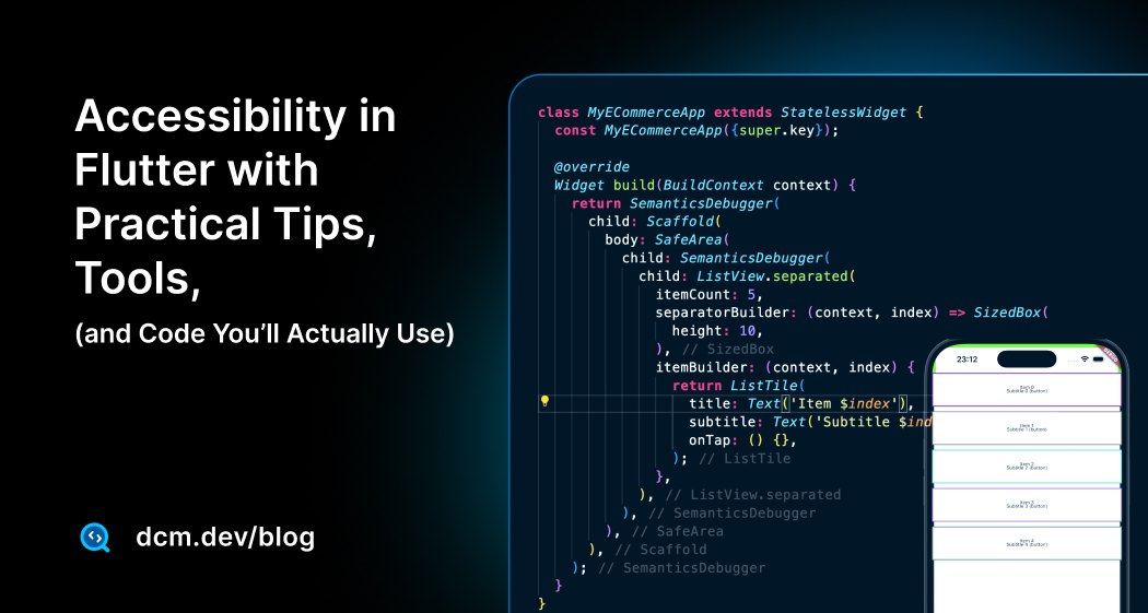
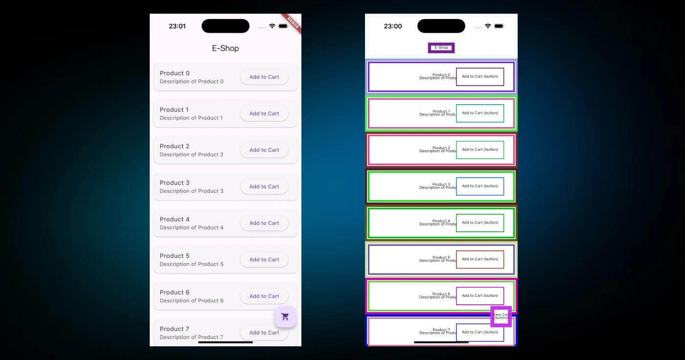
Flutter’s Semantics Debugger:
Flutter’s built-in visual debugger is invaluable. Enable it to see an overlay of the semantic tree, making it easy to spot missing labels or incorrect groupings.
MaterialApp(
  // Add this line to see the accessibility overlay
  showSemanticsDebugger: true,
  home: YourHomePage(),
);
This overlays visual boxes and labels on the UI to show what Flutter’s semantics tree looks like. Each interactive node gets a colored rectangle and label in the overlay, so you can spot missing labels or incorrect groupings easily.
-
Static analysis helps by implementing shifting left which catches common mistakes before you even run the app. Configure your
analysis_options.yamlto enforce key accessibility rules.analysis_options.yamldart_code_metrics:
rules:
- avoid-missing-image-alt
- prefer-text-rich
- prefer-action-button-tooltip
- prefer-dedicated-media-query-method
Enjoying this article?
Subscribe to get our latest articles and product updates by email.
-
Automated Widget Testing with
AccessibilityGuidelineFlutter’s testing framework provides a built-in way to verify that your widgets conform to common accessibility requirements (based on WCAG) by using the
meetsGuidelinematcher together with the AccessibilityGuideline enum.import 'package:flutter/material.dart';
import 'package:flutter_test/flutter_test.dart';
void main() {
// A list of common guidelines to check against.
const List<AccessibilityGuideline> guidelines = [
androidTapTargetGuideline, // Checks for 48x48 dp minimum tap targets.
iOSTapTargetGuideline, // Checks for 44x44 dp minimum tap targets.
textContrastGuideline, // Checks for WCAG 2.1 AA contrast ratios.
labeledTapTargetGuideline, // Checks that interactive elements have labels.
];
for (final guideline in guidelines) {
testWidgets('MyWidget follows ${guideline.description}', (tester) async {
await tester.pumpWidget(MaterialApp(home: MyFailingWidget()));
// The expectLater call provides a detailed failure report.
await expectLater(tester, meetsGuideline(guideline));
});
}
}
// An example widget with multiple accessibility failures.
class MyFailingWidget extends StatelessWidget {
Widget build(BuildContext context) {
return Scaffold(
body: Column(
children: [
// Fails tap target and label guidelines.
GestureDetector(onTap: () {}, child: Icon(Icons.close)),
// Fails text contrast guideline.
Text('Low contrast', style: TextStyle(color: Colors.grey)),
],
),
);
}
}This single test structure can replace multiple manual checks and prevent regressions.
-
Testing Navigation Order with
simulatedAccessibilityTraversalSometimes, it’s not enough to know that a widget has the right label; you also need to ensure that screen reader users will navigate through your UI in a logical order. This is especially important in complex layouts.
Flutter’s test framework lets you simulate this navigation journey. To do this, you must first explicitly enable the semantics layer for your test using
tester.ensureSemantics(). This gives you aSemanticsHandlethat you mustdispose()of when the test is complete.Here is my widget example:
import 'package:flutter/material.dart';
import 'package:flutter_test/flutter_test.dart';
// A widget with a few elements to test traversal order.
class UserProfileCard extends StatelessWidget {
const UserProfileCard({super.key});
Widget build(BuildContext context) {
return const Column(
crossAxisAlignment: CrossAxisAlignment.start,
children: [
Text('User Profile', style: TextStyle(fontSize: 24)),
SizedBox(height: 8),
Text('Jane Doe'),
SizedBox(height: 16),
Row(
children: [
Text('Enable notifications'),
Switch(value: true, onChanged: null),
],
),
],
);
}
}Here is how you can write a test to verify the screen reader traversal order:
void main() {
  testWidgets('UserProfileCard has a logical accessibility traversal order', (tester) async {
    // Enable the semantics tree and get a handle to it.
    final SemanticsHandle semantics = tester.ensureSemantics();

    await tester.pumpWidget(const MaterialApp(home: Scaffold(body: UserProfileCard())));

    // Simulate the traversal and check the order of semantic nodes.
    // This simulates a user swiping through the elements.
    expect(
      tester.semantics,
      hasSemantics(
        TestSemantics.root(
          children: <TestSemantics>[
            TestSemantics(
              children: <TestSemantics>[
                TestSemantics(
                  children: <TestSemantics>[
                    // We expect the elements to be read in this specific order.
                    TestSemantics(label: 'User Profile', isHeader: true),
                    TestSemantics(label: 'Jane Doe'),
                    TestSemantics(
                      label: 'Enable notifications',
                      // The Switch's properties are merged with the label.
                      hasCheckedState: true,
                      isChecked: true,
                      isEnabled: false, // Because onChanged is null
                    ),
                  ],
                ),
              ],
            ),
          ],
        ),
        ignoreId: true,
        ignoreRect: true,
        ignoreTransform: true,
      ),
    );

    // Always dispose of the handle to clean up.
    semantics.dispose();
  });
}
In this example, we use
tester.semanticsto inspect the entire semantics tree and verify that the nodes for the header, the name, and the switch appear in the correct, sequential order. This technique gives you confidence that your app provides a coherent experience for users relying on screen readers. -
Verifying a Single Widget with
matchesSemanticsFlutter’s testing framework allows checking semantics. You can write widget tests that verify a widget’s semantic properties using
tester.getSemantics(find.byType(...))or matchers likematchesSemantics(...).testWidgets('Custom favorite tab button has correct semantics', (tester) async {
await tester.pumpWidget(
MaterialApp(
// Assuming FavoriteTabButton is a custom stateful widget.
home: FavoriteTabButton(isFavorite: false),
),
);
// Find the semantics for the button.
final finder = find.byType(FavoriteTabButton);
final semantics = tester.getSemantics(finder);
// Verify its properties.
expect(
semantics,
matchesSemantics(
label: 'Add to favorites',
hasTapAction: true,
isEnabled: true, // You can check many other properties too!
),
);
});For instance, you could test that your custom control has a label and the
hasEnabledStateflag, etc. This is advanced usage, but if you have critical custom widgets, consider adding a test to ensure they’re accessible (so regressions get caught). There’s alsoAccessibilityTesterutilities in some packages or you can even script running your app with TalkBack turned on via integration tests, but that’s beyond the scope here. -
Getting User Feedback
Finally, consider involving real users or specialized QA. Nothing beats feedback from a person who relies on these features daily. They might find issues you never considered for example, "this swipe gesture is hard to perform" or "the way you labeled this icon is confusing".
Conclusion
Flutter makes it possible to build beautiful apps and with a bit of effort, beautiful, accessible apps. The great thing is that many accessibility improvements are small tweaks that have big impact.
Add that semantic label here, that tooltip there, swap a RichText for a Text.rich, use a proper widget instead of a hacked container, these are often one-liners or low-effort changes once you know about them. Building inclusive apps is not only the right thing to do morally, it also improves overall app quality.
For more in-depth API references, always check the Flutter Accessibility Docs, SemanticsRole, and AccessibilityGuideline testing as Flutter’s accessibility features keep evolving.
Happy coding, and happy enabling everyone to enjoy your apps!
Sharing your feedback
Do you have a feature request? Have questions or suggestions? Please reach out via email [email protected] or on our Discord server.
Enjoying this article?
Subscribe to get our latest articles and product updates by email.

 Dmitry Zhifarsky