8 More Flutter Widgets You’re Probably Not Using (But Should Be)
It never ceases to amaze me how Flutter continues to surprise developers with its depth and versatility. Even after years of working with this framework, there are still widgets hiding in plain sight that solve very specific problems elegantly.
I recently demonstrated a set of 10 widgets in a lightning talk at FlutterCon as a DCM advocate, where I showcased several niche but incredibly useful widgets. After the talk, I decided to turn it into an in-depth and more detailed blog post about these widgets. Like my previous article on 10 Flutter widgets you probably haven't heard of (But you should be using), I went into the source code to understand not just how to use these widgets, but also how they work under the hood.
Before we start, all examples and source code of this blog has been posted to this repo which was created for Navigating the Hard Parts of Testing in Flutter article.
Now, let's uncover these widgets together!
SnapshotWidget
The SnapshotWidget is a performance optimization powerhouse that can transform complex, expensive-to-draw widgets into static, non-interactive images. Think of it as taking a screenshot of a specific widget, once captured, Flutter no longer needs to spend resources redrawing the original complex widget on every frame.
You should reach for SnapshotWidget when you have graphically complex UI elements (custom drawings, charts, complicated widget stacks) that don't change frequently but are expensive to render, or when performance degrades on low-end devices and you want to enhance performance.
Here's how it works in practice:
SnapshotWidget(
  controller: controller,
  child: const ExpensiveCircleGrid(),
)
You wrap your expensive widget with SnapshotWidget and provide a SnapshotController.
class _SnapshotExampleState extends State<SnapshotExample> {
  final controller = SnapshotController();
  bool isSnapshotEnabled = false;

  // ... rest of the code
}
Initially, controller.allowSnapshotting is false, so the original widget renders normally. When you're ready (perhaps after an animation finishes or data loads), you set controller.allowSnapshotting = true. On the next frame, SnapshotWidget captures the child into a rasterized image buffer and displays that frozen image instead, dramatically improving performance.
The trade-off is clear: the snapshot is not interactive. Any gesture detectors, buttons, or animations within the original widget will no longer work after the snapshot is taken.
SnapshotWidget Under the Hood
If you peek into Flutter’s source code, the SnapshotWidget lives in snapshot_widget.dart, and it’s surprisingly elegant.
Here is an abstract, pseudocode of the implementation:
enum SnapshotMode { permissive, normal, forced }

class SnapshotController extends ChangeNotifier {
  bool get allowSnapshotting;
  set allowSnapshotting(bool value);
  void clear(); // notifyListeners → force re-snapshot
}

abstract class SnapshotPainter extends ChangeNotifier {
  void paintSnapshot(PaintingContext c, Offset o, Size s, ui.Image image, Size srcSize, double pixelRatio);
  void paint(PaintingContext c, Offset o, Size s, PaintingContextCallback paintChild);
  bool shouldRepaint(covariant SnapshotPainter old);
}

class SnapshotWidget extends SingleChildRenderObjectWidget {
  const SnapshotWidget({
    required SnapshotController controller,
    SnapshotMode mode = SnapshotMode.normal,
    SnapshotPainter painter = const _DefaultSnapshotPainter(),
    bool autoresize = false,
    required Widget child,
  });

  // if (controller.allowSnapshotting) {
  //   capture child as ui.Image and reuse it
  // } else {
  //   paint live child using painter.paint()
  // }
}
The SnapshotWidget leverages Flutter's layer system to create a texture-backed representation of child widgets. According to the Flutter documentation, it creates a frozen representation stored as a ui.Image, making it particularly useful for short animations that would otherwise be expensive, such as scale and skew transformations on complex children.
Let me explain a bit more. The design is neatly modular.
At the top, you have SnapshotMode, an enum that defines how strict the widget should be about what can be captured.
- In
normal, it throws an error if the child contains an un-snapshotable view (like a platform texture). - In
permissive, it quietly skips snapshotting and paints the child normally. - And in
forced, it snapshot everything possible—even if it has to ignore those platform layers.
The SnapshotController is a lightweight ChangeNotifier that acts as the on/off switch.
Setting allowSnapshotting = true tells Flutter’s rendering pipeline to “freeze” the child into a texture (a ui.Image). Calling clear() drops the cached snapshot and forces the widget to capture a new one the next time it paints.
The SnapshotPainter defines how to draw that image once it exists.
It provides two methods: paintSnapshot() for the frozen bitmap, and paint() for the live child. This is what makes SnapshotWidget powerful, you can apply visual transformations like rotations, blurs, or scaling directly on the snapshot image without rebuilding the original widget tree.
Finally, SnapshotWidget itself extends SingleChildRenderObjectWidget. Inside the render layer, it checks the controller’s flag:
-
If
snapshottingis enabled, the child is rendered once into aui.Image(via thedart:uilibrary) and that image is reused for subsequent paints. -
If not, it simply paints the child normally through the painter.
The autoresize flag ensures the snapshot refreshes automatically when the widget size changes.
SnapshotWidget Implementation Lessons
SnapshotWidget captures the essence of Flutter’s rendering philosophy: "don’t rebuild what you can reuse." By storing a widget’s visual output as a ui.Image, it gives you a way to animate, transform, or transition complex UIs cheaply. It’s a reminder that optimization in Flutter isn’t just about clever state management, sometimes, it’s about knowing when to stop drawing and just reuse what’s already there.
SnapshotWidget Practical Full Example
Let's look at a practical example that was shown in the video above which demonstrates the performance benefits:
import 'package:flutter/material.dart';
void main() {
runApp(const MyApp());
}
class MyApp extends StatelessWidget {
const MyApp({super.key});
Widget build(BuildContext context) {
return MaterialApp(
debugShowCheckedModeBanner: false,
home: SnapshotExample(),
);
}
}
class SnapshotExample extends StatefulWidget {
const SnapshotExample({super.key});
State<SnapshotExample> createState() => _SnapshotExampleState();
}
class _SnapshotExampleState extends State<SnapshotExample> {
final controller = SnapshotController();
bool isSnapshotEnabled = false;
int buildCounter = 0;
Widget build(BuildContext context) {
return Scaffold(
appBar: AppBar(
title: Text('SnapshotWidget Demo (Builds: $buildCounter)'),
actions: [
IconButton(
icon: const Icon(Icons.add),
onPressed: () => setState(() => buildCounter++),
),
],
),
body: Center(
child: Column(
mainAxisAlignment: MainAxisAlignment.center,
children: [
SnapshotWidget(
controller: controller,
child: const ExpensiveCircleGrid(),
),
const SizedBox(height: 30),
ElevatedButton(
onPressed: () {
setState(() {
isSnapshotEnabled = !isSnapshotEnabled;
controller.allowSnapshotting = isSnapshotEnabled;
});
},
child: Text(
isSnapshotEnabled
? 'Unfreeze Widget'
: 'Freeze Widget (Snapshot)',
),
),
const SizedBox(height: 10),
Text(
isSnapshotEnabled
? 'The widget is now a static image.\nParent rebuilds will not repaint it.'
: 'The widget is live and will repaint.',
textAlign: TextAlign.center,
),
],
),
),
);
}
}
class ExpensiveCircleGrid extends StatelessWidget {
const ExpensiveCircleGrid({super.key});
Widget build(BuildContext context) {
print("--- Repainting ExpensiveCircleGrid ---");
return Container(
width: 200,
height: 200,
decoration: BoxDecoration(border: Border.all(color: Colors.black)),
child: CustomPaint(painter: CirclePainter()),
);
}
}
class CirclePainter extends CustomPainter {
static int _paintCount = 0;
void paint(Canvas canvas, Size size) {
_paintCount++;
print("🎨 CirclePainter is painting now! (Count: $_paintCount) 🎨");
final paint = Paint()..color = Colors.teal;
double radius = 5.0;
for (int i = 0; i < 20; i++) {
for (int j = 0; j < 20; j++) {
canvas.drawCircle(
Offset(i * 10.0 + radius, j * 10.0 + radius),
radius,
paint,
);
}
}
}
bool shouldRepaint(covariant CustomPainter oldDelegate) => true;
}
In this example, you can see the performance impact clearly (check the video above). When snapshotting is enabled, the expensive CustomPainter stops being called on every rebuild, even though the parent widget continues to rebuild when you press the add button.
A Pro-Tip for Your Team: Improving Readability
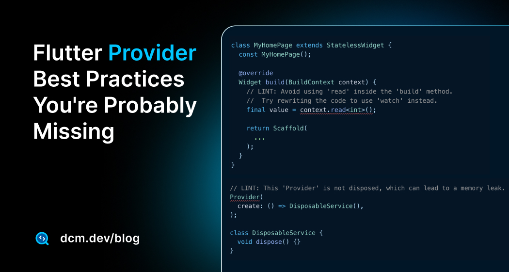
We've just optimized our app's runtime performance, but what about our development performance? Messy build methods, many lines of inline logic, are a major drag on readability and make maintenance a chore.
Take the onPressed callback in our SnapshotWidget example. It's four lines of state-changing logic sitting right in the middle of our UI tree:
  ElevatedButton(
    onPressed: () { // <-- Logic clutters the UI
      setState(() {
        isSnapshotEnabled = !isSnapshotEnabled;
        controller.allowSnapshotting = isSnapshotEnabled;
      });
    },
    child: Text(...),
  )
DCM has a fantastic rule called prefer-extracting-callbacks, which is designed to enforce a clean separation of concerns. We can tell DCM to flag any inline callback that's longer than one line.
dcm:
  rules:
    - prefer-extracting-callbacks:
        allowed-line-count: 3
With this rule active, DCM would flag our onPressed callback.
✔ Analysis is completed. Preparing the results: 0.3s

lib/snapshot_widget.dart (1 issue):
STYLE     Prefer extracting the callback to a separate widget method.
          at lib/snapshot_widget.dart:38:15
          prefer-extracting-callbacks : https://dcm.dev/docs/rules/flutter/prefer-extracting-callbacks


Scanned folders: 1
Scanned files: 1
style issues: 1
The fix is simple:
class _SnapshotExampleState extends State<SnapshotExample> {
// ...
// Logic is now in a clean, testable method
void _toggleSnapshot() {
setState(() {
isSnapshotEnabled = !isSnapshotEnabled;
controller.allowSnapshotting = isSnapshotEnabled;
});
}
Widget build(BuildContext context) {
// ...
ElevatedButton(
onPressed: _toggleSnapshot, // <-- Build method is 100% UI
child: Text(...),
),
// ...
}
}
Now, our build method is purely declarative (it describes what the UI looks like), and our logic is encapsulated in the _toggleSnapshot method (it describes how the UI works). This shows how DCM goes beyond and actively guides your entire team to write more professional, testable, and maintainable Flutter apps.
As you can see, it's not just about finding new widgets or writing code, it's about making it maintainable, testable, scalable and increase code quality even when you are not focusing on it.
DCM is a code quality tool that helps your team move faster by reducing the time spent on code reviews, finding tricky bugs, identifying complex code, and unifying code style.
RepaintBoundary.toImage
The RepaintBoundary widget is a performance optimization tool that limits the area of the screen needing redraws when visual updates occur. By creating a new compositing layer in Flutter's rendering pipeline, it ensures only that specific layer redraws when visual updates happen within its subtree, rather than the entire screen.
Without RepaintBoundary, Flutter's rendering engine propagates visual updates upward through the widget tree, marking all ancestor widgets as dirty. This cascading effect can result in large portions of the screen being unnecessarily redrawn, even when changes are confined to a small area.
RepaintBoundary(
  child: Container(
    width: 100,
    height: 100,
    color: Colors.blue,
    child: Text('Optimized Painting'),
  ),
)
I have written extensively about this widget in my previous blog.
However, I want to look at this widget from a different angle.
The RepaintBoundary also has a powerful feature: its render object has a toImage() method that lets you capture the layer as a ui.Image. This image can then be converted to bytes (PNG, JPEG, etc.), saved to disk, uploaded, or displayed elsewhere.
The process is straightforward: wrap your widget in a RepaintBoundary with a GlobalKey, then use the key to access the RenderRepaintBoundary instance and call its toImage() method. The RepaintBoundary is implemented at the rendering layer as a RenderRepaintBoundary object.
RepaintBoundary(
  key: _boundaryKey,
  child: Container(
    color: Colors.blueAccent,
    width: 200,
    height: 200,
    child: const Center(
      child: Text(
        'Snapshot me!',
        style: TextStyle(fontSize: 20, color: Colors.white),
      ),
    ),
  ),
)
RepaintBoundary.toImage Under the Hood
Here is the source code of ProxyBox, which contains the definition of RenderRepaintBoundary.
The toImage() method is implemented in the RenderRepaintBoundary class. It captures the current state of the render object and its children, returning a ui.Image with uncompressed raw RGBA bytes. The method requires that the render object has gone through the paint phase (debugNeedsPaint must be false).
class RenderRepaintBoundary extends RenderProxyBox {
/// Creates a repaint boundary around [child].
RenderRepaintBoundary({RenderBox? child}) : super(child);
bool get isRepaintBoundary => true;
Future<ui.Image> toImage({double pixelRatio = 1.0}) {
assert(!debugNeedsPaint);
final OffsetLayer offsetLayer = layer! as OffsetLayer;
return offsetLayer.toImage(Offset.zero & size, pixelRatio: pixelRatio);
}
ui.Image toImageSync({double pixelRatio = 1.0}) {
assert(!debugNeedsPaint);
final OffsetLayer offsetLayer = layer! as OffsetLayer;
return offsetLayer.toImageSync(Offset.zero & size, pixelRatio: pixelRatio);
}
// ...
}
The pixelRatio parameter describes the scale between logical pixels and the output image size, allowing you to control the quality of the captured image.
RepaintBoundary.toImage Practical Full Example
Here's a complete example showing how to capture and display a widget as an image:
import 'dart:typed_data';
import 'dart:ui' as ui;
import 'package:flutter/material.dart';
import 'package:flutter/rendering.dart';
void main() {
runApp(MaterialApp(
debugShowCheckedModeBanner: false,
home: CaptureExample(),
));
}
class CaptureExample extends StatefulWidget {
_CaptureExampleState createState() => _CaptureExampleState();
}
class _CaptureExampleState extends State<CaptureExample> {
final GlobalKey _boundaryKey = GlobalKey();
Uint8List? _capturedImage;
Future<void> _capturePng() async {
try {
RenderRepaintBoundary boundary = _boundaryKey.currentContext!
.findRenderObject() as RenderRepaintBoundary;
ui.Image image = await boundary.toImage(pixelRatio: 3.0);
ByteData? byteData =
await image.toByteData(format: ui.ImageByteFormat.png);
Uint8List pngBytes = byteData!.buffer.asUint8List();
setState(() {
_capturedImage = pngBytes;
});
} catch (e) {
debugPrint("Error capturing image: $e");
}
}
Widget build(BuildContext context) {
return Scaffold(
appBar: AppBar(title: const Text('RepaintBoundary Capture Example')),
body: Column(
mainAxisAlignment: MainAxisAlignment.center,
children: [
RepaintBoundary(
key: _boundaryKey,
child: Container(
color: Colors.blueAccent,
width: 200,
height: 200,
child: const Center(
child: Text(
'Snapshot me!',
style: TextStyle(fontSize: 20, color: Colors.white),
),
),
),
),
const SizedBox(height: 20),
ElevatedButton(
onPressed: _capturePng,
child: const Text('Capture to Image'),
),
const SizedBox(height: 20),
if (_capturedImage != null)
Image.memory(_capturedImage!, width: 200),
],
),
);
}
}
This functionality is particularly powerful for creating drawing applications where users can capture their artwork, or for generating shareable content dynamically.
Advanced RepaintBoundary: Drawing Pad Example
Let's explore a more advanced use case, creating a drawing application where users can capture their artwork as images.
This demonstrates the real-world power of combining RepaintBoundary with custom painting.
import 'dart:ui' as ui;
import 'package:flutter/material.dart';
import 'package:flutter/rendering.dart';
void main() {
runApp(const MyApp());
}
class MyApp extends StatelessWidget {
const MyApp({super.key});
Widget build(BuildContext context) {
return const MaterialApp(
debugShowCheckedModeBanner: false,
home: DrawingPadScreen(),
);
}
}
class DrawingPadScreen extends StatefulWidget {
const DrawingPadScreen({super.key});
State<DrawingPadScreen> createState() => _DrawingPadScreenState();
}
class _DrawingPadScreenState extends State<DrawingPadScreen> {
final GlobalKey _repaintKey = GlobalKey();
final List<Offset?> _points = [];
ui.Image? _capturedImage;
Future<void> _captureDrawing() async {
try {
final RenderRepaintBoundary boundary =
_repaintKey.currentContext!.findRenderObject()
as RenderRepaintBoundary;
final ui.Image image = await boundary.toImage(pixelRatio: 3.0);
setState(() {
_capturedImage = image;
});
} catch (e) {
debugPrint("Error capturing image: $e");
}
}
Widget build(BuildContext context) {
return Scaffold(
appBar: AppBar(
title: const Text('Drawing Pad'),
actions: [
IconButton(
icon: const Icon(Icons.clear),
onPressed: () => setState(() {
_points.clear();
_capturedImage = null;
}),
tooltip: 'Clear Drawing',
),
],
),
body: Padding(
padding: const EdgeInsets.all(16.0),
child: Column(
crossAxisAlignment: CrossAxisAlignment.stretch,
children: [
const Text(
'Draw in the box below:',
style: TextStyle(fontSize: 18, fontWeight: FontWeight.bold),
),
const SizedBox(height: 10),
Expanded(
child: RepaintBoundary(
key: _repaintKey,
child: AspectRatio(
aspectRatio: 1.0,
child: GestureDetector(
onPanUpdate: (details) {
setState(() {
_points.add(details.localPosition);
});
},
onPanEnd: (details) {
setState(() {
_points.add(null); // Break the line
});
},
child: Container(
decoration: BoxDecoration(
color: Colors.grey[200],
border: Border.all(color: Colors.blueGrey),
),
child: CustomPaint(
painter: DrawingPainter(
points: List.of(_points),
),
),
),
),
),
),
),
const SizedBox(height: 20),
ElevatedButton.icon(
icon: const Icon(Icons.camera_alt),
label: const Text('Capture Drawing'),
onPressed: _captureDrawing,
),
const SizedBox(height: 20),
const Text(
'Captured Image:',
style: TextStyle(fontSize: 18, fontWeight: FontWeight.bold),
),
const SizedBox(height: 10),
Expanded(
child: Container(
decoration: BoxDecoration(
border: Border.all(color: Colors.green),
),
child: _capturedImage != null
? RawImage(image: _capturedImage)
: const Center(
child: Text('Press capture to see the image here'),
),
),
),
],
),
),
);
}
}
class DrawingPainter extends CustomPainter {
final List<Offset?> points;
DrawingPainter({required this.points});
void paint(Canvas canvas, Size size) {
final paint = Paint()
..color = Colors.black
..strokeCap = StrokeCap.round
..strokeWidth = 5.0;
for (int i = 0; i < points.length - 1; i++) {
if (points[i] != null && points[i + 1] != null) {
canvas.drawLine(points[i]!, points[i + 1]!, paint);
}
}
}
bool shouldRepaint(covariant DrawingPainter oldDelegate) =>
oldDelegate.points.length != points.length ||
!_listEquals(oldDelegate.points, points);
bool _listEquals<T>(List<T>? a, List<T>? b) {
if (a == null) return b == null;
if (b == null || a.length != b.length) return false;
for (int i = 0; i < a.length; i++) {
if (a[i] != b[i]) return false;
}
return true;
}
}
The combination of gesture detection, custom painting, and image capture creates a powerful foundation for drawing or design applications.
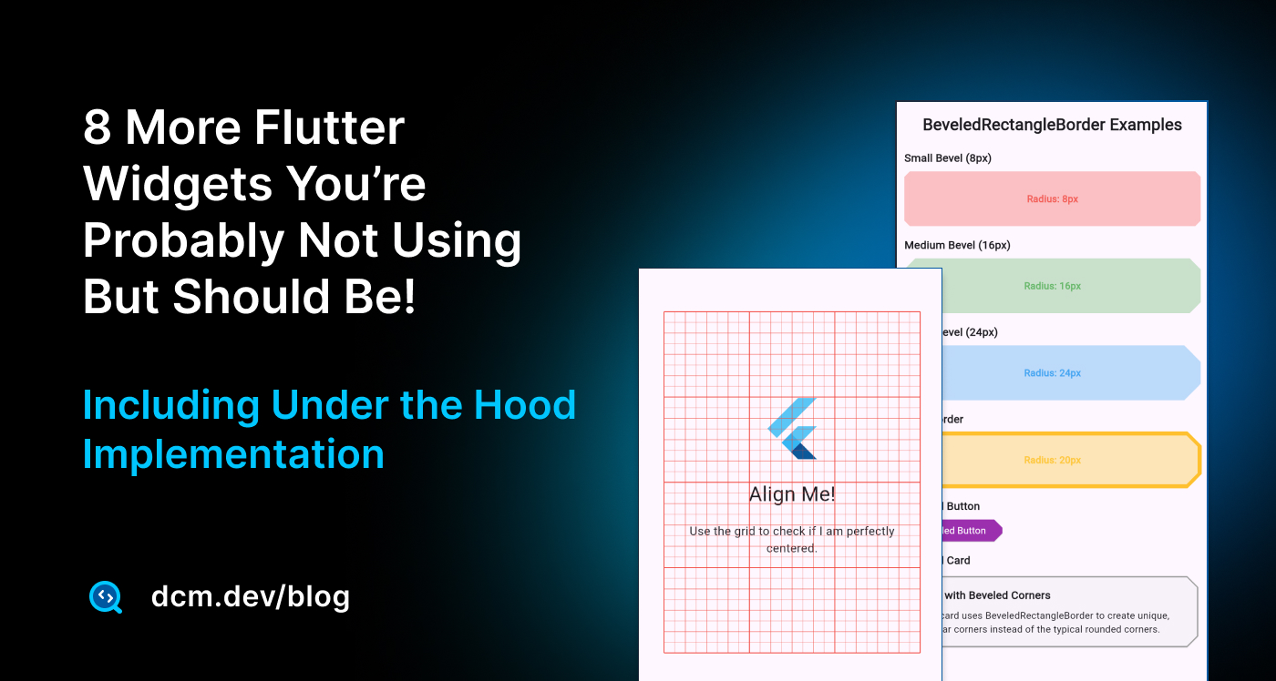
GridPaper
The GridPaper widget is a debugging and design tool that overlays a grid pattern onto its child widget, making it easier to check for misalignments and ensure your layout is pixel-perfect.
Think of it as placing a sheet of graph paper over your app, it's purely a visual aid for development and shouldn't be used in production UI.
GridPaper(
  color: Colors.red,
  interval: 100,
  divisions: 2,
  subdivisions: 4,
  child: SizedBox(
    width: 300,
    height: 400,
    child: Column(
      mainAxisAlignment: MainAxisAlignment.center,
      children: [
        const FlutterLogo(size: 80),
        const SizedBox(height: 20),
        const Text('Align Me!', style: TextStyle(fontSize: 24)),
      ],
    ),
  ),
)
The widget's key Properties are:
color: The color of the grid linesinterval: The distance in logical pixels between the major grid linesdivisions: The number of major grid linessubdivisions: The number of smaller lines within each major grid division
GridPaper Under the Hood
Here is the source code for GridPaper:
class _GridPaperPainter extends CustomPainter {
// ...
void paint(Canvas canvas, Size size) {
final Paint linePaint = Paint()..color = color;
final double allDivisions = (divisions * subdivisions).toDouble();
for (double x = 0.0; x <= size.width; x += interval / allDivisions) {
linePaint.strokeWidth = (x % interval == 0.0)
? 1.0
: (x % (interval / subdivisions) == 0.0)
? 0.5
: 0.25;
canvas.drawLine(Offset(x, 0.0), Offset(x, size.height), linePaint);
}
for (double y = 0.0; y <= size.height; y += interval / allDivisions) {
linePaint.strokeWidth = (y % interval == 0.0)
? 1.0
: (y % (interval / subdivisions) == 0.0)
? 0.5
: 0.25;
canvas.drawLine(Offset(0.0, y), Offset(size.width, y), linePaint);
}
}
bool shouldRepaint(_GridPaperPainter oldPainter) {
return oldPainter.color != color ||
oldPainter.interval != interval ||
oldPainter.divisions != divisions ||
oldPainter.subdivisions != subdivisions;
}
bool hitTest(Offset position) => false;
}
class GridPaper extends StatelessWidget {
// ...
final Color color;
final double interval;
final int divisions;
final int subdivisions;
final Widget? child;
Widget build(BuildContext context) {
return CustomPaint(
foregroundPainter: _GridPaperPainter(
color: color,
interval: interval,
divisions: divisions,
subdivisions: subdivisions,
),
child: child,
);
}
// ...
}
GridPaper is built using a CustomPaint widget with _GridPaperPainter as its foreground painter.
The painter simply draws vertical and horizontal lines spaced by the interval, with different stroke widths for major, minor, and subdivision lines.
By combining these evenly spaced strokes, Flutter renders a rectilinear grid across the widget’s surface, almost like graph paper laid over your UI. Because it’s painted directly on the canvas, it doesn’t interfere with the child widget beneath it; it’s purely a visual overlay.
GridPaper Practical Full Example
Here's an example showing GridPaper in action as you have seen in the video above:
import 'package:flutter/material.dart';
void main() {
runApp(const MyApp());
}
class MyApp extends StatelessWidget {
const MyApp({super.key});
Widget build(BuildContext context) {
return MaterialApp(
debugShowCheckedModeBanner: false,
home: Scaffold(
appBar: AppBar(
title: const Text('GridPaper Demo'),
),
body: Center(
child: GridPaper(
color: Colors.red,
interval: 100,
divisions: 2,
subdivisions: 4,
child: SizedBox(
width: 300,
height: 400,
child: Column(
mainAxisAlignment: MainAxisAlignment.center,
children: [
const FlutterLogo(size: 80),
const SizedBox(height: 20),
const Text(
'Align Me!',
style: TextStyle(fontSize: 24),
),
const Padding(
padding: EdgeInsets.all(16.0),
child: Text(
'Use the grid to check if I am perfectly centered.',
textAlign: TextAlign.center,
),
),
],
),
),
),
),
),
);
}
}
As said, GridPaper is particularly useful when you're trying to achieve pixel-perfect layouts or when working with designers who need precise alignment verification. You can easily toggle it on and off during development to check your layout precision.
Enjoying this article?
Subscribe to get our latest articles and product updates by email.
LayerLink
The LayerLink is a fascinating widget system that connects two widgets across the widget tree, allowing one widget (the follower) to be positioned relative to another widget (the target), even when they're not direct parent-child relationships.
Think of it as an invisible wire connecting two widgets, no matter where the target moves, the follower maintains its relative position.
LayerLink works with two companion widgets:
CompositedTransformTarget: The "anchor" widget that other widgets can followCompositedTransformFollower: The widget that positions itself relative to the target
This system is particularly useful for dropdown menus, tooltips, and custom overlays that need to stay positioned relative to a specific UI element.
final LayerLink _layerLink = LayerLink();

// The target widget
CompositedTransformTarget(
  link: _layerLink,
  child: ElevatedButton(
    onPressed: _toggleDropdown,
    child: Text('Menu'),
  ),
)

// The follower widget (usually in an Overlay)
CompositedTransformFollower(
  link: _layerLink,
  showWhenUnlinked: false,
  targetAnchor: Alignment.bottomLeft,
  offset: const Offset(0, 8),
  child: Material(
    elevation: 4.0,
    child: Container(
      padding: const EdgeInsets.all(8.0),
      child: Column(
        mainAxisSize: MainAxisSize.min,
        children: [
          Text('Option 1'),
          Divider(),
          Text('Option 2'),
        ],
      ),
    ),
  ),
)
LayerLink Under the Hood
LayerLink creates a connection between a LeaderLayer and FollowerLayer at the rendering level. You can check the full source code on the Flutter repository.
Here is an abstract, pseudocode of the implementation:
// Shared rendezvous
class LayerLink {
LeaderLayer? leader;
void _registerLeader(LeaderLayer l) => leader = l; // ...
void _unregisterLeader(LeaderLayer l) {
if (leader == l) leader = null;
}
}
// Leader: created by CompositedTransformTarget
class LeaderLayer extends ContainerLayer {
LeaderLayer({required LayerLink link, Offset offset = Offset.zero});
LayerLink link;
Offset offset;
void attach(Object owner) {
super.attach(owner);
link._registerLeader(this);
}
void detach() {
link._unregisterLeader(this);
super.detach();
}
void addToScene(SceneBuilder b) {
// Collapse offset into a transform, children see Offset.zero.
if (offset != Offset.zero) {
b.pushTransform(translate(offset));
addChildrenToScene(b);
b.pop();
} else {
addChildrenToScene(b);
}
}
void applyTransform(Layer? child, Matrix4 m) {
m.translate(offset.dx, offset.dy);
}
}
// Follower: created by CompositedTransformFollower
class FollowerLayer extends ContainerLayer {
FollowerLayer({
required LayerLink link,
bool showWhenUnlinked = true,
Offset unlinkedOffset = Offset.zero,
Offset linkedOffset = Offset.zero
});
LayerLink link;
bool showWhenUnlinked;
Offset unlinkedOffset;
Offset linkedOffset;
bool get alwaysNeedsAddToScene => true; // recompute every frame
void addToScene(SceneBuilder b) {
if (link.leader == null && !showWhenUnlinked) {
return;
}
// M = inverse(follower→ancestor) * (leader→ancestor) * translate(linkedOffset)
final Matrix4 M = _establishTransformOrFallback(unlinkedOffset, link.leader, linkedOffset);
b.pushTransform(M.storage);
addChildrenToScene(b);
b.pop();
}
}
CompositedTransformTarget and CompositedTransformFollower are a duo for spatial relationships in Flutter. The target inserts a LeaderLayer that registers itself with a shared LayerLink. Anywhere else in the layer tree, the follower inserts a FollowerLayer with the same link. During composition, the follower asks, "Where’s my leader?" and, if present, computes a matrix that maps its own space into the leader’s space:
// M = inverse(follower→commonAncestor)
//    * (leader→commonAncestor)
//    * translate(linkedOffset)
It then pushes M so its children render as if they’re attached to the leader—great for anchored menus, tooltips, FAB-to-sheet transitions, and context-aware overlays—without manual global-to-local math or extra rebuilds. If the leader isn’t present and showWhenUnlinked is true, the follower simply falls back to unlinkedOffset.
The LeaderLayer also "collapses" its offset into a transform and passes Offset.zero to its children. That subtle choice ensures the transform chain is consistent, so the follower’s mapping is stable and accurate.
Design Patterns Lessons
Looking at this smart implementation shows how you can blend design patterns and how important they could be in building software and applications:
- Observer (pull-based): the follower "observes" the leader’s state each frame via the shared
LayerLink. - Mediator:
LayerLinkdecouples leader and follower, neither holds a direct reference to the other. - Bridge (architectural): widgets (
CompositedTransformTarget/Follower) cleanly bridge high-level UI to the low-level layer tree and engine transforms.
LayerLink Practical Full Example
Here's a complete example showing a dropdown menu implementation using LayerLink:
import 'package:flutter/material.dart';
void main() {
runApp(const MyApp());
}
class MyApp extends StatelessWidget {
const MyApp({super.key});
Widget build(BuildContext context) {
return const MaterialApp(
debugShowCheckedModeBanner: false,
home: LayerLinkDropdownExample(),
);
}
}
class LayerLinkDropdownExample extends StatefulWidget {
const LayerLinkDropdownExample({super.key});
State<LayerLinkDropdownExample> createState() => _LayerLinkDropdownExampleState();
}
class _LayerLinkDropdownExampleState extends State<LayerLinkDropdownExample> {
final LayerLink _layerLink = LayerLink();
OverlayEntry? _overlayEntry;
bool _isDropdownOpen = false;
void _toggleDropdown() {
if (_isDropdownOpen) {
_hideDropdown();
} else {
_showDropdown();
}
}
void _showDropdown() {
_overlayEntry = _createDropdownEntry();
Overlay.of(context).insert(_overlayEntry!);
setState(() {
_isDropdownOpen = true;
});
}
void _hideDropdown() {
_overlayEntry?.remove();
_overlayEntry = null;
setState(() {
_isDropdownOpen = false;
});
}
OverlayEntry _createDropdownEntry() {
return OverlayEntry(
builder: (context) {
return CompositedTransformFollower(
link: _layerLink,
showWhenUnlinked: false,
targetAnchor: Alignment.bottomLeft,
offset: const Offset(0, 8),
child: Material(
elevation: 4.0,
borderRadius: BorderRadius.circular(8),
child: Container(
padding: const EdgeInsets.all(8.0),
decoration: BoxDecoration(
color: Colors.white,
borderRadius: BorderRadius.circular(8),
),
child: const Column(
mainAxisSize: MainAxisSize.min,
children: [
Text('Option 1'),
Divider(),
Text('Option 2'),
Divider(),
Text('Logout'),
],
),
),
),
);
},
);
}
Widget build(BuildContext context) {
return Scaffold(
appBar: AppBar(title: const Text('Dropdown Menu with LayerLink')),
body: Padding(
padding: const EdgeInsets.all(20.0),
child: Column(
crossAxisAlignment: CrossAxisAlignment.start,
children: [
const Text(
"Press the button to show a menu that is perfectly aligned using LayerLink.",
style: TextStyle(fontSize: 16),
),
const SizedBox(height: 20),
CompositedTransformTarget(
link: _layerLink,
child: ElevatedButton(
onPressed: _toggleDropdown,
child: Row(
mainAxisSize: MainAxisSize.min,
children: [
const Text('Menu'),
Icon(
_isDropdownOpen
? Icons.arrow_drop_up
: Icons.arrow_drop_down,
),
],
),
),
),
],
),
),
);
}
}
The beauty is that the follower automatically adjusts its position when the target moves, scrolls, or transforms, making it perfect for responsive overlay elements.
TickerMode
The TickerMode widget is a performance optimization tool that controls whether animations are running in a specific part of your app's widget tree. By wrapping widgets with TickerMode, you can enable or disable all animations (like those driven by AnimationController) for that widget and all of its descendants.
This widget is particularly valuable for performance optimization and state management. Common use cases include pausing off-screen animations in PageView or ListView, implementing accessibility preferences for users who prefer reduced motion, and temporarily halting animations during network requests or loading states.
TickerMode(
  enabled: false, // Disables all animations in the subtree
  child: AnimatedContainer(
    duration: Duration(seconds: 1),
    color: isBlue ? Colors.blue : Colors.red,
    child: Text('This animation is paused!'),
  ),
)
TickerMode Under the Hood
The TickerMode widget works by controlling the TickerProvider system that Flutter uses for animations. Here is the source code.
TickerMode is the global on/off switch for animations in a subtree. It wraps your content in an _EffectiveTickerMode (an InheritedWidget) that carries two things: the current enabled flag and a ValueNotifier<bool> that broadcasts changes.
// Rest of the code
class TickerMode extends StatefulWidget {
final bool enabled;
final Widget child;
static bool of(BuildContext c) => c.dependOn<_EffectiveTickerMode>()?.enabled ?? true;
static ValueListenable<bool> getNotifier(BuildContext c) =>
c.get<_EffectiveTickerMode>()?.notifier ?? const _ConstantValueListenable(true);
State<TickerMode> createState() => _TickerModeState();
}
class _TickerModeState extends State<TickerMode> {
bool _ancestor = true; // TickerMode.of(context)
final _effective = ValueNotifier<bool>(true);
void didChangeDependencies() {
_ancestor = TickerMode.of(context);
_effective.value = _ancestor && widget.enabled;
}
void didUpdateWidget(TickerMode old) {
_effective.value = _ancestor && widget.enabled;
}
Widget build(BuildContext _) => _EffectiveTickerMode(
enabled: _effective.value,
notifier: _effective,
child: widget.child,
);
}
// Inherited carrier
class _EffectiveTickerMode extends InheritedWidget {
// Rest of the code
}
// One ticker
mixin SingleTickerProviderStateMixin<T extends StatefulWidget> on State<T>
implements TickerProvider {
// Rest of the code
}
// Many tickers
mixin TickerProviderStateMixin<T extends StatefulWidget> on State<T>
implements TickerProvider {
// Rest of the code
}
When TickerMode.enabled == false, tickers are muted under that subtree. Animations don’t "rewind" or lose time; their tick callbacks just stop firing while muted. Time still progresses.
When enabled flips back to true, tickers resume and controllers continue from the current time.
On the consumer side, the standard mixins you already use for animations are ticker-mode–aware:
SingleTickerProviderStateMixin(one controller)TickerProviderStateMixin(many controllers)
both call TickerMode.getNotifier(context) and subscribe. Whenever the ticker mode changes, they set ticker.muted = !enabled. This is why simply placing a TickerMode(enabled: false, child: ...) above your screen pauses all animations created with the widget-aware providers—no extra plumbing.
TickerMode Practical Full Example
Here's a practical example showing TickerMode in action that you have seen in the video above:
import 'package:flutter/material.dart';
import 'dart:math' as math;
void main() {
runApp(const MyApp());
}
class MyApp extends StatelessWidget {
const MyApp({super.key});
Widget build(BuildContext context) {
return const MaterialApp(
debugShowCheckedModeBanner: false,
home: TickerModeExample(),
);
}
}
class TickerModeExample extends StatefulWidget {
const TickerModeExample({super.key});
State<TickerModeExample> createState() => _TickerModeExampleState();
}
class _TickerModeExampleState extends State<TickerModeExample> {
// A boolean to control the TickerMode's `enabled` property.
bool _animationsEnabled = true;
Widget build(BuildContext context) {
return Scaffold(
appBar: AppBar(title: const Text('TickerMode Demo')),
body: Center(
child: Column(
mainAxisAlignment: MainAxisAlignment.center,
children: [
// This Switch controls the TickerMode below.
Row(
mainAxisAlignment: MainAxisAlignment.center,
children: [
Text(
_animationsEnabled ? 'Animations ON' : 'Animations OFF',
style: const TextStyle(fontSize: 18),
),
const SizedBox(width: 10),
Switch(
value: _animationsEnabled,
onChanged: (value) {
setState(() {
_animationsEnabled = value;
});
},
),
],
),
const SizedBox(height: 50),
// The TickerMode widget.
// It will enable or disable animations for everything inside it.
TickerMode(
enabled: _animationsEnabled,
child: const SpinningContainer(),
),
],
),
),
);
}
}
/// A widget with a continuous, repeating animation.
class SpinningContainer extends StatefulWidget {
const SpinningContainer({super.key});
State<SpinningContainer> createState() => _SpinningContainerState();
}
class _SpinningContainerState extends State<SpinningContainer>
with SingleTickerProviderStateMixin {
late final AnimationController _controller;
void initState() {
super.initState();
_controller = AnimationController(
vsync: this,
duration: const Duration(seconds: 5),
)..repeat(); // The animation starts repeating immediately.
}
void dispose() {
_controller.dispose();
super.dispose();
}
Widget build(BuildContext context) {
return AnimatedBuilder(
animation: _controller,
builder: (context, child) {
return Transform.rotate(
angle: _controller.value * 2 * math.pi,
child: Container(
width: 150,
height: 150,
color: Colors.blue,
child: const Center(
child: Text(
'I am animating!',
style: TextStyle(color: Colors.white, fontSize: 16),
),
),
),
);
},
);
}
}
TickerMode is incredibly useful when you want to optimize performance by disabling animations that are not currently visible to the user, or when implementing accessibility features for users who prefer reduced motion.
Enforcing New Widgets for Advanced Use Cases
Discovering a powerful widget like TickerMode is great, but how do you ensure your entire team starts using it and stops using an old, custom-built, or less-efficient alternative?
Perhaps your codebase already has a custom MyAnimationPauser widget that developers are used to. This is where a static analysis tool like DCM becomes essential for scaling knowledge.
Using DCM's banned-usage rule, you can gently guide your entire team to adopt this new, better widget. You would simply add a rule to your analysis_options.yaml:
dcm:
  rules:
    - banned-usage:
        entries:
          - type: MyAnimationPauser
            entries:
              - name: new
                description:
                  'Deprecated. Use the built-in TickerMode widget instead to
                  pause/resume animations in a subtree.'
              - name: call
                description:
                  'Deprecated. Use the built-in TickerMode widget instead to
                  pause/resume animations in a subtree.'
Now, any time a developer on your team tries to use the old MyAnimationPauser, the linter will immediately flag it,
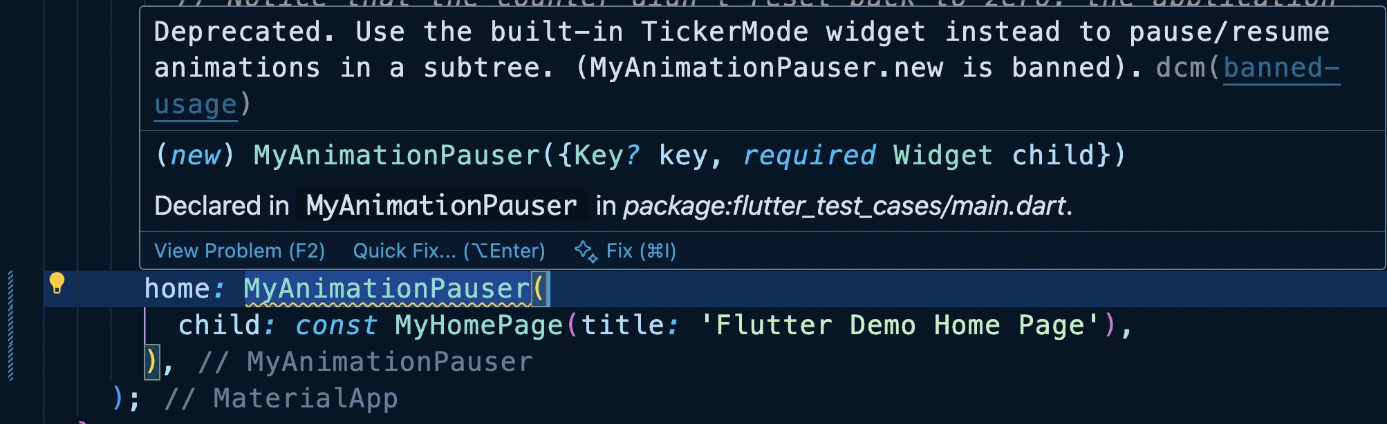
show them the reason right in their IDE, and point them to TickerMode.
lib/main.dart (1 issue):

WARNING   Deprecated. Use the built-in TickerMode widget instead to pause/resume animations in a subtree. (MyAnimationPauser.new is banned).
          at lib/main.dart:51:13
          banned-usage : https://dcm.dev/docs/rules/common/banned-usage


Scanned folders: 3
Scanned files: 42
It’s a fantastic way to enforce new best practices and make sure these "hidden gems" actually get used.
DCM is a code quality tool that helps your team move faster by reducing the time spent on code reviews, finding tricky bugs, identifying complex code, and unifying code style.
SensitiveContent
The SensitiveContent widget is a security-focused widget introduced for Android 15+ that marks parts of your UI as containing sensitive information. Its primary purpose is to signal to the operating system that the screen should be obscured during screen sharing or screen recording to protect user privacy.
Think of it as the digital equivalent of covering a document when someone is looking over your shoulder. When your app displays passwords, financial details, or personal messages, you can wrap that content in SensitiveContent to prevent accidental exposure during screen capture sessions.
SensitiveContent(
  sensitivityLevel: ContentSensitivity.sensitive,
  child: TextField(
    obscureText: true,
    decoration: InputDecoration(
      labelText: 'Password',
      hintText: 'Enter your password',
    ),
  ),
)
The SensitiveContent widget supports three sensitivity levels:
ContentSensitivity.sensitive: The highest priority setting that ensures the screen remains obscuredContentSensitivity.autoSensitive: Second priority, relies on system heuristics to determine sensitivityContentSensitivity.notSensitive: Lowest priority, explicitly marks content as not sensitive
SensitiveContent Under the Hood
Here is the source code for SensitiveContent:
// Counters for what's currently in the tree (priority: sensitive > auto > not)
class _ContentSensitivitySetting {
int sensitive = 0, auto = 0, notSensitive = 0;
void add(ContentSensitivity s) { /* ++counter for s */ }
void remove(ContentSensitivity s) { /* --counter for s (assert non-negative) */ }
bool get hasWidgets => (sensitive + auto + notSensitive) > 0;
ContentSensitivity? get current {
if (sensitive > 0) return ContentSensitivity.sensitive;
if (auto > 0) return ContentSensitivity.autoSensitive;
if (notSensitive > 0) return ContentSensitivity.notSensitive;
return null;
}
}
// Process coordinator + platform bridge (singleton)
final class SensitiveContentHost {
static final instance = SensitiveContentHost._();
SensitiveContentHost._();
final _svc = SensitiveContentService(); // platform channel
final _counts = _ContentSensitivitySetting();
bool? _isSupported; // cached capability
ContentSensitivity? _fallback; // platform’s pre-existing mode
static Future<void> register(ContentSensitivity s) => instance._register(s);
static Future<void> unregister(ContentSensitivity s) => instance._unregister(s);
Future<void> _register(ContentSensitivity s) async {
_isSupported ??= await _svc.isSupported().onError((_, __) => false);
if (!_isSupported!) return;
_fallback ??= await _svc.getContentSensitivity()
.onError((_, __) => ContentSensitivity.notSensitive);
final before = _counts.current ?? _fallback;
_counts.add(s);
final after = _counts.current;
if (after != null && after != before) {
await _svc.setContentSensitivity(after).catchError(_report);
}
}
Future<void> _unregister(ContentSensitivity s) async {
assert(_isSupported != null); // must have registered first
if (!_isSupported!) return;
final before = _counts.current!;
_counts.remove(s);
if (!_counts.hasWidgets) {
if (_fallback != before) {
await _svc.setContentSensitivity(_fallback!).catchError(_report);
}
return;
}
final restore = _counts.current!;
if (restore != before) {
await _svc.setContentSensitivity(restore).catchError(_report);
}
}
void _report(Object e) { /* FlutterError.reportError(...) */ }
}
// Public widget: participates in global sensitivity via Host
class SensitiveContent extends StatefulWidget {
final ContentSensitivity sensitivity;
final Widget child;
const SensitiveContent({required this.sensitivity, required this.child});
State createState() => _SensitiveContentState();
}
class _SensitiveContentState extends State<SensitiveContent> {
Future<void> _pending = Future.value();
void initState() {
super.initState();
_pending = SensitiveContentHost.register(widget.sensitivity);
}
void didUpdateWidget(SensitiveContent old) {
super.didUpdateWidget(old);
if (old.sensitivity != widget.sensitivity) {
_pending = () async {
await SensitiveContentHost.register(widget.sensitivity);
await SensitiveContentHost.unregister(old.sensitivity);
}();
}
}
void dispose() {
SensitiveContentHost.unregister(widget.sensitivity);
super.dispose();
}
Widget build(BuildContext _) =>
FutureBuilder(future: _pending, builder: (_, snap) =>
snap.connectionState == ConnectionState.done ? widget.child : const SizedBox.shrink());
}
SensitiveContent works by coordinating with a global singleton called SensitiveContentHost, which keeps track of all widgets that declare themselves as sensitive.
When a widget mounts, it registers its sensitivity level (sensitive, autoSensitive, or notSensitive) with the host. The host maintains simple counters for each type and determines the effective mode using a priority rule:
sensitive > autoSensitive > notSensitive.
If the effective mode changes, the host calls SensitiveContentService.setContentSensitivity() on the platform side, which tells Android to obscure or reveal the screen appropriately. When the last sensitive widget is removed, it restores the platform’s original sensitivity.
The widget itself manages this lifecycle automatically, it registers in initState, re-registers if the sensitivity changes, and unregisters on dispose. A small FutureBuilder delay ensures the content is shown only after registration completes, reducing the risk of sensitive data flashing briefly.
SensitiveContent Practical Full Example
Here's a practical example demonstrating SensitiveContent usage but you must run that on Android device:
import 'package:flutter/material.dart';
import 'package:flutter/services.dart'; // Required for ContentSensitivity
void main() {
runApp(const MyApp());
}
class MyApp extends StatelessWidget {
const MyApp({super.key});
Widget build(BuildContext context) {
return const MaterialApp(
debugShowCheckedModeBanner: false,
home: SensitiveContentExample(),
);
}
}
class SensitiveContentExample extends StatefulWidget {
const SensitiveContentExample({super.key});
State<SensitiveContentExample> createState() =>
_SensitiveContentExampleState();
}
class _SensitiveContentExampleState extends State<SensitiveContentExample> {
bool _isSecretVisible = false;
Widget build(BuildContext context) {
return Scaffold(
appBar: AppBar(title: const Text('SensitiveContent Demo')),
body: Center(
child: Padding(
padding: const EdgeInsets.all(20.0),
child: Column(
mainAxisAlignment: MainAxisAlignment.center,
children: [
const Text(
'This is public information that can always be seen.',
textAlign: TextAlign.center,
style: TextStyle(fontSize: 18),
),
const SizedBox(height: 30),
ElevatedButton(
onPressed: () {
setState(() {
_isSecretVisible = !_isSecretVisible;
});
},
child: Text(_isSecretVisible ? 'Hide Secret' : 'Show Secret'),
),
const SizedBox(height: 30),
// This is the widget that conditionally displays the sensitive info.
if (_isSecretVisible)
// The SensitiveContent widget wraps our secret data.
SensitiveContent(
// We mark the content as 'sensitive'.
sensitivity: ContentSensitivity.sensitive,
child: Container(
padding: const EdgeInsets.all(20),
decoration: BoxDecoration(
color: Colors.red[100],
border: Border.all(color: Colors.red),
borderRadius: BorderRadius.circular(8),
),
child: const Column(
children: [
Text(
'SECRET CODE:',
style: TextStyle(
fontSize: 16,
fontWeight: FontWeight.bold,
color: Colors.red,
),
),
SizedBox(height: 8),
Text(
'123-456-789',
style: TextStyle(
fontSize: 24,
fontWeight: FontWeight.bold,
),
),
],
),
),
),
],
),
),
),
);
}
}
Important Note: SensitiveContent currently only works on Android API 35+ (Android 15). On lower Android versions and other platforms, it has no effect. You can check if the device supports this feature using SensitiveContentService.isSupported
Enjoying this article?
Subscribe to get our latest articles and product updates by email.
BlockSemantics
The BlockSemantics widget is an accessibility control tool that prevents screen readers from accessing individual widgets within its child tree. Think of it as placing a "Do Not Disturb" sign on a group of widgets, screen readers will see the sign and ignore everything behind it.
This widget is particularly useful when you have widgets that are visually behind other widgets (like a modal dialog overlay) but are still part of the widget tree. Without BlockSemantics, screen readers might read out potentially confusing or redundant information from widgets that aren't currently relevant to the user.
BlockSemantics(
  child: Container(
    child: Column(
      children: [
        Text('This text will be ignored by screen readers'),
        ElevatedButton(
          onPressed: () {},
          child: Text('This button will also be ignored'),
        ),
      ],
    ),
  ),
)
BlockSemantics Under the Hood
The BlockSemantics widget works by creating a semantics boundary that prevents the propagation of semantic information from its children. It effectively creates a semantic "black hole" where accessibility services cannot penetrate to read the individual child widgets.
class BlockSemantics extends SingleChildRenderObjectWidget {
const BlockSemantics({super.key, this.blocking = true, super.child});
final bool blocking;
RenderBlockSemantics createRenderObject(BuildContext context) =>
RenderBlockSemantics(blocking: blocking);
void updateRenderObject(BuildContext context, RenderBlockSemantics renderObject) {
renderObject.blocking = blocking;
}
void debugFillProperties(DiagnosticPropertiesBuilder properties) {
// ...
}
}
The render object RenderBlockSemantics overrides the semantic annotation methods to prevent child semantics from being included in the accessibility tree.
BlockSemantics Practical Full Example
Here's a complete example showing BlockSemantics in a modal dialog scenario:
import 'package:flutter/material.dart';
void main() {
runApp(const MyApp());
}
class MyApp extends StatelessWidget {
const MyApp({super.key});
Widget build(BuildContext context) {
return const MaterialApp(
debugShowCheckedModeBanner: false,
home: BlockSemanticsDemo(),
);
}
}
class BlockSemanticsDemo extends StatefulWidget {
const BlockSemanticsDemo({super.key});
State<BlockSemanticsDemo> createState() => _BlockSemanticsDemoState();
}
class _BlockSemanticsDemoState extends State<BlockSemanticsDemo> {
bool _showDialog = false;
bool _useBlockSemantics = true;
void _toggleDialog() {
setState(() {
_showDialog = !_showDialog;
});
}
void _toggleBlockSemantics() {
setState(() {
_useBlockSemantics = !_useBlockSemantics;
});
}
Widget build(BuildContext context) {
return Scaffold(
appBar: AppBar(
title: const Text('BlockSemantics Demo'),
),
body: Stack(
children: [
// Background content
_buildBackgroundContent(),
// Modal dialog overlay
if (_showDialog) _buildModalOverlay(),
],
),
);
}
Widget _buildBackgroundContent() {
Widget backgroundContent = Padding(
padding: const EdgeInsets.all(16.0),
child: Column(
crossAxisAlignment: CrossAxisAlignment.stretch,
children: [
const Card(
child: Padding(
padding: EdgeInsets.all(16.0),
child: Column(
crossAxisAlignment: CrossAxisAlignment.start,
children: [
Text(
'Background Content',
style: TextStyle(fontSize: 18, fontWeight: FontWeight.bold),
),
SizedBox(height: 8),
Text(
'This content should be ignored by screen readers when the dialog is open.',
),
],
),
),
),
const SizedBox(height: 16),
SwitchListTile(
title: const Text('Use BlockSemantics'),
subtitle: const Text('Toggle to see accessibility difference'),
value: _useBlockSemantics,
onChanged: (value) => _toggleBlockSemantics(),
),
const SizedBox(height: 16),
ElevatedButton(
onPressed: _toggleDialog,
child: Text(_showDialog ? 'Hide Dialog' : 'Show Dialog'),
),
const SizedBox(height: 20),
const Text(
'Additional Background Elements',
style: TextStyle(fontSize: 16, fontWeight: FontWeight.bold),
),
const SizedBox(height: 8),
ElevatedButton(
onPressed: () {},
child: const Text('Background Action 1'),
),
const SizedBox(height: 8),
ElevatedButton(
onPressed: () {},
child: const Text('Background Action 2'),
),
const SizedBox(height: 8),
const TextField(
decoration: InputDecoration(
labelText: 'Background Input',
hintText: 'This should be blocked when dialog is open',
),
),
],
),
);
// Apply BlockSemantics when dialog is shown and option is enabled
if (_showDialog && _useBlockSemantics) {
return BlockSemantics(child: backgroundContent);
}
return backgroundContent;
}
Widget _buildModalOverlay() {
return Container(
color: Colors.black54,
child: Center(
child: Card(
margin: const EdgeInsets.all(32.0),
child: Padding(
padding: const EdgeInsets.all(24.0),
child: Column(
mainAxisSize: MainAxisSize.min,
children: [
const Text(
'Modal Dialog',
style: TextStyle(fontSize: 20, fontWeight: FontWeight.bold),
),
const SizedBox(height: 16),
const Text(
'This dialog should be the focus of screen readers. '
'Background content should be blocked from accessibility.',
),
const SizedBox(height: 20),
Row(
mainAxisAlignment: MainAxisAlignment.spaceEvenly,
children: [
ElevatedButton(
onPressed: _toggleDialog,
child: const Text('Cancel'),
),
ElevatedButton(
onPressed: _toggleDialog,
child: const Text('Confirm'),
),
],
),
],
),
),
),
),
);
}
}
BlockSemantics is essential for creating accessible modal experiences where you want to ensure screen reader users focus only on the relevant content and aren't distracted by background elements.
BeveledRectangleBorder
The BeveledRectangleBorder is a shape class that creates rectangular shapes with angled, "cut-off" corners instead of the usual rounded or squared corners. This gives widgets a distinctive, sharp-edged appearance that's perfect for creating unique design elements with a geometric, cut-out style.
You'll commonly use BeveledRectangleBorder with widgets like buttons, cards, and containers through their shape property to achieve that distinctive beveled look.
Container(
  decoration: ShapeDecoration(
    color: Colors.blue,
    shape: BeveledRectangleBorder(
      borderRadius: BorderRadius.circular(16),
      side: BorderSide(color: Colors.purple, width: 2),
    ),
  ),
  child: Text('Beveled Container'),
)
There are two key properties:
borderRadius: Takes a BorderRadius value that determines how far from the corner the bevel begins. Larger radius values create more dramatic cut-off corners.side: Allows you to define a border stroke around the shape, including color, width, and style
BeveledRectangleBorder Under the Hood
The BeveledRectangleBorder extends OutlinedBorder and implements the ShapeBorder interface. Here is complete source code from the Flutter repository on Github.
// ...
class BeveledRectangleBorder extends OutlinedBorder {
  final BorderRadiusGeometry borderRadius;

  ShapeBorder scale(t) => BeveledRectangleBorder(
    side: side.scale(t), borderRadius: borderRadius * t);

  ShapeBorder? lerpFrom/To(other, t) => sameType
    ? BeveledRectangleBorder(
        side: BorderSide.lerp(...),
        borderRadius: BorderRadiusGeometry.lerp(...))
    : super.lerpFrom/To(...);

  BeveledRectangleBorder copyWith({side?, borderRadius?}) => ...;

  Path _getPath(RRect r) {
    // Clamp radii to >= 0
    // Build 8 vertices by “cutting” each corner toward the side center
    final verts = <Offset>[
      // TL edge points toward left & top centers
      // TR, BR, BL similarly…
    ];
    return Path()..addPolygon(verts, true);
  }

  Path getOuterPath(Rect rect, {TextDirection? td}) =>
    _getPath(borderRadius.resolve(td).toRRect(rect));

  Path getInnerPath(Rect rect, {TextDirection? td}) =>
    _getPath(borderRadius.resolve(td).toRRect(rect).deflate(side.strokeInset));

  void paint(Canvas c, Rect rect, {TextDirection? td}) {
    if (side.style == BorderStyle.solid && !rect.isEmpty) {
      final RRect r = borderRadius.resolve(td).toRRect(rect);
      final RRect inflated = r.inflate(side.strokeOutset);
      final Path stroke = _getPath(inflated)
        ..addPath(getInnerPath(rect, textDirection: td), Offset.zero);
      c.drawPath(stroke, side.toPaint());
    }
  }
}
// ...
This border is like RoundedRectangleBorder, but corners are straight cuts instead of arcs _getPath computes an octagon: 8 vertices created by sliding along each side toward its side-center, limited by the provided per-corner radii (clamped to ≥ 0). If radii are huge, the diagonals meet and you get a diamond. getOuterPath/getInnerPath resolve the BorderRadiusGeometry with TextDirection, convert to RRect, then build the outer/inner beveled polygon (inner uses deflate for stroke thickness). and finally paint inflates for stroke outset, builds a path that is outer minus inner, and draws it with side.toPaint().
BeveledRectangleBorder Practical Full Example
Here's a comprehensive example showing different BeveledRectangleBorder variations:
import 'package:flutter/material.dart';
void main() {
runApp(const MyApp());
}
class MyApp extends StatelessWidget {
const MyApp({super.key});
Widget build(BuildContext context) {
return MaterialApp(
debugShowCheckedModeBanner: false,
home: Scaffold(
appBar: AppBar(
title: const Text('BeveledRectangleBorder Demo'),
),
body: const SingleChildScrollView(
padding: EdgeInsets.all(16.0),
child: Column(
crossAxisAlignment: CrossAxisAlignment.stretch,
children: [
Text(
'BeveledRectangleBorder Examples',
style: TextStyle(fontSize: 24, fontWeight: FontWeight.bold),
textAlign: TextAlign.center,
),
SizedBox(height: 20),
BeveledExample(
title: 'Small Bevel (8px)',
borderRadius: 8,
color: Colors.red,
),
SizedBox(height: 16),
BeveledExample(
title: 'Medium Bevel (16px)',
borderRadius: 16,
color: Colors.green,
),
SizedBox(height: 16),
BeveledExample(
title: 'Large Bevel (24px)',
borderRadius: 24,
color: Colors.blue,
),
SizedBox(height: 16),
BeveledExample(
title: 'With Border',
borderRadius: 20,
color: Colors.amber,
hasBorder: true,
),
SizedBox(height: 16),
BeveledButtonExample(),
SizedBox(height: 16),
BeveledCardExample(),
],
),
),
),
);
}
}
class BeveledExample extends StatelessWidget {
final String title;
final double borderRadius;
final Color color;
final bool hasBorder;
const BeveledExample({
super.key,
required this.title,
required this.borderRadius,
required this.color,
this.hasBorder = false,
});
Widget build(BuildContext context) {
return Column(
crossAxisAlignment: CrossAxisAlignment.start,
children: [
Text(
title,
style: const TextStyle(fontSize: 16, fontWeight: FontWeight.w600),
),
const SizedBox(height: 8),
Container(
height: 80,
decoration: ShapeDecoration(
color: color.withOpacity(0.3),
shape: BeveledRectangleBorder(
borderRadius: BorderRadius.circular(borderRadius),
side: hasBorder
? BorderSide(color: color, width: 3)
: BorderSide.none,
),
),
child: Center(
child: Text(
'Radius: ${borderRadius}px',
style: TextStyle(
color: color.withOpacity(0.8),
fontWeight: FontWeight.bold,
),
),
),
),
],
);
}
}
class BeveledButtonExample extends StatelessWidget {
const BeveledButtonExample({super.key});
Widget build(BuildContext context) {
return Column(
crossAxisAlignment: CrossAxisAlignment.start,
children: [
const Text(
'Beveled Button',
style: TextStyle(fontSize: 16, fontWeight: FontWeight.w600),
),
const SizedBox(height: 8),
ElevatedButton(
onPressed: () {},
style: ElevatedButton.styleFrom(
backgroundColor: Colors.purple,
foregroundColor: Colors.white,
shape: const BeveledRectangleBorder(
borderRadius: BorderRadius.all(Radius.circular(12)),
),
padding: const EdgeInsets.symmetric(horizontal: 24, vertical: 12),
),
child: const Text('Beveled Button'),
),
],
);
}
}
class BeveledCardExample extends StatelessWidget {
const BeveledCardExample({super.key});
Widget build(BuildContext context) {
return Column(
crossAxisAlignment: CrossAxisAlignment.start,
children: [
const Text(
'Beveled Card',
style: TextStyle(fontSize: 16, fontWeight: FontWeight.w600),
),
const SizedBox(height: 8),
Card(
shape: const BeveledRectangleBorder(
borderRadius: BorderRadius.all(Radius.circular(16)),
side: BorderSide(color: Colors.grey, width: 1),
),
child: const Padding(
padding: EdgeInsets.all(16.0),
child: Column(
crossAxisAlignment: CrossAxisAlignment.start,
children: [
Text(
'Card with Beveled Corners',
style: TextStyle(fontSize: 16, fontWeight: FontWeight.bold),
),
SizedBox(height: 8),
Text(
'This card uses BeveledRectangleBorder to create unique, '
'angular corners instead of the typical rounded corners.',
),
],
),
),
),
],
);
}
}
BeveledRectangleBorder is perfect when you want to create distinctive UI elements that stand out from the typical rounded rectangle aesthetic. It's particularly effective in design systems that favor geometric, angular styles.
Conclusion
In this blog, we've explored 8 powerful but often overlooked Flutter widgets or classes that can solve specific development challenges. The beauty of these widgets lies not just in their functionality, but in how they showcase Flutter's consistent design patterns. Whether it's performance optimization, accessibility, security, or unique visual effects, Flutter provides elegant, widget-based solutions that integrate seamlessly into your application architecture.
As you continue your Flutter journey, remember that the framework is full of these hidden gems. The official documentation, source code exploration, and community discussions are treasure troves of solutions waiting to be discovered. Keep exploring, keep building, and don't hesitate to dive into the source code when you want to understand how these powerful tools work behind the scenes.
The complete source code for all examples in this series is available in the flutter test cases repository, where you can explore, experiment, and build upon these concepts in your own projects.
I am committed to bring you more of these widgets in the future, so stay updated, sign up to our newsletter.
Enjoying this article?
Subscribe to get our latest articles and product updates by email.

 Dmitry Zhifarsky