Best Flutter Features in 2025

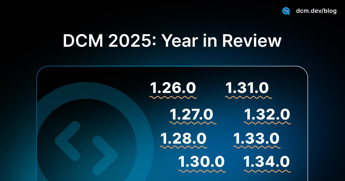
2025 was a big year for Flutter. Between February and November, the team shipped four stable releases (3.29 through 3.38), and each one brought meaningful improvements to how we build apps.
These weren't just minor updates. The team tackled real problems: shader jank on mobile, slow web development cycles, widget preview workflows, and AI coding assistance.
In this article, I'll walk you through the features that actually mattered in 2025. Some are stable and ready to use. Others are experimental but worth watching.
A Year of Polish and Performance for Flutter 2025
Before diving into the major features, it's worth noting that 2025 wasn't just about big changes. Every release brought meaningful refinements across Cupertino, Material, performance, and developer tools.
Huge kudos to the Flutter team who shipped 825 commits in 3.38 alone, with hundreds more across 3.29, 3.32, and 3.35. I personally thanks the team and appreciate their great work!
Let's explore the highlights.
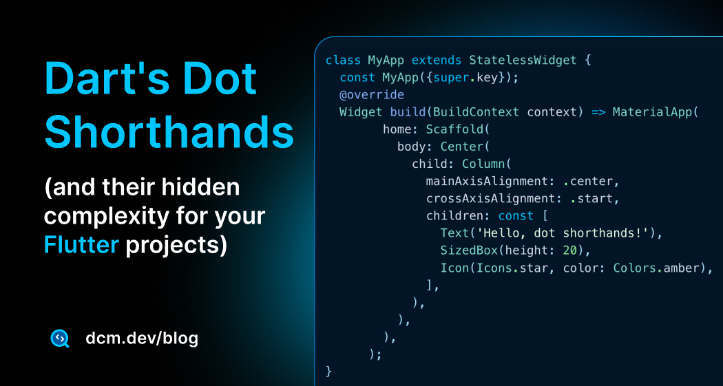
Dot Shorthands for Easier-to-read Flutter Code
If you've built Flutter UIs, you know the repetitive pain: typing MainAxisAlignment.center, CrossAxisAlignment.end, Colors.blue, EdgeInsets.all(8) over and over. Across a whole codebase, this becomes visual noise that makes widget trees harder to scan.
Dart 3.10 (bundled with Flutter 3.38) introduced dot shorthands, a syntax feature that lets you write .center instead of MainAxisAlignment.center whenever Dart can infer the type from context.
// Before: Verbose type repetition
Column(
  mainAxisAlignment: MainAxisAlignment.center,
  children: [
    Container(
      padding: EdgeInsets.all(8),
      color: Colors.blue,
    ),
  ],
);

// After: Clean and concise with dot shorthands
Column(
  mainAxisAlignment: .center,
  children: [
    Container(
      padding: .all(8),
      color: .blue,
    ),
  ],
);
Dart uses the expected type from context to resolve what .something refers to. Variable declarations, function parameters, and return types all provide this context.
No context means the shorthand fails, Dart doesn't guess.
Dot shorthands shine in specific scenarios:
- Enums:
case .warning:instead ofcase LogLevel.warning: - Widget parameters:
mainAxisAlignment: .center,alignment: .bottomCenter - Static constants:
Duration timeout = .zero;instead ofDuration.zero - Constructors:
EdgeInsets padding = .all(8);instead ofEdgeInsets.all(8)
These use cases make widget trees significantly easier to read.
Why It's Also Not Good (Hidden Complexity):
While powerful, dot shorthands introduce real challenges:
-
Nested shorthands are unreadable: Code like
.new(.new(version: .new('val')))becomes a puzzle. You lose all visual type anchors, making debugging and code reviews extremely difficult. -
Team disagreements emerge: Some developers love the conciseness, others argue it hides too much information. Junior developers may struggle to infer missing types without IDE support.
-
Context dependency: Shorthands only work when types are explicit. Using
varinstead of explicit types breaks the feature entirely. -
Inconsistent adoption: Without guidelines, codebases become a mix of old and new syntax, creating cognitive overhead when reading code.
What We Can Do to Make Fewer Mistakes:
The solution isn't to avoid shorthands, it's to enforce consistent, safe usage patterns. This is where automated lint rules become essential. Without enforcement, teams waste time in code reviews debating style choices instead of reviewing logic.
For a comprehensive exploration of dot shorthand edge cases, compiler behavior, tricky scenarios, and detailed configuration examples, read our deep dive on Dart's dot shorthands and their hidden complexity.
DCM provides specific rules to prevent common pitfalls and maintain consistency:
- avoid-nested-shorthands: Flags deeply nested shorthands like
.new(.new(.new()))that hurt comprehension. Forces you to keep outer calls as shorthands while inner calls remain explicit and readable. - prefer-shorthands-with-enums: Ensures everyone on the team writes
case .warning:instead of mixingcase LogLevel.warning:and.warningrandomly throughout the codebase. - prefer-shorthands-with-constructors: Suggests shorthands for constructor calls when types are explicit. Configure it to match your preferences (e.g., only apply to
EdgeInsets,BorderRadius,Border). - prefer-shorthands-with-static-fields: Enforces consistent usage for static fields like
Duration.zero→.zeroacross your entire project. - prefer-returning-shorthands: Ensures return statements use shorthands when return types are explicit:
Color getColor() => .red;
Most rules come with quick fixes and CLI support, meaning you can automatically apply best practices across your entire codebase in seconds. This eliminates style debates, speeds up code reviews, and makes onboarding new developers smoother, they see one consistent pattern instead of a mix of styles.

DCM is a code quality tool that helps your team move faster by reducing the time spent on code reviews, finding tricky bugs, identifying complex code, and unifying code style.
Stateful Hot Reload on the Web
Hot reload has been one of Flutter's superpowers on mobile and desktop for years. In 2025, it finally came to the web, a highly-requested feature that transforms the web development experience.
Flutter 3.32 introduced stateful hot reload for web as an experimental feature (requiring the --web-experimental-hot-reload flag).
This dramatically shortens the development feedback loop for web work. By Flutter 3.35, it became stable and enabled by default. No more flags needed; When hot reload is enabled, you can reload your application by pressing r in the running terminal, or R to hot restart.
Widget tree state survives hot reload, which means:
- Form input values remain intact
- Scroll positions don't reset
- Navigation stack is maintained
- StatefulWidget data persists
However, app-level state outside the widget tree (like global variables) can still be lost. This is why architecture matters:
// ✅ Good: State preserved during hot reload
class Counter extends StatefulWidget {
State<Counter> createState() => _CounterState();
}
class _CounterState extends State<Counter> {
int count = 0; // Hot reload preserves this
Widget build(BuildContext context) {
return Column(
children: [
Text('Count: $count'),
ElevatedButton(
onPressed: () => setState(() => count++),
child: const Text('Increment'),
),
],
);
}
}
// ❌ Avoid: Global state gets reset on hot reload
int globalCount = 0; // Lost on hot reload!
To catch and prevent this pattern early, enable DCM’s avoid-global-state rule; it flags global state so hot reload doesn’t silently reset critical values.

With this milestone, web development feels dramatically closer to the mobile/desktop workflow.
Oh, and did I mention DartPad? Even DartPad got a web hot reload button now! 2025 truly spoiled Flutter web devs.
WebAssembly Previews (Preparing for Wasm)
WebAssembly is coming to Flutter web as the default compilation target, and Flutter 3.35 started preparing developers for this transition with Wasm dry-run builds. This feature can be toggled with the --(no-)wasm-dry-run flag.
Starting in Flutter 3.35, every JavaScript build also performs a trial WebAssembly compilation in parallel. If your app isn't Wasm-compatible, you'll see warnings during the build, giving you time to fix issues before Wasm becomes mandatory.
flutter build web
# Output includes:
# Building with sound null safety
# Compiling lib/main.dart for the Web...
# [Wasm dry-run] Found 2 potential compatibility issues
# Warning: Package 'dart:html' is not supported in Wasm
WebAssembly delivers significant performance improvements over JavaScript:
- 2-3x faster execution for compute-intensive operations
- Smaller bundle sizes due to more efficient compilation
- Better memory management with linear memory model
- Near-native performance for graphics-heavy apps
However, not all Dart/Flutter code is automatically Wasm-compatible. The most common issues:
-
dart:htmlusage: Direct browser API access doesn't work in Wasm. Usepackage:webinstead, which provides a unified API for both JS and Wasm targets. -
JS interop: Code using
@JS()annotations ordart:js_utilneeds migration todart:js_interop(the new unified FFI). -
Dynamic HTML manipulation: Direct DOM manipulation should be replaced with Flutter's widget-based approach or the new
package:webAPIs.
But how do you prepare your app? Let's take a quick look. We will come with a comprehensive guide on this topic in 2026 on the DCM blog, so stay tuned!
// ❌ Old: Won't work in Wasm
import 'dart:html' as html;

void openLink() {
  html.window.open('https://dcm.dev', '_blank');
}

// ✅ New: Wasm-compatible
import 'package:web/web.dart' as web;

void openLink() {
  web.window.open('https://dcm.dev', '_blank');
}
Dart's
package:webexposes access to browser APIs, enabling interop between Dart applications and the web. Check out Migrate to package:web
For JS interop:
// ❌ Old: Legacy JS interop
()
library analytics;
import 'package:js/js.dart';
('gtag')
external void gtag(String event, String action, Object params);
// ✅ New: Unified JS interop for Wasm
import 'dart:js_interop';
('gtag')
external void gtag(String event, String action, JSAny params);
You can disable the Wasm compatibility check if needed:
flutter build web --no-wasm-dry-run
But I recommend keeping it enabled. Catching incompatibilities early, before Wasm becomes the default, saves you from emergency migrations later.
While Flutter hasn't announced an exact date for Wasm to become the default, the dry-run feature signals it's approaching. Starting your migration now means you'll be ready when the switch happens, and you might even opt into Wasm mode early to unlock those performance benefits.
Look at the official doc page: Flutter WASM.
New Material 3 and Cupertino Widgets
Flutter 2025 brought several practical widget additions across Material and Cupertino libraries, making common UI patterns simpler.
Material 3 Additions
DropdownMenuFormField (Flutter 3.35): Native form support for dropdowns. No more wrapping DropdownButton in custom FormField widgets.
DropdownMenuFormField<String>(
  initialValue: 'option1',
  dropdownMenuEntries: [
    DropdownMenuEntry(value: 'option1', label: 'Option 1'),
    DropdownMenuEntry(value: 'option2', label: 'Option 2'),
  ],
  onChanged: (value) => print('Selected: $value'),
  label: const Text('Choose an option'),
),
SearchAnchor & SearchBar (Flutter 3.32): Material 3 search components with built-in support for leading/trailing icons, callbacks, and suggestion handling. Replaces custom text field workarounds for search patterns.
SearchAnchor(
  builder: (context, controller) {
    return SearchBar(
      controller: controller,
      hintText: 'Search products...',
      leading: const Icon(Icons.search),
      onTap: () => controller.openView(),
      onChanged: (_) => controller.openView(),
    );
  },
  suggestionsBuilder: (context, controller) {
    final keyword = controller.value.text;
    return List<ListTile>.generate(5, (index) {
      final item = 'Result $index for "$keyword"';
      return ListTile(
        title: Text(item),
        onTap: () {
          controller.closeView(item);
          // Handle selection
        },
      );
    });
  },
),
SegmentedButton (Flutter 3.35): Material 3 segmented control for exclusive selection. Perfect for filtering, view switching, or multi-state toggles without radio buttons.
enum ViewMode { grid, list }

SegmentedButton<ViewMode>(
  segments: const [
    ButtonSegment(
      value: ViewMode.grid,
      label: Text('Grid'),
      icon: Icon(Icons.grid_view),
    ),
    ButtonSegment(
      value: ViewMode.list,
      label: Text('List'),
      icon: Icon(Icons.view_list),
    ),
  ],
  selected: {_viewMode},
  onSelectionChanged: (newSelection) {
    setState(() => _viewMode = newSelection.first);
  },
),
Badge (Flutter 3.32): Native badge widget for notifications, counts, or status indicators. Eliminates custom stacked containers for notification dots on navigation items.
MenuAnchor & MenuBar (Flutter 3.32): Desktop-first menu system supporting both context menus and application menus. RawMenuAnchor provides an unstyled foundation for custom menu designs.
Carousel Improvements (Flutter 3.32): New CarouselController with animateToIndex method for smooth navigation in carousels with fixed or dynamic-sized items.
final _carouselController = CarouselController();

CarouselView(
  controller: _carouselController,
  itemExtent: 300,
  children: List.generate(10, (index) {
    return Card(
      child: Center(
        child: Text('Item $index'),
      ),
    );
  }),
)

// Navigate programmatically
ElevatedButton(
  onPressed: () => _carouselController.animateToIndex(
    5,
    duration: const Duration(milliseconds: 500),
    curve: Curves.easeInOut,
  ),
  child: const Text('Jump to Item 5'),
),
Scrollable NavigationRail (Flutter 3.32): Handle apps with many sections gracefully. When destinations exceed vertical space, the rail becomes scrollable instead of overflowing.
NavigationDrawer Header & Footer (Flutter 3.35): Built-in slots for branding and persistent actions. Add user profiles at the top and logout buttons at the bottom without custom layouts.
Slider & TabBar Enhancements (Flutter 3.32 & 3.38): Sliders now support always-visible value indicators and custom thumb hover states. TabBar gained onHover and onFocusChange callbacks for better state control.
CalendarDatePicker Customization (Flutter 3.32): New calendarDelegate parameter enables integration of custom calendar systems beyond the Gregorian Calendar.
Cupertino Enhancements
CupertinoExpansionTile: iOS-style expandable list items. Built on the new Expansible core widget, matching Apple's design language.
CupertinoListSection(
  children: [
    CupertinoExpansionTile(
      title: const Text('Expandable Section'),
      children: [
        const Text('Item 1'),
        const Text('Item 2'),
      ],
    ),
  ],
),

Squircle Shapes: Flutter 3.32 introduced Apple's rounded superellipse shape for CupertinoAlertDialog and CupertinoActionSheet. By 3.35, more Cupertino widgets adopted this pixel-perfect iOS aesthetic.
Haptic Feedback: Native-feeling vibrations added to pickers and sliders, matching iOS interaction patterns.
These widgets reduce dependency on third-party packages and custom implementations.
Flutter's built-in components now cover more real-world UI patterns out of the box.
There are other improvements with other widgets that I did not mention to keep the blog short!
Decoupling the Material & Cupertino Libraries
One of 2025's most significant architectural decisions: Flutter announced plans to decouple Material and Cupertino libraries from the core framework.
First hinted at throughout the year in design documents, this was formally announced in the Flutter 3.35 release. Also, you can join the Github Discussion on this topic.
What's Changing?
Material and Cupertino will become separate first-party packages, versioned and released independently from Flutter's core framework. The core widgets library stays lightweight and design-agnostic.
Progress in 2025:
-
New foundation widgets:
Expansible(As mentioned above) serves as the base for bothExpansionTileandCupertinoExpansionTile. Similarly,RawMenuAnchorprovides design-agnostic menu functionality. -
Cross-library reuse:
CupertinoExpansionTile(As mentioned above) uses the sameExpansiblecore as Material, proving the decoupling strategy works. -
Release strategy: The team published design docs on Color theming and adopted a batch release strategy, allowing Material/Cupertino to update faster than Flutter's quarterly releases.
Why It Matters
-
Faster innovation: Material Design updates won't wait for Flutter SDK releases.
-
Leaner apps: Eventually, exclude unused design systems from your bundle.
-
Ecosystem growth: Opens doors for alternative design libraries (Fluent, custom systems) alongside Material and Cupertino.
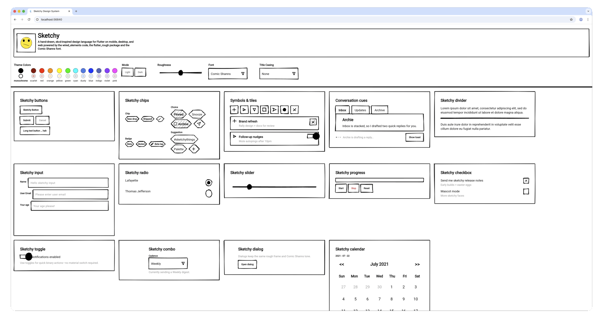
For example, recently Sketchy Design Language for Flutter was published by former Flutter Product Manager
-
No action needed: This is a gradual migration,everything works as before. But in a couple of years,
flutter createmight prompt you to choose which UI package to add. It's modularity by design.
Flutter Widget Previews
Flutter 3.35 introduced Widget Previews, letting you visualize widgets in isolation without running a full app. If you've used SwiftUI previews or Jetpack Compose preview, you'll feel right at home.
Add the @Preview annotation to any widget or widget, returning function:
import 'package:flutter/widget_previews.dart';
import 'package:flutter/material.dart';
(name: 'Custom Button')
Widget previewButton() {
return ElevatedButton(
onPressed: () {},
child: const Text('Click Me'),
);
}
Run the previewer:
flutter widget-preview start
This launches a live web UI showing your widget. Changes update instantly as you save.
By Flutter 3.38, VS Code and Android Studio auto-start the previewer in a dedicated tool window, you see renders side-by-side with your code.
Widget previews excel at:
- Rapid iteration: Test multiple states (loading, error, success) without navigating through your app
- Edge case testing: Verify long text, empty states, different screen sizes
- Design system development: Build component libraries with visual documentation built-in
- Theme validation: Toggle light/dark mode instantly to catch contrast issues
For advanced patterns, configuration tips, and real-world examples, we're writing a Comprehensive Guide to Flutter Widget Previews on the DCM blog.
While previews help you see widgets, DCM helps you maintain their quality:
dcm analyze-widgets: Reports the quality and usage of your widgets.
- DCM Metrics: Use metrics to measure the complexity of your code and identify areas that may be difficult to maintain or test.
Check the official Flutter Widget Previewer documentation to get started today.
DCM is a code quality tool that helps your team move faster by reducing the time spent on code reviews, finding tricky bugs, identifying complex code, and unifying code style.
Performance Gains with Impeller
Flutter's new rendering engine, Impeller, became the default on both iOS and Android in 2025.
Impeller eliminates shader compilation jank by using precompiled shaders, making complex animations and first-run interactions significantly smoother.
There were many improvements but the key ones across 3.29-3.35:
- Faster text rendering: Higher-resolution glyph caching eliminates hitches in text animations
- Efficient blur effects: Backdrop filters and transparent effects now avoid redundant layers
- Better memory management: Optimized partial repaints reduce garbage collection pressure
- Broader GPU support: Added support for Vivante GPUs and improved Vulkan/OpenGL stability
- Faster engine startup: Background thread initialization reduces app launch time
All of these changes in 2025 made real-world impact (mentioned in the release notes and benchmarks by the Flutter team) as:
- 30-50% reduction in jank frames during complex animations
- 20-40% improvement in text rendering performance
- Smoother interactions with backdrop filters and shader effects
Impeller is now rock-solid for production apps. If you use custom rendering code or unusual BlendMode combinations, test on Flutter 3.29+ to verify everything renders correctly.
iOS & Android Polish
Flutter 3.29 brought meaningful improvements to platform-specific widgets.
Cupertino iOS-styled Modal
CupertinoSheetRoute: A new iOS-styled modal sheet that supports the native drag-to-dismiss gesture, replacing custom sheet implementations:
import 'package:flutter/cupertino.dart';
/// Flutter code sample for [showCupertinoSheet].
void main() {
runApp(const CupertinoSheetApp());
}
class CupertinoSheetApp extends StatelessWidget {
const CupertinoSheetApp({super.key});
Widget build(BuildContext context) {
return const CupertinoApp(title: 'Cupertino Sheet', home: HomePage());
}
}
class HomePage extends StatelessWidget {
const HomePage({super.key});
Widget build(BuildContext context) {
return CupertinoPageScaffold(
navigationBar: const CupertinoNavigationBar(
middle: Text('Sheet Example'),
automaticBackgroundVisibility: false,
),
child: Center(
child: Column(
mainAxisAlignment: MainAxisAlignment.center,
children: <Widget>[
CupertinoButton.filled(
onPressed: () {
showCupertinoSheet<void>(
context: context,
useNestedNavigation: true,
pageBuilder: (BuildContext context) => const _SheetScaffold(),
);
},
child: const Text('Open Bottom Sheet'),
),
],
),
),
);
}
}
class _SheetScaffold extends StatelessWidget {
const _SheetScaffold();
Widget build(BuildContext context) {
return const CupertinoPageScaffold(child: _SheetBody(title: 'CupertinoSheetRoute'));
}
}
class _SheetBody extends StatelessWidget {
const _SheetBody({required this.title});
final String title;
Widget build(BuildContext context) {
return Center(
child: Column(
mainAxisAlignment: MainAxisAlignment.center,
children: <Widget>[
Text(title),
CupertinoButton.filled(
onPressed: () {
Navigator.of(context).maybePop();
},
child: const Text('Go Back'),
),
CupertinoButton.filled(
onPressed: () {
CupertinoSheetRoute.popSheet(context);
},
child: const Text('Pop Whole Sheet'),
),
CupertinoButton.filled(
onPressed: () {
Navigator.of(context).push(
CupertinoPageRoute<void>(builder: (BuildContext context) => const _SheetNextPage()),
);
},
child: const Text('Push Nested Page'),
),
CupertinoButton.filled(
onPressed: () {
showCupertinoSheet<void>(
context: context,
useNestedNavigation: true,
pageBuilder: (BuildContext context) => const _SheetScaffold(),
);
},
child: const Text('Push Another Sheet'),
),
],
),
);
}
}
class _SheetNextPage extends StatelessWidget {
const _SheetNextPage();
Widget build(BuildContext context) {
return const CupertinoPageScaffold(
backgroundColor: CupertinoColors.activeOrange,
child: _SheetBody(title: 'Next Page'),
);
}
}
Other improvements: CupertinoNavigationBar now supports bottom widgets, dark mode enhancements for alert dialogs, and refined text selection handling on iOS.
Material Refinements
FadeForwardsPageTransitionsBuilder: Material 3 now uses a fade-through page transition instead of zoom, matching Android's latest native behavior.
Progress indicators and sliders received visual refinements as well.
Framework Architecture Changes
Backdrop Filter Optimizations with BackdropGroup: Flutter 3.29 introduced BackdropGroup, a new widget that batches multiple BackdropFilter widgets into a single render layer. Previously, each BackdropFilter was its own layer, which could cause performance issues in complex UIs with many filters (think frosted glass effects on multiple cards). Now:
BackdropGroup(
  children: [
    BackdropFilter(
      filter: ImageFilter.blur(sigmaX: 4, sigmaY: 4),
      child: Container(color: Colors.white.withOpacity(0.1)),
    ),
    BackdropFilter(
      filter: ImageFilter.blur(sigmaX: 2, sigmaY: 2),
      child: AnotherWidget(),
    ),
  ],
),
This single change can reduce GPU overhead significantly in apps with heavy filter usage.
What are the use cases?
Dashboard apps with many frosted glass panels, Instagram-like story overlays, or chat apps with blurred background notifications.
ImageFilter.shader for Custom Effects: Want a custom shader applied as a filter? Flutter 3.29 added ImageFilter.shader, letting you supply a fragment shader to the BackdropFilter. This unlocks effects that plain blur/color filters can't achieve, displacement maps, custom gradients, HDR effects, etc. Example:
BackdropFilter(
  filter: ImageFilter.shader(
    shader: shader, // Your compiled fragment shader
    size: Size(200, 200),
  ),
  child: Container(
    width: 200,
    height: 200,
    child: Text('Custom shader effect'),
  ),
),
This is for advanced use cases, but it's a game-changer for apps that need pixel-perfect custom rendering.
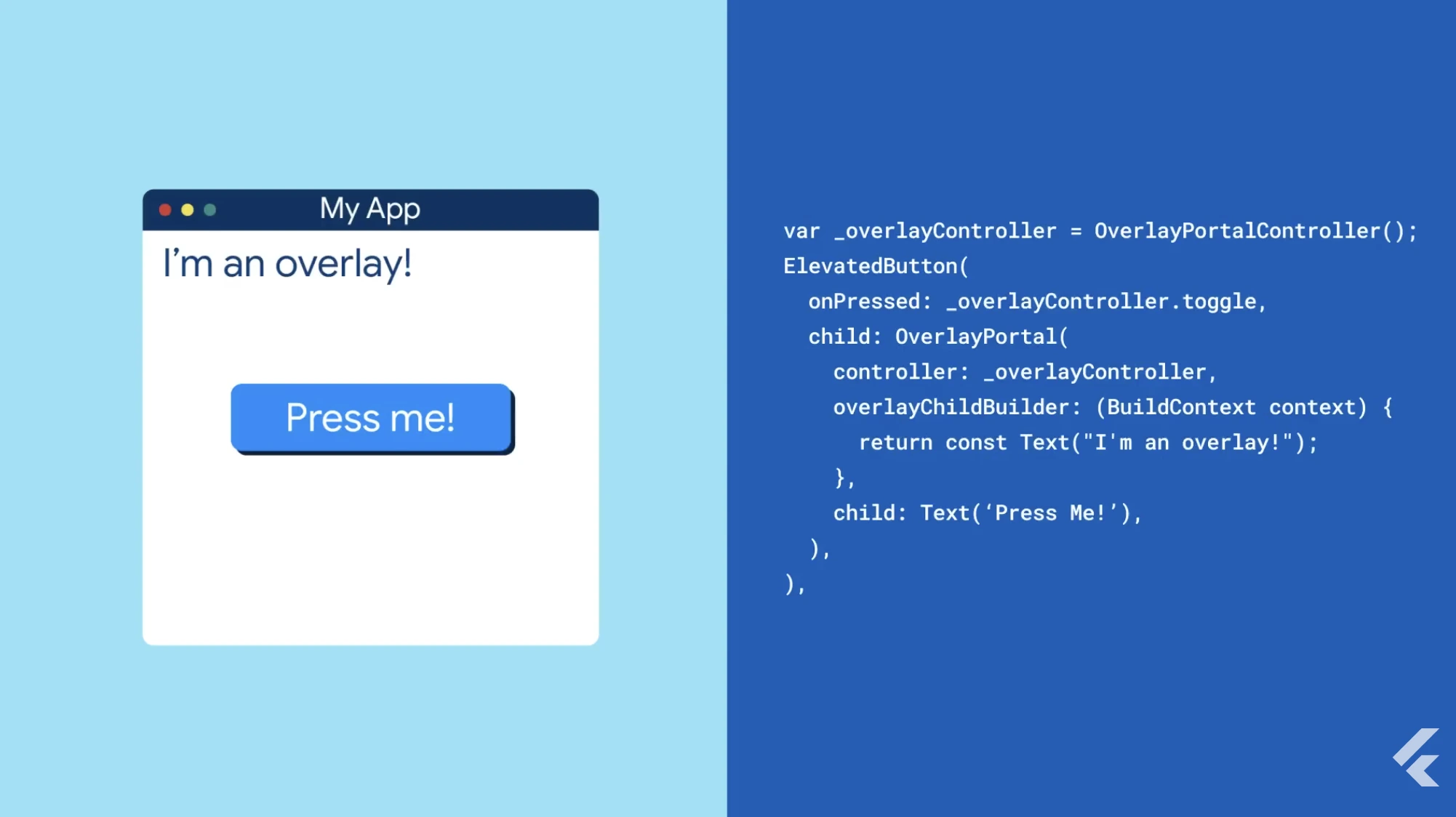
OverlayPortal Improvements: The OverlayPortal API, introduced in Flutter 3.5, got significant enhancements in 3.29. You can now nest portals, control z-order explicitly, and detect when a portal is shown/hidden via callbacks. This is the recommended way to build floating UI elements (tooltips, popovers, menus) without managing a separate overlay stack.
OverlayPortal(
  controller: _portalController,
  overlayChildBuilder: (context) => Positioned(
    top: _tooltipPos.dy,
    left: _tooltipPos.dx,
    child: Tooltip(message: 'Hello'),
  ),
  child: GestureDetector(
    onTapDown: (_) => _portalController.show(),
    onLongPress: () => _portalController.hide(),
    child: Text('Tap me'),
  ),
),
From Flutter 3.8+, The OverlayPortal.targetsRootOverlay constructor is deprecated. Use the default constructor with overlayLocation to choose where the overlay renders (e.g., OverlayChildLocation.rootOverlay).
// Before
OverlayPortal.targetsRootOverlay(
  controller: myController,
  overlayChildBuilder: _builder,
  child: myChild,
);

// After
OverlayPortal(
  overlayLocation: OverlayChildLocation.rootOverlay,
  controller: myController,
  overlayChildBuilder: _builder,
  child: myChild,
);
Dart Threading Model on Mobile: One of the more under-the-hood but important changes was moving the Dart VM to the main thread on iOS and Android.
Previously, Dart ran on its own thread, with complicated synchronization to the platform thread for native calls.
Now, Dart runs on the platform's main thread directly. What does this mean for you?
- Fewer thread switches = lower latency for platform channel calls
- Native code can now safely access Dart state without expensive marshaling
- Simpler debugging experience; no more thread boundary crossings to trace
- Slightly easier integration with platform libraries that expect main-thread execution
This was a deep architectural change that required coordinating with both the Dart and Flutter runtimes, but it unlocks cleaner native interop down the line.
If you use platform channels heavily (camera, location, payments, etc.), you'll benefit from lower overhead.
Accessibility & Developer Tooling
Flutter 3.35 focused on accessibility improvements and analysis performance.
Accessibility Enhancements
SelectionListener & SelectableRegionSelectionStatusScope provide granular control over text selection, useful for formatting toolbars.
Improved VoiceOver & TalkBack support makes semantic annotations more robust.
Live region support allows announcements to be read by screen readers even when unfocused.
And of course, CupertinoExpansionTile brings iOS-native expansion tiles using the Expansible core, proving the decoupling effort works.
Analysis Server Speed Boosts
The Dart analysis server got significant performance improvements, large projects now analyze in under 2 seconds instead of 5+.
Error messages became more contextual, and refactoring tools (extract method, rename) now understand nullable types better.
AI-Assisted Development and Features
2025 was the year Flutter embraced AI in a big way, both for developers' workflow and in-app capabilities.
Dart & Flutter MCP Server
Dart 3.9 introduced the Model Context Protocol (MCP) server, an AI bridge that gives code assistants deep knowledge of your Flutter project.
dart mcp # Exposes project structure, dependencies, and analysis to AI tools
This powers Gemini Code Assist, GitHub Copilot and similar AI assistants, enabling them to understand Flutter context, navigate your codebase, and handle multi-step refactors like adding screens and updating navigation.
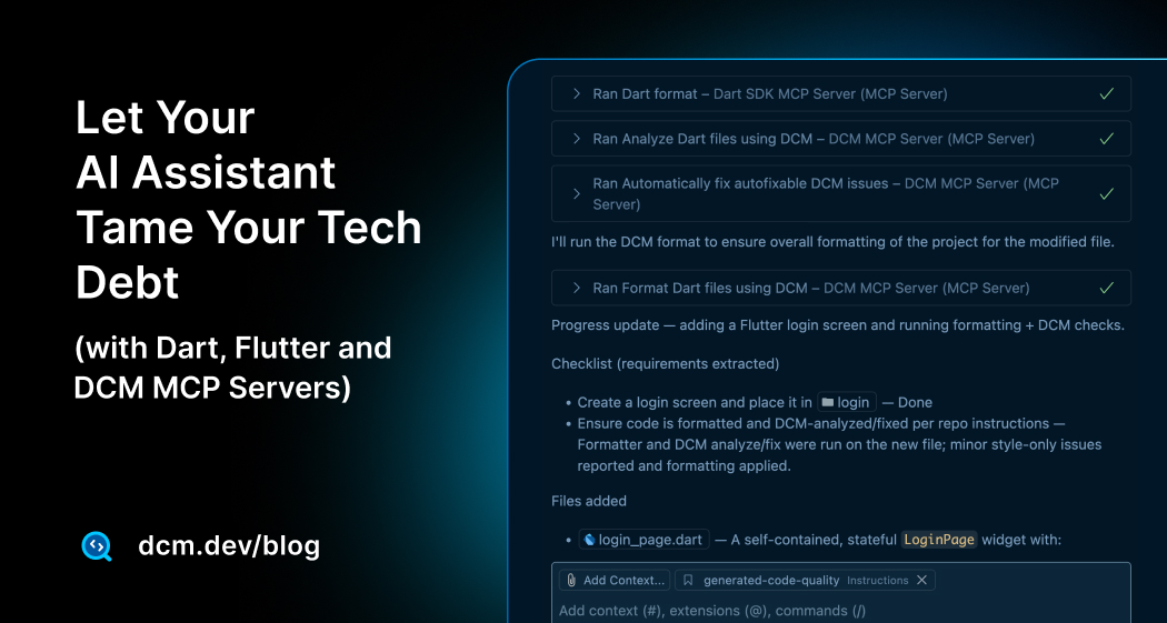
For production-grade AI-assisted development, combine MCP with automated code quality. Read our guide on Agentic Code Quality with Dart and DCM MCP to learn how DCM's lint rules and metrics catch issues AI assistants might introduce.
DCM is a code quality tool that helps your team move faster by reducing the time spent on code reviews, finding tricky bugs, identifying complex code, and unifying code style.
Firebase AI Integration
Flutter 3.32/3.35 coincided with Firebase launching the revamped firebase_ai SDK (formerly firebase_vertexai) to access Gemini models and Imagen.
You get chat/completion, image generation, and safety settings without hand-rolling HTTP/auth.
The official Flutter AI website is also up and running now.
Other Noteworthy Improvements
There are a few more updates that I thought it's nice to bookmark them here to reference as what has happened in 2025:
- Privacy/Safety:
SensitiveContentwidget (Android 14+) obscures UI during screen recording. I have written about this widget on this blog 8 More Flutter Widgets You’re Probably Not Using (But Should Be)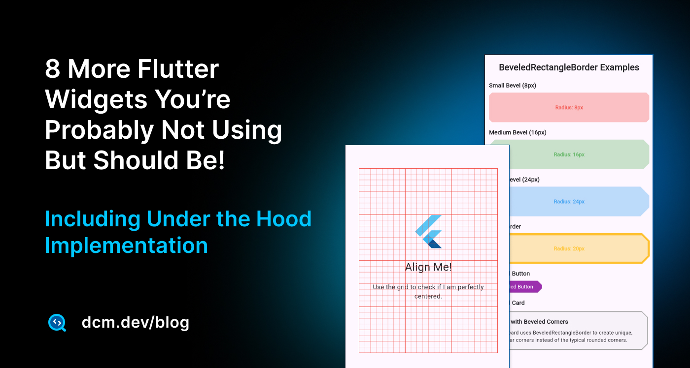
- Accessibility:
SemanticsLabelBuilder,SliverSemantics, and more robust screen reader behavior. Audit with DCM accessibility rules. You can also read our deep dive article.
- DevTools/Analyzer: Faster AOT analysis, redesigned inspector, metadata-aware logging, and better refactors.
- Platform readiness: iOS 17/Xcode 15 support, Android 14 polish, and multi-window via the iPad UIScene lifecycle (3.38) with automatic migration.
- UI polish: Predictive back (Android 14), improved text editing on iOS,
form onReset, scrolling/gesture fixes,OverlayPortalimprovements. - Material 3: Refined progress indicators/sliders, DropdownMenu keyboard fixes, TabBar animations, RangeSlider alignment, Chip/Tooltip
mouseCursor, Badge, MenuAnchor/MenuBar, Carousel, scrollable NavigationRail, NavigationDrawer slots, BottomSheet dynamic heights. - Cupertino: NavigationBar bottom widget, dark-mode alert tweaks, better text selection handles, haptics across pickers/sliders.
- Android 16KB pages: Play requires 16KB page support; Flutter 3.38+ is compliant.
flutter build appbundle --target-platform android-arm64is enough, verify any custom native libs. - Build toolchain: Java 17+ now required for Android builds; ensure CI uses the new JDK.
Breaking Changes & Deprecations
A few things to be aware of if you're upgrading from 3.35 to 3.38:
- Older iOS versions: Support for iOS 11 and 12 was dropped; minimum is now iOS 12.2 (effectively 12.2+). Apps targeting iOS 11 won't compile with Flutter 3.38.
- Android API 20 (Android 4.3): Officially dropped. If you need to support very old devices, stay on Flutter 3.35 or earlier.
- Dart 3.9 null safety: All packages must be null-safe; if you depend on an unmaintained package, you may hit dependency issues. Consider forking or switching packages.
- Platform channels: The migration from the old
MethodChannelto the newStandardMessageCodecis mostly transparent, but if you have complex custom serialization, test thoroughly.
Further Reading and References
If you want to dive deeper into any of the topics above, I highly recommend the official release announcements and docs:
-
Flutter 3.29 Release Blog (Feb 2025): Impeller on Android, rendering improvements
-
Flutter 3.32 Release Blog (May 2025): Hot reload on web, Cupertino superellipses, and more
-
Flutter 3.35 Release Blog (Aug 2025): Web hot reload stable, Widget Previewer, new widgets
-
Flutter 3.38 Release Blog (Nov 2025): Dot shorthands, performance updates, UI polish, AI integrations
-
Flutter Widget Previewer Documentation: Guide to using
@Previewand the preview tool -
Comprehensive Guide on Flutter Widget Previewer: Guide to using
@Previewand the preview tool with practical examples and edge cases. -
Firebase Generative AI for Flutter: Official Firebase AI SDK documentation for integrating Gemini models
-
Let Your AI Assistant Tame Your Tech Debt (with Dart, Flutter and DCM MCP Servers)
-
Breaking Changes in Flutter 2025: Official list of deprecated APIs and migrations (useful if you encounter warnings or new deprecations).
Each of these resources provides more technical details and examples.
As Flutter developers, we have a lot to celebrate from 2025's progress, our apps are not only easier to write and faster to build, but they are also ready to do some really clever things.
Here's to an even more productive (and fun) 2026!
Happy coding!
Enjoying this article?
Subscribe to get our latest articles and product updates by email.

 Dmitry Zhifarsky